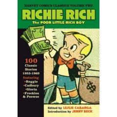
 Harveytoons had a very appealing house style. It's generic but cute. Almost all their kid stars were the same design.
 I'm not sure who did this really cute cover...Warren Kremer?
Casper is Elmer Fudd without ears. He is a living dead construction model- the ultimate bland!

Spooky is Casper with a dognose and freckles. And he's a smartass bully.

Audrey is Casper with a dress and hair.

So is Dot.

Hot Stuff has pointy ears and horns.

HOWIE POST
When I was a kid there was one Harvey artist I loved. I thought of him as "the fun one".
 Jerry Beck later told me it was Howie Post. He did the 1950s Spooky and Little Audrey comics. He continued in the 60s but someone else started to take over.
 Howie not only drew the most likable versions of the characters, he did the nicest backgrounds too. His haunted forests were great!
 These examples are actually a little later than the most cartoony stuff he did. I found these online, but I have a stack of 50s Harvey comics somewhere and as soon as I find them I'll post some.
I always thought the comics were drawn better than most of the animated cartoons.


Just for comparison sake, here are the same characters drawn by Ernie Colon. Not so cute. Kinda serious looking. (This is also a bit later)

Colon is obviously a good draftsman and he must have been fast, because he did tons of titles all through the 60s, and I read 'em all.

He's not as appealing and not at all cartoony though. He also has a tendency to draw the characters mean.
 Colon did this weird thing that confused me when I was little. He would combine regular bighead Harvey kids with little head incidental characters. Tiny close set eyes even on the kids.
 The adults had heads that were a quarter the size of the kids' heads! Check out your collection of Richie Rich comics and get creeped out! The adults are a different species than the kids!
Sometimes he made the kids positively demonic. Audrey could use an exorcism!
 Howie Post's cute Audrey.

Howie's caveboy Melvin
Here are some more great covers from the 50s. Kremer?


 The earliest comics looked more like the cartoons:


 Audrey could use an exorcism!
 Howie Post's cute Audrey.
Compare the proportions of her features in Post's design to the Colon one.
Her eyes are bigger, wider apart and set on angles.
Her eyes are bigger, wider apart and set on angles.

Howie's caveboy Melvin
Here are some more great covers from the 50s. Kremer?


 The earliest comics looked more like the cartoons:


So you might be wondering, "Why do you like these characters if they are generic and bland?"
Well Casper is very bland indeed and I didn't like him as much as the other characters. But the stories were about magical impossible stuff happening and that was good enough for a reading or 2. The other characters have a bit of personality and much appeal when in the hands of appealing artists.
These are for kids and have simple stories with simple personalities and I'm completely fine with that - as long as they look fun! And they aren't pretending to be anything more than that. I never heard the artists (or writers!) telling us about the great acting and storylines - although I'd say they were still ahead of animated features on both scores. They were silly and sincere. Fun throwaway entertainment. A classic American tradition.
They also were done very cheap. You could buy a fist full of these comics for a buck and still have money left over for smokes and cokes. Generic and silly for 10 cents makes more sense to me than generic and hard on the eyes for $100,000,000 or more. Plus the Harvey style didn't squeeze every other style out of business. There was a lot of variety in comics and cartoons back then.
If you're gonna do simple and soft for kids, an appealing visual style can do a lot for a lack of "deep" content.


These look like they are drawn by someone who never grew up and is still immature, silly and playful. He'd let you stay up past your bedtime and eat big helpings of ice cream.
Howie Post's really cute and lively drawing style gave the comics a light hearted and imaginative personality.

It's amazing how different artists can bring such different feelings to the same designs and material.
Harvey comics is a naturally cute style.
I'm saddened by the realization that the concept of cute and appeal may be lost forever.
Look what happens to a once cute style today when really serious people get a hold of it.

Well Casper is very bland indeed and I didn't like him as much as the other characters. But the stories were about magical impossible stuff happening and that was good enough for a reading or 2. The other characters have a bit of personality and much appeal when in the hands of appealing artists.
These are for kids and have simple stories with simple personalities and I'm completely fine with that - as long as they look fun! And they aren't pretending to be anything more than that. I never heard the artists (or writers!) telling us about the great acting and storylines - although I'd say they were still ahead of animated features on both scores. They were silly and sincere. Fun throwaway entertainment. A classic American tradition.
They also were done very cheap. You could buy a fist full of these comics for a buck and still have money left over for smokes and cokes. Generic and silly for 10 cents makes more sense to me than generic and hard on the eyes for $100,000,000 or more. Plus the Harvey style didn't squeeze every other style out of business. There was a lot of variety in comics and cartoons back then.
If you're gonna do simple and soft for kids, an appealing visual style can do a lot for a lack of "deep" content.


These look like they are drawn by someone who never grew up and is still immature, silly and playful. He'd let you stay up past your bedtime and eat big helpings of ice cream.
I liked the early cartoony Harvey comics but didn't care too much for the late 60s comics when they started looking too serious and the style got dreary and less cartoony.
These look like they are drawn by an intelligent mature man who always balances his checkbook. He'd be sure you got to bed on time and finished your cauliflower.

These look like they are drawn by an intelligent mature man who always balances his checkbook. He'd be sure you got to bed on time and finished your cauliflower.

It's amazing how different artists can bring such different feelings to the same designs and material.
Harvey comics is a naturally cute style.
I'm saddened by the realization that the concept of cute and appeal may be lost forever.
Look what happens to a once cute style today when really serious people get a hold of it.

Did you know that there is a huge difference between "Design" and "Style"?
I was thinking about doing a post on that, but it'll take some work.
I was thinking about doing a post on that, but it'll take some work.


