Wednesday, January 31, 2007

Milt Gross comics, drawing with every principle EXCEPT construction


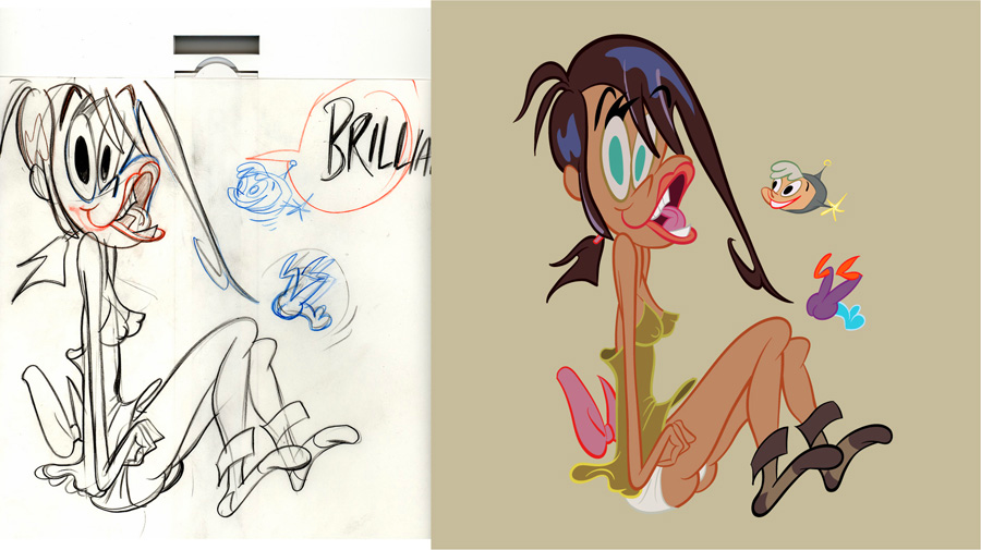
I think Milt Gross is the most naturally gifted cartoonist in history.
On the surface, if you are just looking at his work for the first time, you might be shocked. It's so loose and cartoony and doesn't use strict construction. Not all the details wrap perfectly strictly around the forms. (They DO wrap around the shapes and compositions.)

BUT Milt had absolutely great natural control over a ton of principles and skills, he had a natural observant eye for the way things really looked, a gift for caricaturing them and a beautiful ornate style that had humor as its first element.

His graphic style is hard to peghole. It doesn't fit into any school of cartooning. It's neither 2 dimensional nor 3 dimensional. It has elements of both at the same time, but perfectly controlled. I guess it's 4 dimensional. He bends space to allow you to see what he thinks is important in the scenes.

He also had a very rare gift that few cartoonists have-the gift of life. His every panel and character seem alive and bustling and full of inner motivation. I don't even know if that can be taught. Some artists never get it, no matter how many principles they learn.

This panel below has:
Great page layout design - every panel is a different and organic shape, yet all the panels are composed to look good together.
Every Pose is different and fun.
Every Pose has a clear silhouette and line of action.

A funny observant take on dog anatomy- Milt takes the stiffness of a dog's limbs and bends them into human actions and situations. This is not like Bugs Bunny or Tom and Jerry, who are merely built of pears and tubes. Their poses are comfortable in human attitudes. Pooch here is struggling with his own canine anatomy, but is not at all deterred despite the awkwardness- genius!

Original Cartoony designs inspired by but not hampered by reality
Look at these hilarious designs of ferocious animal heads! They aren't stock Disney animals or stock anybody's animals. Milt needed to make a story point and did it as extreme and precise as his wild creativity let him.

Great backgrounds

These BGs are not only shown from very difficult angles-they are also very specific.
The characters are in a Craftsman house.

Gross must have done tons of drawings of real things. He must have looked at all different kinds of houses, trees, landscapes, cities, furniture etc.

He was interested in how everything looked and he thought everything looked funny so that's how he drew it.

He didn't draw the "stock cartoon house" or the stock Nelvana tree with the Sheridan college bark that looks the same as the texture on every object in the Sheridan college universe.

I think Milt does the best cartoon backgrounds ever.

Crazy Ideas and Funny execution of them
Compare these pages to the great Harvey Eisenberg pages in the post below. While Harvey's are technically great, they aren't particularly funny and the story is just stock comic book cartoon story fare.

The idea of a mutt wanting to be glamorous, so he cuts up a fox fur and glues it to himself in patches is funny by itself, but the drawings show the hilarious incongruity of how matted up and nasty the dog looks, yet he is prouder than a peacock.

Genius Page Layout

Great Compositions
Varied and contrasted character designs
Look how each character is made up of different shapes. The lady has a diamond shaped head with a pointy nose.
The man has a large forehead and a skinny protruding jaw. The little character has an upside down triangle head and an upturned bulbous nose.
The man is organic and the woman is more angular.

Many animated cartoons recycle the same basic shapes for their designs and just change the ears to denote what animal you're looking at.
In a Jack Kirby comic, almost every man has the same square head design.
It's very rare for a cartoonist to have a lot of different custom designed characters.
Milt Gross seemed to never run out of them.

Wild Action
Milt's comics seem more animated than most animation-especially today's.

Control of details-look how in the middle panel, the lady with the out of control vacuum cleaner and the horse all fly in an overall arc...the seemingly chaotic situation is carefully controlled to make it funny and easy to read and beautiful.

Funny Poses- no stock poses for Milt. Look at the pose in the second panel of the man with bent knee supporting the stretched right side of his body.

Scale.
Amazing design, composition and control of where to put details to make this mansion look huge and magnificent.
Note the trees in the foreground are different kinds of trees than the ones in the background.


Dynamic Angles!
Comic Story Pacing
The angles get progressively more extreme which helps build the pace of the action.

Opposing Poses

The poses of the characters contrast and react to each other. They don't just stand there straight up and down. They are alive and thinking.

The best animal Designs
This bulldog kills me. He isn't your stock Preston Blair bulldog that you see many variations of in old cartoons. This one is totally original. Actually, maybe it's a boxer, but look at what an asshole he is!

Extreme Cartooniness
These pages are just pure brilliant cartooniness. Milt is obviously totally into his story and having a lot of fun drawing it and that fun translates to us.

Cartoons are supposed to be fun, aren't they?

UPA really missed the boat on this point. Graphically, the UPA (and Disney's "UPA Style cartoons) cartoons are similar to Gross'. They are both "designy", yet the UPA and Disney cartoons are missing the element of fun and exuberance for life that leaps off of Milt Gross' pages.
Great Crowd Control


I always wonder what Clampett would have done had he stayed in cartoons through the graphic 50s. He loved Milt Gross and his cartoons were always very alive. I imagine they would have looked something like this only with that great animation you only see in Clampett cartoons.

Designy cartoons don't have to be flat or boring.

These pages are works of fine art and should be hanging in a museum somewhere.


A 15-page Pete the Pooch comic is reprinted in ART OUT OF TIME!


Discover more Milt Gross and lots of other great cartoon art at Shane's wonderful site!
http://cartoonretro.com/


NEXT! .....The Rise and Fall of Construction in Cartoons, an inspiring and sad story.

Harvey Eisenberg - Tom and Jerry comics - construction, difficult angles and other skills


Harvey Eisenberg was a giant among cartoonists.

He was a layout artist on the early Tom and Jerrys and then he migrated to doing comics in the 1940s.

He could draw almost everything well, because he understood all the principles of good drawing in general, and then good cartooning/animation principles on top of that.

He could draw a character and a background from any angle, no matter how difficult. This gave him a much wider canvas to create from than today's flat cartoonists who are limited by only being able to draw a small amount of poses and only in 2 dimensions. You might be able to imagine a certain expression pose and angle in your head but then find that your pencil won't give it to you, because you have been relying on drawing "by design" rather than learning your skills properly.


Construction and asymmetry

Difficult angles and great perspective


Varied and interesting compositions

Lively and fluid, yet solidly constructed poses

He can draw characters from any angle

Organic shapes and forms-even the shingles and chimney


Fun poses, his characters seem alive and motivated

These are the kinds of skills I think they should teach at cartoon and animation schools.
The more knowledge and skill you have at principled 3 dimensional drawing, the more creative choices you have to draw from.

Harvey could draw in many different styles. He later did Hanna Barbera comics more in the TV style, but they are great looking because of how well he could draw technically.

If you are young and are drawing in a flat stylized style, you are severely handicapping your creative choices and your future. Learn the principles well and you will be much more creative in the long run.
AND....YOU WON'T HAVE TO STRUGGLE SO HARD TO GET YOUR PENCIL TO DO WHAT YOUR IMAGINATION WANTS IT TO.


Here's more great info from animator Kent Butterworth:
Harvey Eisenberg started doing comics around 1943 at Timely (later Marvel) comics, then he and Joe Barbera started their own comic book company, Dearfield in 1946 with "Foxy Fagan" & Red Rabbit". Joe supposedly wrote the stories & Harvey did most of the art. (Jerry Eisenberg told me that Joe & his dad worked out of a small shed in their back yard)

After this, he drew Tom & Jerry comics (and other stuff for Dell) from the late '40s though the early sixties.

His style became streamlined in the '60s, but there was always a great sense of action and perspective in his shots. It was never "flat". He really knew how to show depth in a layout with a minimum of simple shapes. A carefully placed fence or picnic table would give a perfect sense of "camera angle" and describe a 3-d space, and then a real nice dynamic shape for the characters in motion in the scene (foreshortened so they are "in the scene" not flat like a model-sheet lineup). Lots of nice "low angle" shots so we could see both Tom & Jerry in the same shot (Jerry in the FG) and see the facial expressions on both of them clearly.

He makes it all look really easy and simple, but there's a lot of skill in laying out these panels.

Sunday, January 28, 2007

G.I. Babies from 1988

This was a show Idea I pitched in 1988 to make fun of all the baby cartoon shows that were popular.


Saturday, January 27, 2007

Folks Seem to Like Drawing Sody


Here's more inks from Brian Romero.
Looks like real Spumco material to me.

People keep sending me their renderings of Sody Pop.Here's Kali's...

And Art's.

I'm gonna be doing some cartoons about Sody and her pals soon, so if you are good at drawing cute girls, I'm gonna need some help. It ain't easy, lemme tell ya!

Friday, January 26, 2007

No More 'Tude!

I hereby command that you stop drawing 'tude.

I see you there at your desk. You have a drawing on your board with a character with a sly half closed eyelids sneer looking at the camera.

I caught you. Someone is standing over your shoulder right now watching you and shaking her head with shame.

Why in Hell would anyone draw this expression on a cartoon character? And why on so many characters?

If I see one more animated feature billboard staring down at me with 'tude, I'm gonna become a 'toon terrorist.

What the hell is 'tude anyway? Have you ever actually met anyone in real life who makes this expression?

Would you have anything to do with him if you did?

What if your best friend, someone you have known for a few years, showed up at your house one day and he had 'tude all of a sudden?
Wouldn't you just wanna kick the shit out of him? Would you be seen in public with him?

This is the face you would make if you saw someone on the street with 'tude.You wouldn't walk around town with your willie hanging out of your giant trousers would you? Well, then why would you draw 'tude? It's the same exact thing.


So this is the last day that you are allowed to draw 'tude. From now on, draw real human expressions that are funny and amusing. Your public will thank you.If you have more images of unsightly 'tude, post a link in the comments!

Want a cure for drawing 'tude? Pay attention to the expressions, faces and poses your friends and family make. Caricature them and then draw your cartoon characters making funny and real and specific expressions. You'll feel much better and be able to walk the streets with your head held up.

In the meantime, cleanse your eyes with these joyful pictures:


Thanks to Trevour for this abominable example of 'toon 'tude.


Thursday, January 25, 2007

Look What Brian Did

Hey Brian Romero took it upon himself to ink and color one of the pencil roughs I did of Sody Pop and Raketeena the Imp From The Future. http://brian-romero.blogspot.com/


He did a pretty good job too, I think. He captured all the flowing lines.

Would you give it to them?

http://johnkstuff.blogspot.com/2007/01/sody-meets-raketeena-for-raketu.html

Wednesday, January 24, 2007

Crackpot Executive Beliefs 1

Executives in Hollywood are like cultists. They believe fervently in things that completely go against common sense and reason. They are like Scientologists, except that executive beliefs change faster than established religions. The religion of executives follows trends.

Every time someone comes along and breaks all the previous religious beliefs and is successful, a new crop of nutty executives displaces the last and tries to find the magic reasons that the latest new entertainment phenomena succeeded. Then for years and years they try to repeat a formula that wasn't there, until a new rule breaker like me or Mike Judge or Matt Groening comes along to dash the previous religion to bits.

The executives never come to the obvious conclusion that a normal sane person would, that when a new show comes along that destroys the previous religious beliefs, that the reason for the success is the person who made the show.

Here are just a few preposterous beliefs of current executives in animation:

Someone With Talent Who is A Natural Entertainer Needs Someone Who Has Never Entertained Anyone To Tell Him How to Do His Job

That's the justification for why you need executives in the first place. That's it. They freely admit and with great pride, that they were previously dentists, lawyers or secretaries and now they tell cartoonists how to make cartoons. They never think they need to explain why they should know better than someone who actually can do it, has done it and does it naturally and has spent a few years learning the craft.


You Can Direct And Create Cartoons With No Experience

This is a fairly modern belief. It happened after Ren and Stimpy. All the shorts programs have as their goal to find a young kid who has the latest greatest idea in the world.
They actually believe that you don't need to have ever worked on cartoons to create a cartoon.

It's as if they were hunting for the latest choreographer and they put up a sign saying, "Dancers need not apply".

This is a hugely dangerous and evil belief.
One exec actually told me, "we can't buy cartoon ideas and characters from someone who has been working in the business, because his ideas won't be fresh."

They then get some kid from nowhere who has never worked for anyone in cartoons or has very little experience, doesn't know how cartoons are made and they put him in charge of a short or series.

Of course SOMEONE has to have experience who works on the cartoon or the cartoon won't get made.

So they put an inexperieneced kid in charge of artists who have paid their dues (and would like a chance to make their own cartoons) on other people's cartoon series and all the experienced people are jealous of the guy who came from nowhere and won the cartoon lottery.

So if you plan to make a career of cartoons, you better sell a show the first couple years you're in the business, because as soon as you have learned something the execs think you can no longer be creative. But be prepared for your crew to hate your guts.

A Cartoon Character Has Inherent Value

Execs think that characters by themselves have inherent value. "This character is worth millions". They never get that the artist who is able to create great characters is the thing of value.

Bugs is a great character, right? Then why hasn't anyone been able to do a good cartoon with him in 50 years?

Because they don't have Clampett, Avery or Jones to direct him. These guys created scores of great characters.

This obvious fact of history that repeats itself over and over again is completely over the heads of executives.

You Need To Find The Next "Look"
Another modern executive belief. Because Ren and Stimpy came along in 1991 and looked "different", they expect this to happen every year at every studio.

Things tend to evolve (or devolve). Very rarley throughout history do "new" things spring into existence out of nowhere. When they actually do, all the execs and establishment do everything they can to crush them out of existence.

Instead of just wanting the cartoons to be good, and strong and funny and amusing, there is this insane search for something relatively insignificant.

An exec told me a month or so ago, again, that experienced cartoonists were doomed because they couldn't create one of these new looks, but some 16 year old kid from the Ozarks who can barely scrawl, can.

The exec admitted one drawback to this doctrine and rolling her eyes said, of course "these kids are a pain, because they have never made cartoons before so we have to hold their hands throughout the process."

D-uh!!!

"Adult" Cartoons Have To Look Like They Were Drawn By Kids
Because the Simpsons and Beavis and Butthead were so successful, the execs tried to figure out the "secret" of their success. The magic ingredient taht could be injected into every cartoon ever after.

Execs being simple of wit and illogical, looked at the most superficial aspects of the shows-that the drawings were primitive and looked like kids drew them, rather than professional artists.

From then on, every "adult" cartoon show has looked like it was drawn by 8 year olds.

They seriously believe that if you had a show that was aimed at adults but was drawn well, people wouldn't watch.

Adults Don't Like Slapstick
When I was developing the George Liquor Program for MTV, the executive in charge of my creativity kept telling me to take out the crazy stuff. Formerly from MTV, and never having worked on The Simpsons, she told me what she thought the formula was for the Simpsons: "Your cartoons are too lively and animated. Adults don't want that. That's for kids. The Simpsons works for adults because nothing ever happens. They sit on the couch and say witty things. Adults don't like slapstick."

This was at the time Jim Carrey was making hit after hit of wacky slapstick films for adults.


Anybody can write cartoons (except cartoonists)

Executives believe that anyone is qualified to write cartoons-that is anybody except cartoonists.

Secretaries, friends of execs, psychologists, film editors - this is where execs find their "writers". Not experienced real writers, let alone cartoonists with story ability who are funny-
the folks who built the animation business and created the greatest cartoons and characters in history do not qualify.

I guess they think you can only have one talent at a time.

They would also assume that The Beatles needed plumbers to write their songs for them and that Walt Disney, Chuck Jones, Bob Clampett, Tex Avery and a horde of other cartoonists couldn't decide for themselves what cartoons to make.

Anybody can direct voices, as long as they didn't have anything to do with creating the cartoon story

Execs believe that you need a special person to tell the actors how to act out the cartoon voices.

They don't believe that the creator of the show, or the writer of the episode or the storyboard artists, all people who have spent considerable time on the actual episodes know how the characters feel about the events in the story.

They believe that someone who has just this moment been handed a script, knows exactly how to direct the voices. Someone seeing the show for the first time, who has no creative stake in the show, because she also "directs" 15 other shows every day.

Now, maybe you think the reason this person is better qualified than the people who made the stories and characters is because she has some special training.

The voice director of course used to be an actor.

Nope.

A writer?
Nope?

A cartoonist?
God no!

Voice directors are usually the studio head's secretary, someone who spends most of her time under the most important desk in the studio.
After awhile, the boss wants a fresh new secretary and promotes the dusty one to "voice director".

There are many more crazy executive beliefs. In fact if you have experienced any, feel free to share your experiences in the comments-better post anonymously!


By the way, don't take my word for any of this.

Read the crazy religious beliefs of some of the most renowned crackpots in the cartoon business:

http://mag.awn.com/index.php?ltype=search&sval=RD01&article_no=2738

Tuesday, January 23, 2007

BGs and Style 7 - Inki and the Minah Bird (1943) - backgrounds

That Chuck Jones sure was an experimental rascal.All through the early to mid forties, Jones tried all kinds of different background styles, from cartoon to cartoon, sometimes radically different.

I find it interesting that his character design style slowly evolved but his BG style changed in creative spurts.
His characters were very stylish and you see a constant progression from cartoon to cartoon with slight variations and experiments, but the style is still firmly based on the pears and spheres-Preston Blair-standard 40s cartoon style.

The one big experiment he did in character styling was The Dover Boys-1942. But I heard Leon Schlesinger hated the cartoon and told him never to do anything like that again. John Hubley at Columbia cartoons saw it and was hugely influenced by it and copied the characters and styling for his own cartoons, Professer Tall and Mr. Small. He later carried the idea of experimental design even further and helped found UPA.

Maybe Chuck's way of staying experimental was by trying different, more graphic BG styles.


He might have thought thatLeon didn't pay attention to the BGs and so wouldn't notice how radical the changes and experiments were. I don't really know, but it is odd to see graphic BGs behind rounded flowing characters.
I was always fascinated by these early Jones cartoons and hugely impressed at how many ideas were created so fast, whereas today it takes a whole decade at least to notice any discernible changes in cartoon styling and it's usually accidental and for the worse.


People ask me about the Ren and Stimpy or the Spumco "style" and I always say there isn't one. Jones and others instilled in me the idea to constantly try new things and experiment and always be restless and never satisfied with anything. I might be the last person on earth who remembers the concept of "progress" as a positive thing, a concept that just a few decades ago was the American philosophy that made the country the greatest, most influential and fastest moving nation in history.

What is known as the "Spumco style" is really the style of my imitators who carry on all the mistakes in my cartoons and turn them into cliches.

The real John K/ Spumco style is the combination of whichever artists worked on which cartoon and what we were thinking about at the time. Almost every Ren and Stimpy is a different style -until Nickelodeon took it over and even then it took awhile to become a formula. The barreling momentum of constant change started on Bakshi's Mighty Mouse and carried on in Ren and Stimpy took awhile to brake.

It finally did and now has gone quite a bit in reverse in the cable cartoon network studios.

Functional drawings1 - draw with a purpose - layout/posing


1st 2 poses by Mike Fontanelli, 2nd 2 by me
Learn Fundamentals

There is a reason for learning all these basic drawing tools I've been talking about. Once you understand your basic tools, you'll want to do something with them.

By themselves they have no meaning unless you apply them to some purpose.

If you just fill up sketchbooks with floating characters that look neat, that's not really functional. That's good for showing your friends, and it's good if you are studying how certain things look, but it won't help you do an actual job.

That's the next step- using your skills to perform a function.

Applying fundamentals to a purpose- functional art

I have learned (and I learned this slowly) from experience that talent and skill is not enough to be able to do a job.
I have hired many young artists just on the basis of some sketches in their portfolios that indicated to me that they had talent.
Sometimes it paid off fast. A small % of them learned quickly and then after a couple months started doing work that was usable.

Most didn't. Talent and even basic skills isn't enough. I used to assume if you had talent, you could just sit down and bang out a scene.

Everyone learns to function at different rates. Some never do.

It's a sad state of the system today that people can't learn the best way to do functional animation drawings.

The best learning system existed in the 1930s, when all the animation was done in the studio in the country, and under the direction of an experienced animation director.

You started as an inbetweener working for an animator and by tracing his drawings and filling in the inbetweens you learned how to animate.

You learned to leave enough space between your characters for when they had to stretch their arms or jump up or walk out of the scene or sit on a chair. This is stuff you can only learn by doing it, and all that is done outside the country now, so really hardly anyone who makes cartoons today really knows how they are made, because they never learned by doing it themselves.

So it's not the fault of the young artists today, but the system makes it almost impossible to do anything truly animated in a creative way because you just can't afford to train people on the budgets that the studios give you. And the most important jobs are done overseas.

That's what this blog is for, to give young cartoonists as much knowledge and common sense tips to help them teach themselves what will give them the the most skills and more skill and knowledge means you have more tools to create from.

Functions in Animation
Animation is a collaborative medium. There are so many creative steps that go into making a cartoon and every one is important.

Here are some rough functions of some departments:

Storyboards:

These are the drawings that write and tell the story.

The function of a storyboard artist is to make the story make sense, be entertaining, have structure and give some indication of the acting and personalities of the characters.

It's not enough to be able to draw funny characters that float in a sketch book.

You have to be able to draw logical steps in continuity.

The characters to be staged in a way that tells each story point the most effectively.

The characters have to make expressions that not only tell the viewer what they are thinking each step of the way, but tell you in a way that only that particular character would do it.

The expressions have to be
1) funny
2) in character
3) in context of the moment of the story

The same goes for the body poses and gestures.

Now these are just a few functions you have to be able to perform to draw a storyboard.
You also have to have good and logical cutting.

You have to understand how animation works so that you don't storyboard something that is impossible to animate.

You can only really know this by having done some animation and having shot some storyboards on film and then seeing the final animation working and having people who you don't know laugh at the final product.

I'll talk about storyboards more in another post.

Posing for Animation Layouts

Because animation was done overseas by the time I got into the business, there was no way to control the entertainment though the character drawings in the 1980s, so I came up with a band-aid approach: Doing tons of poses in the layouts.

Doing character layouts is similar to storyboard posing but more detailed and finished.

The functions (besides using all the fundamental drawing tools I've been talking about) are

breaking down the scene into every pose that tells the story and that tells the changes in emotion.

Drawing the characters "on-model". Not on-model in the sense of tracing model sheets like most studios do, but to draw them recognizably as who they are.

Here's a relatively simple scene below as an example of a functional and creative scene.

Before you draw a scene, you have to analyze the story meaning of the scene and the physical restrictions of the scene. You can't just sit down and be creative and draw in the style of your sketchbook or phone doodles.

You need to analyze...

the Story purpose: In this scene above, you have to tell the audience in a funny way that:

1 The Happy Helmet has just kicked in and Ren is feeling his first moment of pure happiness.
2 Stimpy is an idiot and has no clear expression unless something moves.
3 Ren laughs joyously, innocently, not crazy yet
4 Stimpy sees Ren laugh and has a "pre-reaction" -slight surprise before:
5 Ren stops laughing/moving and Stimpy goes retarded again
6 Ren starts to talk, all happy now
7 Stimpy reacts- he joins in with Ren's new found emotion

Physical requirements:

This means there has to be enough space in the scene for the characters to do all the story things they have to do.
Ren basically moves up and down, so he has to have space above his head to move up.

This sounds simple, but you wouldn't believe how many layout artists (me too) who don't leave enough room for the action to happen in and have to go to the xerox machine to shrink down and reposition everything.

The expressions have to be clear, specific and in context and have to wrap around the construction of the characters.

So... having to balance all the story requirements and physical requirements of the scene drags your brain down and makes it hard to be creative. You have to work out a lot of creative and mechanical problems at the same time.

You might wonder: Where is there room for creativity here if the story is already written?

In the quality and entertainment value and humor of the drawings. In fact, to me this is the most creative and important step in the animation process-drawing the drawings that the people see. These drawings are the entertainment. They are the performers of the show and every other job on a show is subservient to the performance.


It's a lot easier to do a free and creative fun looking drawing in a sketchbook when you don't have anything to think about except how cool the individual floating drawing is, but as soon as you sit down to do functional drawings that have a consecutive order and have to build emotionally and be in the right place, then you find out what drawing really means.

This process of functioning makes you stiff. All of a sudden your drawings are lifeless and boring and awkward. This is natural to most artists and the only cure for it is to keep doing it until you are able to loosen up and function at the same time. This is a very frustrating balance and it breaks a lot of cartoonists. It separates the boys from the men. I've seen people give up just because they hate that stiff period while they are learning something new that they haven't done before. Every real artist goes through this constantly (unless they settle into a comfortable cliched simple style). You have to eat the pain and get used to hating your drawings every time you try to improve yourself. It's natural.

This takes time and practice. Start now! If you want to have cartoons that are filled with funny drawings and acting you better get your fundamental skills down as soon as possible and start doing whole scenes! Once you get confident and loose you will have a lot of fun.

Every expression and pose in here is completely specific to the progression of the story. There are expressions that were created for the scene because no stock expression would do. Of course after the cartoon, you've probably seen some of these expressions again out of context in other cartoons.
The drawings look free and crazy and fun, but they are not at all arbitrary. They are suited to the needs of the scene. I wouldn't be able to think of expressions like this arbitrarily if I didn't have a funny story to inspire me. I could think of arbitrary crazy non-functional drawings and I do on my napkins at Lido's, but those drawings are only seen by 2 or 3 people and they sure wouldn't affect the world the way tailored wacky drawings to a story can.


Here's a scene that a talented Spumco cartoonist was struggling with. The more things that happen in a scene, the harder it is to coordinate them together. The scene becomes way harder to plan. There were a ton of complex problems to work out in this scene.


There are a lot of long long scenes in Spumco cartoons. A general theory I have heard at the Saturday morning (and prime time) studios is that you should keep your scenes short, keep cutting at random from a long shot to a close up to a medium shot etc. Why? "To keep the film interesting". That's because nothing interesting happens in many modern cartoons, so you have to have quick cuts to fool the audience into thinking the film is moving along.

I've had scenes without a cut that lasted more than a minute and people laughing all through them. That's because I make sure there is always something happening, not just flapping lips.
Like this one.
This scene was extremely hard to work out functionally and it took 3 of us: Mike F., Bob Camp and me all helping each other.

Stimpy is cute, stupid and sincere and has to press a button with clear silhouettes.


Learn your fundamentals and then start to function!

Monday, January 22, 2007

BGs and Style - Part 6 - Scale


The greater the contrast between the size of your forms and the size of your details, the greater the scale.
After sending the service studio many of Jim Smith's designs of BGs and mountains like the one on top of the page above, they would send us back drawings like the one below it.

Sunday, January 21, 2007

I Found Old Cartoons To Buy! The Farmer Alfalfa Show! Jim Tyre! Carlo Vinci! B and W Eros!


Holy crap! I found a great site where you can get tons of old cartoons that they don't run on TV anymore!

WORLD'S BEST COMICS!

http://wbcomicshop.com/shop/searchBase.asp?stS=&selectcategory=234

It's almost impossible to find B&W cartoons anywhere. They don't run them on TV because the execs tell me that kids don't like B&W. I know this to be a lie, because I have little cousins and whenever I visit them I bring armloads of old cartoons-Betty Boop, Popeye, Terrytoons and stuff, and the kids sit in front of the TV in awe! They laugh, rock back and forth cluthing their little toes and then after the cartoons are finished they act them all out then watch them all again! And again and again!

There was a kind of humor in the old cartoons that you can't find in modern cartoons and even in the great 1940s color cartoons.

Terrytoons from the 1930s have these lost styles of animation that later disappeared as animation techniques became more standardized and influenced by Disney.

Carlo Vinci was way ahead of his time. In the late 20s he had already figured out squash and stretch, he could animate dancing, he animated really sensual little furries. Each animator was figuring out how animation works in his own way. There were no rules and the gags are cartoony and crazy.

Farmer Alfalfa cartoons are completely wacky and unpredictable and a lot of pure cartoony fun.

50s TV Cartoons Had Cool Packaging!
Hey, in the 50s TV was a lot smarter than today. They had a great idea for showing old cartoons.
I remember when I was a consultant for the Cartoon Network, a few years ago, they used to have these 3 hour blocks where they would throw together unrelated old cartoons from different eras and studios and give the block a retarded name like "Down Wit' Droopy D". This was a dead giveaway that these were "old" or "used" cartoons. Kids would know this and the feel cheated, because kids think that new means better.

In the 50s, they would take old cartoons and make half hour shows out of them. They would animate a new fun title sequence and write a rousing theme song-like the Bugs Bunny Show's "This Is It". Then in between the classic cartoons, they would get real animators to animate "bumper" scenes of the characters talking to the audience which made the kids think the characters were real. It made the cartoons feel special and new. This was the inspiration for the bumpers in the Ren and Stimpy Show.

The studios that now own all these old cartoons tore off all these great title sequences and threw out the bumpers, so most of these shows are lost.

THE FARMER ALFALFA SHOW!

Here is a great discovery. The Farmer Alfalfa Show from the 1950s.

The shows are intact as actually aired on TV 50 years ago! With:

Rare classic Terrytoons-even black and white ones!

New Titles animated in the 1950s by Carlo Vinci and the old Terrytoons animators- but -here's the really cool part- animated in the 1930s style! So...it's like they had to remember how they animated 25 years earlier-so it has a bit of 50s UPA influenced style (what they were doing at the time), mixed with the typical Terrytoons style - mixed with the rubber hose style! It's a really funny combination!

Jim Tyer Bumpers!
Between the cartoons are these weird non sequitor bumpers animated by the craziest animator of all time!

The Original Commercials!
As in all old TV shows the programs were directly sponsored, and the characters from the cartoons in Farmer Alfafa do these long elaborate commercials for Tootsie Rolls. Animated by the real Terrytoons animators! So cool
I just ordered a whole bunch of the Farmer Alfalfa Show
http://wbcomicshop.com/shop/searchBase.asp?stS=alfalfa&selectcategory=0&1=Go&kfg=fromsearch
Now I'm gonna dig through the rest of the cartoons at World's Best Comics and dig for more animated treasure...

Saturday, January 20, 2007

BGs and Style - part 5 - Contrasts in Texture, Avoid Even Spacing


Friday, January 19, 2007

BGs and Style - Part 4 - Use Organic Shapes AND FORMS


The manual pages below are about BG design, but they feature the principle of "organic" so I figure I better give you a clear definition of what I mean by that.

Organic as opposed to mechanical or geometric. Natural objects are organic. They are uneven, they flow, they are not symmetrical, they are complex. Humans, animals, rocks, trees, rivers and old cartoons are organic.

Nothing in reality is perfectly geometric. Man tries hard to make things into simple shapes and forms sometimes, like boxes, balls, mailing tubes and modern cartoons. This kind of form is simple, regular, predictable, easy and in most eras, boring.

Organic art uses smooth flowing lines and shapes describing various surfaces and densities and textures as opposed to geometric lines and shapes that describe all surfaces and substances stiffly and the same way. Organic art under control gives you an infinite palette of ideas to create from. Geometric is limited. There are only so many types of shapes you can make with straight lines and simple curves.

ORGANIC DRAWINGS

Organic comes in infinite variations and styles.


Stylized cartoons can be organic - and should be.


Of course you have to be a much more sophisticated, intelligent, cultured and skilled craftsman to be able to take advantage of organic art, but if you regularly haunt this blog that's your goal, isn't it?

If you want the easy way, then get a circle template and a ruler and you can create cartoons like these:

GEOMETRIC DRAWINGS


Because the trend for the last 30 years has been stiff, regular and evenly composed art, it makes it hard for me to hire current artists-especially if they are over 25 and set in their ways. This happened to me on The Ripping Friends. I hired 2 Canadian studios who were used to drawing in the Canadian style, which is even stiffer than the LA styles. Jim Smith and John Dorman would draw brilliant backgrounds and character layouts and we would send them to the Canadian studios who would look at them in disbelief, toss them away and then "correct" the drawings by spacing every object in the scene on a grid and standing all the characters straight up and take out everything interesting or worth looking at.

LOOK AT HOW DIRTY CANADIANS DRAW

GOD, HOW THEY MUST HATE KIDS.

So I made all these manuals to try to teach them. The younger folks, Helder, Kristy, Nick, Steve, Jose and a few more caught on quick. They hadn't been ruined by Nelvana yet. Jess already drew in an organic old fashioned sophisticated way, so I didn't have to teach her anything.

The studio's old guard of calcified brained 30 year olds and older were hopeless. They couldn't even grasp a single concept I wanted - and refused to even try.

So here's more free information for you. Learn it and practice it and if you become decent and functional, work for me. If you understand these concepts you will be suicidal working on Samurai Jack or the other million modern cartoons.


Thursday, January 18, 2007

Sody Pop coming soon


only if you want her...

Wednesday, January 17, 2007

My Crappy BG paintings-Big House Blues


When we did the pilot for Ren and Stimpy, we couldn't afford extra people to do all the jobs that needed to be done, so Bob Camp and I painted most of the BGs.

He did the real ones, and I did mostly color cards.

I always loved in Clampett's Baby Bottleneck, how there were many scenes with no BGs, just color cards behind the characters. In some scenes the BGs would change color on accents, like when a little hammer hits Daffy on top of his noggin, and his head changes shapes really fast.

Nico put this up:
http://www.happyhourshorts.com/gifs/daffyhit.gif

These quick color changes gave the accents more "oomph" and I thought, maybe I'll do it even weirder and put nutty patterns and blotches on the BGs.


I tried to do some real paintings in the cartoon but couldn't get the brushes or paint to obey.

I wish I had known Art Lozzi was around!
I did the opening pan of the cityscape. It's a real mess and one of my first attempts at painting. I don't have a frame grab of it though....Well Rogello was nice enough to make one!

http://unofficialspumco.com/html/bighouseblues.html

Tuesday, January 16, 2007

Dan Gordon and what makes a cartoonist

http://potulentpalaver.blogspot.com/2007/01/john-k-wrote-about-dan-gordon-today-so.html

There are 3 related terms for artists who draw "Popular" rather than "Fine" art.

Illustrator: an artist who draws mainly "realistic" images that are subordinated to a story, or article. Sometimes the subject matter is fantastic-like Frazetta's. Sometimes it's mundane, like Norman Rockwell.
Of course, they are designy illustrators too, but my definition mainly means-non-cartoony.


Animator: An artist that moves drawings. During the Golden Age of Cartoons, most animators were cartoonists who learned to move their cartoons. Disney introduced the idea of hiring illustrator types, like Milt Kahl and Marc Davis and taught them to move their less "cartoony" drawings.


Cartoonist: An artist who draws funny and lively and not realistic or designy. This concept started around the turn of the 20th century in newspaper comics and continued in animated cartoons until the 1960s, then died. Now "cartoonist" means someone who can't draw. Witness the current comic strips in the newspaper. Sometimes people call modern animators "cartoonists" and that's wrong too.

During the period from roughly 1920-1950, most animated cartoons were animated in a "cartoony" style. Cartoons were extremely popular mainstream entertainment, so they attracted young cartoonists who wanted to grow up to draw animated cartoons. Most animation then was drawn by cartoonists who as a second thought learned to move them. This produced the greatest age of cartoons.

Both comic strips and animated cartoons inspired funny young kids to want to be "cartoonists", not "animators". The two terms were practically synonymous.


In the 30s, Disney introduced the idea of non-funny animation and hired illustrator types and trained them to animate. "The Illusion of Life" brags about how the original animators like Freddy Moore and Bill Tytla couldn't keep up with the more illustrative type of animation that the feature animators developed in the 1940s. I won't argue the contradictions in this. That's for another post.
These drawings have inspired the Cal Arts style for decades. Everyone is still stealing these expressions, only without the solid construction.


By the 1970s, there were no cartoons in animation anymore. Not on TV and not in the movies.
No one really aspired to grow up to draw the likes of Scooby Doo or Fat Albert. (Actually a couple did, and I wish I had a picture of them to show you.)


People who wanted to be "animators" only had Disney features to look at and really decadent ones at that. This led to the "Cal Arts style".
How many times have you seen this character stolen for modern animated features?
These are what I call "Cal-Arts expressions". They aren't funny, and they don't reflect any observation of or comment on humanity.

This is a style that is the opposite of cartoony. It's about moving things smoothly and using the poses and expressions you have seen a million times in Disney and Bluth movies. These types of artists don't have cartoonist personalities. They aren't wacky or zany. They aren't hard-bitten sarcastic men who take a grim realistic view of life and then make fun of it in their cartoons.

The Cal Arts style looks like it's drawn by suburban kids who had a normal easy life and don't have anything to say about the world except that their Mom is pear shaped. You see the same stereotypical vacant characters in all their cartoons, whether 2d or 3d. When they get to write their own cartoons, they tend to have scenes where the Mowgli descendants marry their normal bland suburban pear-shaped Moms. (Treasure Planet, Iron Giant).

This character is technically well-drawn by a talented artist, but is not very fun or cartoony and the expressions don't reflect anything identifiable. They are Cal-Arts expressions.

In 25 years of me meeting and hiring Cal Arts students I have only met about 3 or 4 "cartoonists". Aaron Springer, Jim Reardon and Jeff Pidgeon spring to mind. Somehow these guys emerged after 4 years and a hundred thousand dollars wasted with a style of their own and their own unique view of the world.

Cal Arts often rejects super talented cartoonists just because they are cartoonists. Katie Rice and Matt Danner, 2 of the most talented artists and quickest learners I have ever worked with were both rejected on the basis of their portfolios which when they were teenagers were already better than most Cal Arts graduates. Cartooniness is now a crime amongst animation people.


A real cartoonist is a contradiction. It's usually someone who sees life realistically and has a sarcastic view of all the hypocrisy and insanity in the world, yet he (she) draws in a really happy lively, funny style.

Don Martin, Tex Avery, Virgil Partch, Bob Clampett, Grim Natwick, Rod Scribner, Irv Spence, Carlo Vinci, Milt Gross.

Mike Fontanelli, me, Eddie Fitzgerald, Mike Kerr, Nick Cross, Katie Rice, Bob Jaques, Vincent Waller, Jim Smith.

Unfortunately for the very few existing modern cartoonists, there is no cartoon industry anymore. Cartoons are no longer mainstream. Not because the audience doesn't want cartoons, but because the executives don't understand and fear them; cartoons are "written" now by idiots, rather than drawn by funny artists with life experiences and a funny world view to share.

In TV we have fake cartoons, imitation Spumco cartoons or "designy" angled Cal Arts stuff. In features we have Cal Arts CG or we have Dreamworks executive bad taste numbskull CG. No cartoony vision anywhere. Now that they have almost eliminated classic cartoons from television I fear there is nothing to inspire nature's next batch of potential young cartoonists, so they will just find some other field of work to get lost in.

It's ridiculous and criminal, because cartoons are the perfect artform for regular folks. Cartoons are the folk and rock music for the unwashed masses. They are every democratic person's birthright and the modern world won't give people their due.

Cartoons are supposed to be FUN and creative.

DAN GORDON DRAWS FUN

Dan Gordon is a great example of a pure cartoonist. I don't know a heck of a lot about him. He was an animator, storyboard artist (writer) and director for the Fleischers and Famous studios in the 30s and early 40s. He disappears from animated cartoon credits for almost 15 years.

He drew lots of really fun comic books in the 1940s and I collect them.

He has an elusive appeal in his drawings. They aren't perfectly constructed or particularly careful, but the characters all seem really alive and motivated from within. They believe in their little adventures and play their parts with gusto.

A lot of animators in the 40s and 50s drew comic books on the side and it's really interesting to see how they drew when they didn't have to conform to the studio style or the director's style.http://kinky-boot-beast.blogspot.com/2006/12/comic-book-scans.html

Ken Hultgren drew well and perfectly professionally and in a similar style to Dan Gordon's but it lacks the pure fun element in Dan's comics. It's like an illustrator who has been taught to draw cartoons for a living. Chuck Jones' animators drew comics and they are somewhat bland by comparison.
A HANDSOME PAGE FROM A KEN HULTGREN COMIC

Anyway, here's Dan-as pure a cartoonist who ever held a pencil. This is a guy who is nice to kids.

Thanks to my pal, Tara, who gave me this comic!
http://kinky-boot-beast.blogspot.com/2006/12/giggle-december-1943.html


Here's more Dan Gordon from Kent Butterworth's collection!
http://potulentpalaver.blogspot.com/2007/01/john-k-wrote-about-dan-gordon-today-so.html

Dan later became one of the key creative founders of Hanna Barbera's TV cartoon studio. I have seen a few of his storyboard panels and his drawings of Ed Benedict's characters are great. Stylish and sooo cartoony and fun to look at.

If anyone has any, PLEASE post them and I will link to you!


Monday, January 15, 2007

BGs and Style - part 3 - Contrasts in Direction, Size

Contrasts are tools of communication. They are emphasis. They are tools you can use to make your own unique statement.

Now, having said that I need to add that if you don't already have skills, then you won't understand contrasts and won't be able to use them with control. So learn your construction and other basic principles before you concern yourselves with this advanced concept.
A conservative person fears contrasts. Contrasts draw attention to themselves. This Donald on the left has contrasts in sizes, widths and shapes. A small head, long beak, fat belly, skinny chest, feet that are longer than they are wide.

The Donald on the right has a beak that is the same length as its width, a head that is the same width as the beak, feet that are the same width as length, a chest the same size as his belly.

Donald has been toned down and evened out. The Disney style is the direct result of Walt's extremely conservative taste.

Tom and Jerry are also extremely conservative. Hanna Barbera TV cartoons after the first year became very conservative to match the nature of the studio's owners.


This Disney pig is made up of the same shapes and sizes piled on top of each other. To me it is completely bland and boring. But I'm not conservative. I like excitement and ideas and bold statements of creative conviction.This Tex Avery model sheet is much more interesting and FUN to me. The tiny heads of the characters nd huge fat bodies are extreme contrasts. You laugh at the boldness and audacity of the idea. Tex's statements are always completely clear. He is not afraid of contrasts. They are his tools of communication.

Bob Clampett is even more comfortable with contrasts and that's a reason I like him so much. He uses contrasts not only in his drawings, but in his acting, voices, cutting, music, staging, personalities and everything else he touches. He even lets his animators all draw in their own styles and casts them according to what scenes he thinks they will be most effective at animating.
Now, you can be conservative with skill and appeal, as these Disney designs above are. Skill and cuteness can go a long way in entertaining a non skilled person. Skill in itself is a contrast. If everybody had it, it wouldn't stand out.

That's why today, in an age where skill is almost absent from culture, Tom and Jerry looks so radical and wild. It looks like superhumans did it, and by the standards of today's entertainers the Tom and Jerry creators were superhuman. They could do what only a handful of people could do then and nobody can do now.

Today's art and culture has such low skill standards that almost anyone can become famous in arts and entertainment. Could 50 Cent make it in an era that produced Frank Sinatra, Ella Fitzgerald, Hank Williams, Count Basie and scores of towering entertainers?

If you add contrasts and personality to skill, you get art, not just mere craft.

Tom and Jerry and Disney are craft. Clampett, Jones, Avery and the Fleischers were art.

A truly creative skilled person is not afraid of contrasts or clear statements. All the musicians I mentioned above fit that description. There were some musicians in that era who were skilled but lacked personality, dynamics (contrasts) and were not as interesting as the non-conservative ones.

Here is a conservative skilled drawing of a girl.


Here is an imaginative creative drawing. What's the difference? Katie's girls are full of contrasts. The contrasts give the girls their unique differences that make them individuals, rather than generic symbols.

Conservative art without skill is the norm today. It is the evilest combination and will destroy what was once a great civilization if it continues.

Conservative art with skill is useful as a learning tool. It is not thrilling or uplifting to the human spirit, but it beats the Hell out of amatuerism.

Creativity without skill cannot exist-or it cannot be used effectively. Contrasts won't help unskilled work.

Contrasts added to skill equal interest, dynamics, statements and art and magic.

OK, get what contrast is?

There are many types of contrasts, not just the obvious ones of size and shape.

Here are some to start you thinking:


Sunday, January 14, 2007

ANIMATION SCHOOL LESSON 9A - TOM AND JERRY AGAIN

Some people asked for Tom and Jerry models, so here's what I could find:

I put them in roughly chronological order so you can see the evolution and devolution of the style. All these drawings have most of the basic principles I always harp about so they are great to draw from.The earliest cartoons had less construction.
Here Tom is getting solidified, not perfectly constructed yet, but that's good, because it gives the character more flexibility to move and act in the animators' specific styles.

This is almost the final recognizable model of Tom. I like it better than the final, more generic one.

Here is the solidified design from the mid to late 40s, when the cartoons become excellent craftsmanship, but visually generic. The design is too perfectly mathematical (the Golden Mean) to give the animators freedom to experiment visually. It's become a formula, although a great one to study pure animation drawing principles from.
Bill and Joe, like Walt Disney had a tendency to search for the perfect formula in everything, and their styles always headed towards strict mathematical conservative formulas, even when their characters didn't start out that way.


These Jerrys are beautiful and as perfect as generic designs can be. These are all the animation principles done perfectly, with no specific original ideas or design quirks to distract you from the principles.


Note how all the characters in Tom and Jerry are the same design. The only differences are what kind of ears and what specific species characteristics are tacked on to let you know what animals they are. Tom and Jerry themselves are the same design, with different proportions and different ears.
Put a dress on Tom and make the ears smaller. Voila! You have a girl design.
Here's Tom with a bigger jaw and a Beatle haircut.


In the fifties, the characters got more generic and a bit stiffer.
This seal is what both Tom and Jerry would look like without ears.

These models are all great for you to copy. You will learn all the important basic principles of animation drawing from them.


Then you will begin to understand how other styles are variations of these basic drawing tools.

Here are the same principles used by Rod Scribner. He adds a lot more contrast and variations to the shapes and makes it much more fun and visually interesting than mere perfect circles and pears.

Here are the same principles with one addition: Angles. The designs are still even and generic but add up to a different look and feel than the same principles done with rounded forms.

Today we draw the angles without the principles underneath and get flat bland and crooked Mulan, Samurai Jack and Fairly Odd Parents.

Chuck Jones is known for his style, but he has solid principles underneath.

Tex Avery was much more creative and free with ideas than Bill and Joe. His Lion and mouse are different designs, while Tom and Jerry are the same designs.

Here's a later Tex Avery cartoon with Mike Lah's influence added to Tex' style. Another unique look that still uses basic animation drawing principles.

If you learn your principles correctly then you can contribute to your boss' style. You will be able to differentiate style from substance and be a functional useful artist.

Maybe you can find your own style one day, but remember:

Substance is more important than style.

Here's how you might draw Tom and Jerry if you didn't understand their principles:

Saturday, January 13, 2007

Animation School. Lesson 9: Model sheets/Steve's gift to young cartoonists who thirst for knowledge

Construction

Line Of Action

Fluid Poses


Clear silhouettes, using negative shapes

Appeal and cuteness
This is a very serious message from me to you if you ever want to work on real cartoons, not phony-ass flat Nick stuff.

You have to teach yourself the principles of good animation drawing, because no school will teach you and I can't afford to train you on the job. I'm starting a new studio soon and need cartoonists, but do the work you need to.

All the most important things you need to know about drawing animation are in these model sheets I lifted from Steve's great Animation Archive.
http://www.animationarchive.org/


Do what I did when I was your age. Copy them all and learn the underlying concepts in these great drawings:

Construction
Line Of Action
Fluid Poses
Clear silhouettes
Appeal and cuteness

You kids have a head start. All this stuff was hard to find when I broke into the industry. Now you can just go to the animation archive and see some of the best cartoon and illustration art in history, and then come here to have me pick out the stuff that is the cream of the crop and the quickest to learn from.

Not every old model sheet is great. These are. I weeded the weaker ones out for you.

Take advantage and stop drawing flat and lifeless! If you can do it, then you can help me save cartoons.

If you have talent, and you copy these things carefully, and then apply the principles to your own drawings, you will learn very fast and you will be able to adapt to any style. Once you work at Nick or Cartoon Network, you can easily dumb down your ability. If you work for me, you will learn even more, but learn the principles on your own.

Thursday, January 11, 2007

Sody meets Raketeena for Raketu

This stuff will be animated real soon...


It is sometimes hard to balance between sexy and cartoony, but I'm trying for it.


Monday, January 08, 2007

BG Painting 2: Art Lozzi, Original Flintstones Titles, organized tasteful techniques

On a related note, Kali has posted some funny rude drawings from the very first Flintstones episode-the only time I have ever seen Ken Muse draw funny, so go look!
****http://kalikazoo.blogspot.com/2007/01/love.html


Flintstones_titles

Uploaded by chuckchillout8
Hi Art

I posted your last letter about technique and put up some illustrations to help.Let me know if I got any details wromg and if you look at your paintings and remember any more details about how you did anything, let me know!I wanna ask you about the Flintstones next. The first season has some of the most beautiful BGs I've ever seen in cartoons.You painted the original title sequence right?

Ed's layouts and your colors and techniques are just amazing!
Did you spend extra time developing this style?I love the techniques on the caves-some shadows on the rocks done with friskets, some painted on with big brushstrokes. Sponge over more sponge, but such control! Did you use different kinds of sponges? With different sized holes?How do you keep so many details from looking messy?It seems like you designed every stroke and frisket.The green skies are really cool too.


John


Hi John,

Your latest post is excellent.
all kinds of stuff: Color Theory- Art Lozzi explains some technique
I had no idea that all these bgs still exist. Soon I'll be asking YOU lots of questions.

I'm trying -I really am- to put more importance onto the ones you mention. This has nothing to do with modesty. I do remember them and I remember the fun.

SQUIRTING PAINTS INTO THINGS
I remember standing there (never sat) squirting paints out of the bottle -sometimes into a baking dish, sometimes onto a cel. Another "palette" was a cupcake form for 12 cupcakes. Must've had about ten of them. Very good now that I look back at it.

APPLYING PAINT TO A SPONGE
You could dip your brush into the color and then brush a sponge, lightly, or you could dip the sponge itself into it. Of course you couldn't dip a roller into it. The roller had the sheets of celluloid. Some of the most amazing blends came up this way. Would you classify this as "technique"? It wasn't as controlled as it might appear, but there was always that critical eye that said, "No!" or it said "OK." It wasn't up to Bill and Joe or up to the animators and layout guys. It was entirely up to the bg painter.

TAPE THE BRISTOL BOARDS DOWN
By the way, maybe these bloggers today would like to learn how we held down our Bristol paper while we painted. Remember that we also had long repeat pans to do as well as the single frames. I don't know how backgrounds are done these days -I have NO idea- but after our paper was punch-holed for the pegs, we taped down the top and bottom and began, making sure the paint was always of a consistency that would prevent buckling. Acrylics helped us -the thickish consistency was useful.

WATER COLOR PAPER FOR WET EFFECTS
This, too, is why we avoided using water colors and such; i.e., the paper must never get drenched. When we needed to show a wet, watery effect, it was often on water color paper.

SPONGE EFFECTS
Sponging? Different kinds and sizes of sponges? Yes. Even used crinkled up kitchen paper towel, toothbrushes for splattering too. This is why I say that it was fun. What can you think of next to use?

TAPE PAPER TO WOODEN BOARDS
This taping down was done onto a very flat wooden board, about 4 feet long by about 15 inches high and about 3/4 inch thick. There was more than one of them in case we had a few different bgs to do -for different shows. When only one was being used they were stacked up vertically somewhere nearby.

You can imagine what that board looked like after a few bgs were painted on it. After the overlapping sponging, rolling, brushing, rubbing, etc, it was as if we had frisketed a lot of various colors and intentional designs onto it. I always liked that look. When I decided to get a new board, I didn't want to throw out the used one. I decided to "finish" it off as a painting, adding specific designs and colors that gave it a very "modern" look. I varnished it after and hung it on a wall with a thin wood frame around it. One of them is in Redlands where my late parents lived. My niece will take it and put it into her new home. It's a great memory, practically a museum piece.

HOW TO CUT A FRISKET FROM A CEL
Do people know how to cut a frisket from a cel? We had the pencil-sized X-acto knives, very sharp pointed. All it took was a slight incision, without cutting all the way through. We traced over a shape that was on a page underneath and incised. All it took was a light pressure with the fingers after and the shape would pop out. Simple and safe.

FLINTSTONES TITLES NO BIG DEAL TO ART
The opening scenes -what you call the "title sequence"- of the Flintstones were just plain all right to me. I'm not thrilled about them to tell the truth, but they worked. Let's be frank. So-so, not-too-imaginative layouts, with all that rocky look of buildings, etc, no greenery or trees or flowers or water. I can remember other Flintstone openers too, earlier ones besides those (?) and if I remember well enough, they were better.

I thank Ed B for his own input into the flavor and developing of the Flintstones. Unique stuff. Once that prehistory style was established, Ed's style, with the feel and the taste of Bedrock, it was easy to follow suit and to develop it even moreso. After the very first ones showed success and approval, the following ones were easy, so it was endless continuity: ariations on a theme.

But I dislike the idea of teaching this sort of thing or to stress this to all those young bloggers who want to believe that a specific technique was involved, as if Art Lozzi went to a particular university to learn this. I'D WANT TO THEM TO PICK UP A BRUSH, A SPONGE, USE THE FINGERS, FRISKETS, OR WHATEVER OTHER INNOVATIVE "TECHNIQUE" AND TO EXPERIMENT. Only this way will they themselves see results. They can then say, Hey! Or No! Something from inside will guide them. An instructor can only show so much. I'm back to the beginning with "Open your eyes. Make mistakes. Goof up. Some voice will tell you that they are mistakes and you're going to work to correct them. Or to evolve them into non-mistakes". Piano players don't go straight into Chopin...or who(m)ever.

Awaiting with bated (yes, that's the correct spelling) breath,
Art Lozzi


Here are some of the amazing layouts and paintings that Art just takes for granted as "no big deal".
These layouts are by Ed Benedict. They are absolutely great. Full of contrasts. Nothing mechanical about them. Completely thought out well organized placement of all the graphic elements.


ORGANIZED ART ON EVERY LEVEL OF CREATIVE THOUGHT
At the bridge we have a largely filled space. Then that is interrupted by a grassy hill. The next area is largely empty sky and road. A modern layout artist would probably feel guilty if he didn't fill every square inch of tis pan with objects and details. Ed, on the other hand makes every important element read clearly by the clever way he arranges the objects and the spaces between them.

Art follows this logic with his organized arrangement of colors, shades and textures.
The rocks in the bridge have about the left third (not half!) in shadow and the rest in light. If the shadows were the same size as the light areas and reached the middle of each rock, the rocks would visually be split into 2 separate objects and would not read as solid images.

The textures of the rocks are different than the textures of the plants. The shrubs are painted on with brush, while the rock textures are done with sponge.

Each area of texture on the road is actually designed as shapes and not left to random chance. The shapes are interesting and the spaces between them are too. They are not evenly spaced apart either. This makes the road seem natural or organic, even though it is actually highly thought out by a human.

Each building here is a different, yet related shape. There is a general look to them, while each is specific, following the general idea.

The color of the sky and the road is a similar greenish beige, while the buildings are cleanly separated by having an overall color of off-white.

Now within each of these general colors, there are slight variations to give the picture colorful interest and a natural feel. The shaded streaks on the road are slightly different colors than the base road color, which makes the picture colorful, fun to look at, natural and not monochromatic.

Note the shadow textures on the rocks DO NOT MIRROR THE EXACT SPACE OF THE ROCK and THEY DON'T FILL UP THE WHOLE AREA OF EACH HOUSE.

Each shadow is either sponged on, or painted on with brush-but the shape itself is clear and designed, and loosely follows the general shape of the building it helps define-without being a mathematical mirror image.

Art may think there isn't much to these paintings, but he comes from a very different era than we do. He comes from a day when people were raised on critical thinking and the difference between general concepts and specific instances. Everyone did things with thought 40 years ago. Sometimes artists of that era have trouble analyzing what they did, because it seemed to them to just come natural. Their logical planned approach to their work was instinctual to them.

Today there is no huge wealth of knowledge and experience in the back of anyone's brains that allows artists to act "instinctually". They just do whatever accidentally comes out of their pencils...or worse....Photoshop or Maya.


Hierarchies of texture.
Take a look at the building on the right.
The whole building has a base color of off white.
On top of that, Art has sponged on a very subtle slightly different hue of off white-you don't notice that so much because...
Art then takes a large area on the right of the building and sponges on a darker more obviously contrasted shadow-and in a blueish hue.
He also has more shadow texture in a greenish hue, about the same value as the blue. This adds more richness to the painting.
On top of the sponged shadows, then Art paints on more shadows, some with brush in a washy look.

All these shadow shapes have individual shapes that form around the shape of the building, helping it look at the same time graphic and rounded and natural.
Here all the colors are variations of a similar blue, but the hierarchy of textures makes it still read clearly.


Look at all the amazing subtleties of colors in the shadows and streaks on the building here. Nothing garish, but just as delicious to the eye as rocky road ice cream is to the tongue.

This is cartoon pleasure, what every cartoon should strive for-fun pleasure for your senses.

It takes skill, taste and an appreciation for your audience to achieve this.

Today's cartoons-as well as TV, movies and music all seem to be intended to make you depressed and see the ugly side of life. A little of that would be OK, but everywhere I look or listen, I am bombarded by insults and offences to my senses. This is a fairly modern attitude in culture. It started in the 70s and has grown more grim with each passing decade.

My wish is to bring back some joy to cartoons and a reason to be proud to be human. Yes there are ugly things in the world and we shouldn't ignore them, but why do we glorify them in all walks of culture now?

All the real world ugliness of wars and hate and disease and misery could really use some balance of art that shows us of the beauty and joy that humanity is capable of when it is not trying to murder everyone.

These backgrounds are so full of thought and fun and the pleasure of being alive and smarter than the beasts.


A note on style:
Obviously these pictures are very stylish, They are not realistic at all.

BUT, they are not arbitrarily styled. Each element is made of different types of shapes and colors and textures that help define what the objects represent.

Today's flat cartoons treat everything in the cartoon like it is made of the same substance-broken glass. It is a style that is made up of the inability or unwillingness to make creative decisions.

It is "Trend-thinking". "


Note that the treatment of the rug is completely different than the treatment of the rock table.

Note that the rock table stands out against the rock wall. How?
Because it has more contrast in the light and shadow than the wall.
It is a slightly different color and value.
It has a heavy black organic line around it.
It has more detail.

It takes planning and the ability to make logical artistic decisions to make a picture read clearly- and then to look nice on top of it it.

Now what the heck is this all about?


Friday, January 05, 2007

BGs and Style - part 2 - Contrasts in Shapes


Visual arts (and cartoons have their own version) have something akin to a grammar and a vocabulary: not a grammar and vocabulary of words, but a visual vocabulary of concepts or tools, fundamental tools that help you speak in pictures. You couldn't say anything much with language if your language consisted of only 6 words and no grammar, consistent spelling or punctuation.


I see a lot of modern cartoonists who think they have personal styles that are so brilliant and original, that they transcend the need of having basic visual communication tools, and in fact modern animation executives believe this and encourage it as well. It is encouraged to be a visual (and verbal) illiterate, as if executives at Nasa believed that you could find a gifted caveman who never went to school, never rode in any kind of vehicle, has glimpsed a wheel once and is therefore qualified to build the next rocket to Mars. Cartoon shorts program thinking.

This is all very sad, ugly and very real today.

Because of this, every time I produce a new cartoon I have to train many artists from scratch. I make all these manuals just to present some standard and logical tools to help people make their ideas clear and understandable and worth looking at.

This particular manual is about cartoon background design.

I'll start with an important tool that all artists and communicators should use:

CONTRAST
Contrast is a tool of visual punctuation. Imagine if you spoke in a long run-on-sentence with no pauses, no changes in pitch or volume. (Think Wolf Blitzer or Mike Barrier) How hard it would be to understand what you are trying to say. No one would know what the important points of your discussion are. People would fall asleep as you drone along, or they would themselves pick out certain words at random and interpret what you are saying however they felt like. Everyone would hear your speech a different way. You wouldn't even be able to have any clear thoughts worth sharing if you had no shared communication tools with the rest of humanity. You can't make up your own from scratch and expect to be understood.

Luckily most languages have punctuation to help you draw attention to certain important parts of your speech, although you'd never know it from the way cartoon dialogue is read today.
If you want people to think what you are saying is important and want them to not misinterpret your meaning, you need not only a good vocabulary and grammar, you need punctuation. Spelling would be good too, though I realize that is out of style today.

Anyway, Contrast is an important punctuation tool for you. Use it in all aspects of art, writing, and communication if you want to be an effective and clear communicator.


This is just the beginning. There are many more types of contrasts and I will post some in the next few BG design articles.

BGs and Style - part 1 - General Style Theory


Thursday, January 04, 2007

Speedway 79 commercial John Hubley

Here's a Hubley cartoon that's designed beautifully but has kind of just adequate animation.There are some stylized commercials that are both designed pretty and animated cleverly.

I'll try to post some soon.


There is another of these speedway commercials that has great animation.


These obviously inspired LOG.


Monday, January 01, 2007

ART Lozzi BG painting textures/ theme park water colors

In my posts on bg paintings, I've mostly been talking about color choices. Good color goes a long way in making your backgrounds appealing- good color is a lot more pleasing and effective than a lot of busy detail.

Now I want to talk a bit about texture and brush technique.

I tell all my painters that every stroke they make should be on purpose and should be done with flair and style. Don't just apply paint and push it around and dab it on sloppily.
Below, the paint is just slapped on. The one attempt at texture is the sloppy, ragged old brushes in the tree.

Use an assortment of surface textures:
Like this above: There is a variety of surface textures in the painting. The tree feels like a different substance than the bush which feels different than the grass.

Many painters use the same types of technique and surface texture to describe all surfaces, regardless of what the substances are made of. They just paint the surfaces "wood color" or "rock color" or "flesh color".

Everything is made out of the same rubber in this still, skin, underwear, buildings. There is only one substance in this universe.

This one too. Here's the blotchy airbrush universe.
The smooth shiny universe:


A good cartoon painter can suggest a variety of surfaces with just a few simple techniques-but it takes his artistic taste and control to apply his brush strokes, sponges and pencil shading with confidence and flair.

THAT TAKES PRACTICE! If you are an aspiring painter or just want to try something maybe new, experiment with your brushes and tools and degree of wet paint to paint strokes with flair- just to get your wrist used to applying good looking strokes and textures.

It's the same way with pencil lines. Some artists might have good solid drawings but their finished drawing suffers from awkward sloppy pencil cleanup. Other artists have great finished stylish lines, but maybe don't have a good drawing underneath (this seems to be the style today). You need both. Good knowledge AND good finish.Tom Oreb here has great drawings and great stylish contrasty finish.

So does Freddy Moore:

Here is crummy drawing and NO finish whatsoever. Nothing at all worth the time of an artist or viewer.

There are many painting styles (like Impressionism) where the brush strokes are not as important as what they add up to when you stand at a distance and see them all blended together.

I happen to like less work and more flair and style. This is especially important in animation, because the paintings are not on screen for a long time, and they aren't usually the focus of attention.

You don't have time to look at tons of detail.

So I say "make your details count".

Your colors and your brush techiques should together convey a feeling that enhances the story or mood of the cartoon.


Art Lozzi and Monteleagre were very good at this and that is why their BGS to this day still look so good and are so much fun.

The general feelings they conveyed were fun, silliness, elegance and style.
Look at the way Art uses sponge on the cave to suggest form and rocky texture. The shapes of the sponge areas help make the cave look rounded.


Art has designed a neat way to graphically paint coniferous needle textures. That texture is different than the sponged on texture of the grass.
Note how Art draws on the umbrella shaped needle textures on the bush. Each stroke is clean and careful, no sloppiness and vagueness.

Hey, here are some neat concept sketches Art did for a theme park in 1969. You can tell he did them fast, yet they are still very pretty colors and loose yet confident brush strokes. These are water color, different than the techniques Art used at HB, but still very nice and still his voice.


I found these at a great site called The Imiaginary World.
http://www.theimaginaryworld.com/page4.html
You could spend days there looking at all the fun retro art, toys, cereal boxes and cool stuff. I have.