

FOREGROUND MOVES FASTER THANN BACKGROUND
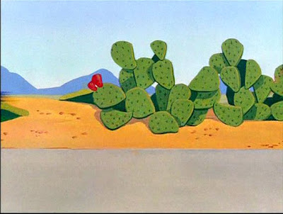
I always liked the BG pans in the early Roadrunner cartoons. They achieved a sense of depth by painting the BG on separate planes or layers.
 The road and cacti are painted on a separate layer from the mountains and the sky. Then they pan the foreground road faster than the background sky/mountain layer.
 This creates the illusion of perspective and 3 dimensions.
 I think it helps to keep the paintings and design somewhat stylized and cartoony because it is merely a flat illusion and not real depth. If it was really 3d, there would be an infinite amount of planes all moving at different speeds and that is of course impossible.
 I think this effect works much better than many Disney multiplane effects. In the Disney fake depth camera moves, they paint the BGs too detailed and "realistic". The more detailed the layers are painted, the more obvious that the layers are flat-that they are paintings. When you truck in on Snow White's cottage and the foreground trees pan apart and go out of focus, it looks like you are watching paintings of trees separate.
 Simple cartoony shapes allow you to suspend your disbelief.
 I love Robert Gribbroek's BG layouts because they are well designed, but not overly stylized like Maurice Nobel's. Noble's BGs are so extremely designed that they jump forward ahead of the characters and distract from the "reality" of the story. For me anyway.
 These are simplified and cartoony, yet inspired by the organic nature of the objects being caricatured.
 It gives the cartoons a feeling of open spaces and nature. That makes the cartoon more unique and really makes me feel the coyote's plight better. In the more stylized Roadrunner's I feel like I'm just watching a generic template of Chuck Jones cartoon tricks, rather than a special treatment designed for the characters and situation.


