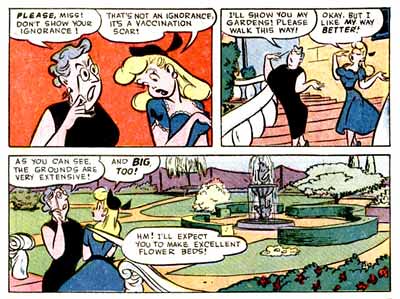
Sunday, June 29, 2008

Bullwinkle Shows Good Design Principles: 1 Asymmetrical Construction

How about if I use this drawing to do a few posts, each one pointing out a separate aspect of good cartoon drawing?

ASYMMETRY IN THE LARGEST CONSTRUCTED FORMS

These characters have good construction, BUT notice that the forms that make them up are not perfect ovals or circles. They are ORGANIC shapes, asymmetrical.

Not mirror images left and right, or top and bottom.
This is a hard technique do right. First you have to understand basic construction. Then you have to be free enough that you can draw shapes that are not mathematical, but still look convincingly solid.
The asymmetry has to be subtle, not wild and wonky, without any form at all.
Real things in nature have form, yet hey are not perfectly symmetrical, and a god cartoonist applies this concept to his drawings to make them feel natural. Warm and not clinical.

Friday, June 27, 2008

Rocky and Bullwinkle Genius Bumper

How the Hell did they come up with this great bumper? Not only is this frame the best drawing of Bullwinkle, but just about every aspect of the cartoon is inspired.


It's designed and cut expertly, full of stark graphic images-but what do they mean? There's no real story or even continuity.
There's a thunderstorm

Rocky and Bullwinkle run around in the storm
These poses are tiny, yet incredible. Perfect silhouettes and full of clever planned design. You barely catch them because they are not only small, but they are being interspersed with flashes of lightning. So much graphic thought for such little time to absorb it!
Beautiful clear poses!
Why is the ground breaking up?
What does it all mean?


They plummet down a crevice. Crevices are always entertaining. No mystery there.
then their faces appear and rise up through the ground
followed by their bodies - and such great stylish drawings!

Asymmetry-Organic in every way
Clear sillos
Great use of negative spaces around and within he characters
Contrasts in sizes and shapes, direction and in angles versus curves
Details much smaller than he major forms
Everything that toots my whistle

They are reborn and pop out of the dirt with the season's sunflower crop. Makes perfect sense!
How would you plan a cartoon like this? Certainly not with a script. I don't think you could do it with just a storyboard either, because it has no logical continuity , but it all seems to go perfectly to the crazy wonderful music. Did the composer write the music and record it first and then hand it to a director to figure out something to go with it? Did he smoke a joint and sit back and listen to it a bunch of times, till this sequence of images popped into his head? Or did he have malaria?

Is this drawn by Bill Hurtz? I'm dying to know the process that went into making this. Any Ward experts out there?

Anyhow, it has to be just about the best cartoon bumper ever. Every time I saw this as a kid, it put me in the mood to sit down and be ready for a real cartoon show. Then the story cartoons would be kinda disappointing by comparison.

http://www.cartoonthrills.org/blog/JayWard/rockyBullwinkleCorn.mov

Wednesday, June 25, 2008

Owen Fitzgerald and His Descendants

OWEN FITZGERALD

You know, a funny thing about DC comics. Their "cartoony" artists are generally much better draftsmen than their "realistic" superhero artists.
Owen Fitzgerald is kind of the father of the DC "funny human" comic lines. Owen was an animator and layout artist for many classic cartoons and drew comics on the side. He drew a beautiful comic series in the 40s called "Starlet O'Hara in Hollywood"
Starlet O'Hara in Hollywood (1948) 1


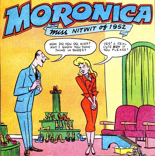
and a few others before he started doing Hollywood star comics for DC. His Bob Hope comics started a style that was adopted by other top cartoonists at DC who all developed their own takes on what was basically Owen's style.


Owen is a master of pretty girl art, in fact, in my opinion, far superior to any of the Archie artists, even though I like some of them very much. Owen is a much more observant artist than the average comic artist. While most comic artists imitate other comic artists, Owen actually draws his style from life. His poses are very natural, his anatomy (esp. the girls) very studied and yet he brings an elegant animated cartoony flair to his work.He is great at composing crowds of girls, and manages to give each one her own distinct pose, while at the same time making all their poses flow together into a complete design.

He also gives each girl her own hair style, so I imagine he must have collected fashion magazines and copied real hair styles to get his ideas from. He does the same thing with their clothing. He doesn't use stock skimpy outfits that most men draw on their sexy girls.


Owen doesn't use a lot of detail within his scenes. His poses and compositions are so strong they carry the work. He is working on the top levels of the drawings. Many lesser artists try to clutter up their lack of knowledge with lots of details, hoping to hide the fact that the underlying drawings are weak.


Owen's style evolves constantly. If you collect his comics you can see him trying endless variations of his basic style.


Not sure who this is, maybe it's early Oksner, but it looks like it's imitating Owen's style pretty closely...


BOB OKSNER
A lot of people mistake Owen's books for Bob Oksner, another skilled cartoonist. Oksner had a different style before he started doing celebrity humor comics for DC, and it looks to me that he was influenced by Owen's work.
Oksner is more detailed and less cartoony and less fluid than Owen, but he has a solid knowledge of real anatomy, great compoistion and perspective. I loved his comics when I was a kid.


I'm not sure if this one is Oksner. It could be Adams or maybe Ross Andru, but it's all part of the DC funny human school of drawing, which is much more natural and less stiff than their typical superhero books.


Here's Oksner's early style, obviously influenced by Milton Caniff. It's funny that Owen's background is animated cartoon style and Oksner's is comic strips, but the two later converged into similar styles coming from such different directions.


Here's Oksner's hippie style, still amazingly solid and composed.


Oksner or Adams??

MORT DRUCKER
I remember Shane Glines telling me that Mort Drucker spoke highly of Owen Fitzgerald's work and said that he was partly mentored by him. (Shane tell me if I got that wrong!)


Mort is a giant in his own right for his work at Mad, but I also love his DC work. He, like Owen is a real admirer of female charms.


NEAL ADAMS?
I don't know if Neal had any contact with Owen, but he certainly spoke highly of Mort, and Adams' own cartoon style is very reminiscent of Drucker's.


Oksner or Adams? I've seen them credited to both.


MYSTERY
All 4 of these artists' styles overlap and sometimes it's hard to tell who did what. Here are a few that I'm not sure of, but they are all great.
The girl in this one sure looks like Owen, but the rest seems like someone else.

I don't know how they grew artists like this in the old days, but I sure wish there was a way to do it today!

George's basement


Tuesday, June 24, 2008

cool 50s sci fi covers by Powers


Richard Powers pioneered a very different style of science fiction art in the 50s. No aliens mating with human women unfortunately, but something just as cool.
He came up with this sort of modern art landscape look to other planets and worlds. It's very creepy and stylish at the same time.


http://hedonia.net/art/powers.htm

Sunday, June 22, 2008

Aliens are lIke Funny Animals

They all crave human women! And who can blame them?
Red Hot Riding Hood


Of the course, if the history channel had anything to do with it, they'd claim that aliens really crave men. (Anybody watched that channel lately and noticed a change?)

But we know the truth.
The image “http://www.trashcity.org/BLITZ/BLIT1541.JPG” cannot be displayed, because it contains errors.

Better hide your harem during the next invasions from fuzzy animals or monsters from space!

Friday, June 20, 2008

Comicrazy - cool site

http://comicrazys.wordpress.com/


Crazy Jim Tyer stuff
http://comicrazys.files.wordpress.com/2008/06/mm-05.jpg

Rare Kurtzman!

http://comicrazys.files.wordpress.com/2008/06/silverlinings_02.jpg
http://comicrazys.files.wordpress.com/2008/06/silverlinings_06.jpg

Even rarer Milt Gross!


You can learn how to write great comic book dialogue while you're at it.


Flip is quite endowed!

Well this looks to be a wonderful comic site and I bookmarked it myself so I could keep checking in.

Thursday, June 19, 2008

Other Harvey Artists

1) THE REALLY EARLY HARVEY STYLE ( STEVE MUFFATI?) It looks like a Famous studios animator drew it.
It's kinda formless like the cartoons but still somewhat cute.This has more form and appeal but still generic.


2) TRANSITION?
3) THE EARLY CUTE STYLE
I love this style. Is this Warren Kremer? It's very cute and stylish, more appealing than the earliest stuff.4 Lotta-another artist?


This one is a mystery to me, a very cool Hot Stuff cover.
5 Transition from late 50s to 60s?

These are still nice but are just starting to lose some appeal, getting a bit straighter or more mature style, less kid-appeal.


This one's nice!


The interiors are full of great Howie Post stuff, though.


6 60s mean style starting
Their heads and eyes start to shrink as time goes on...Casper starts to look like a burn-victim
Here come the hippies to ruin everything fun.

Mean style, plus adults with tiny heads and everyone's eyes too close together.


7 YIKES!!http://www.cartoonbrew.com/archives/spankingdot.jpg

[Richie_pg8.gif][Richie_pg1.gif]Image

Wednesday, June 18, 2008

Howie Post, Tree King

Nate, pay attention!


I love Howie Post's backgrounds. They are caricatures of the general Harvey house style. You notice right away how interesting the details are-the shapes of the trees, the creative bark textures, the clever and stylish shapes of the leaves.

But details don't make a good picture!


LARGE NEGATIVE SHAPES
DRAW YOUR EYE TO THE
POSITIVE SHAPES THEY SURROUND.
SPACE AROUND THE MAIN OBJECTS

What makes the individual objects read especially well is his use of not only the shapes themselves, but the spaces surrounding the shapes, and the spaces within the shapes.
SMALLER SUB FORMS WITHIN THE NEGATIVE SPACES
(MORE SPACE THAN SUB-FORMS)


He doesn't fill a whole tree evenly with bark textures. Note that some areas have bark details close together - but these clumps of texture are separated by other clumps with ample spaces in between.

The characters are always clearly framed by the bgs and the negative spaces between the characters.

The empty spaces are just as pleasingly designed as the positive shapes of the characters and objects.

All the details are small and in organic (non-mathematical) proportions. That's so the details don't draw your attention away from the much larger forms that they wrap around.
He has an infinite amount of ways to draw leaves, without having to draw each individual leaf.


Sometimes his foliage looks like it's from another planet.

Post uses hierarchy of forms and spaces beautifully. All those girls running towards Hot Stuff fit within a flowing organic shape. Plus, they are not evenly spaced. That makes it appear natural, even though Howie is completely controlling the image.

Again, besides marvelling at the beautiful cartoony tree, look at how much negative space there is - both:

1) Surrounding the tree

2) Within the details of the tree. (Nate!)

Each layer of sub forms describes a clear and distinct form, which is in turn subject to the larger form it wraps around.


Tuesday, June 17, 2008

Howie Post and new department in my Amazon store

Boy do I love Howie Post! He has all my favorite traits in a cartoonist:

APPEAL/CUTENESS!
This is probably #1 on my list. Although to be able to draw with appeal, you have to understand some principles and then on top of that just have a natural knack for cuteness.


He even draws ugly characters with appeal. Like Basil Wolverton.

All His Principles

Good construction, line of action, clear clean poses, unambiguous attitudes.

LIFE!

His characters are very lively. Even his props and bgs are. Many artists have trouble with this essential element of cartoons. I see a lot of cartoonists whose characters seem to be sleepwalking, just going through the motions, merely obeying the script. Of course that is encouraged by today's styles, but I don't understand it. No sir, I don't like it.

He's the one with the cartooniest animals.

DESIGN AND CREATIVITY

Howie has a great natural sense of design and balance. He really knows how to use negative spaces to point to the positive spaces. He tries lots of interesting shapees and textures, all very cartoony and fun.

Look how great these silhouettes are! They still read perfectly and have tons of life and attitude - plus being extreme design statements.

Howie's skills are immense and the really amazing thing about the skills is that he is able to balance them all at the same time. Ask my layout artists how hard that is to do!

Not only is each panel a well thought out technical composition, the whole page is balanced as a single overall artistic whole.

These are true works of art.

HOWIE IS KING OF CARTOON TREES
He is so good at designing trees, that I'm going to devote a whole post to it for our lovers of good cartoon backgrounds.


Here's a later comic page by Post. It still has all the principles but is a bit less cartoony. By the mid 60s, just about everyone was getting lesss lively in the arts. Tiredness was setting into American culture and now, 40 years later we are totally lethargic.
http://img.photobucket.com/albums/1003/parsellpost/comics%202/Post-HotStuff.jpg

I found this article about Howie at Pappy's fantastic comics blog.
http://pappysgoldenage.blogspot.com/2007/09/number-188-not-quite-kelly-howie-post.html


http://img.photobucket.com/albums/1003/parsellpost/comics%202/Presto1.jpg
It turns out that Howie had a period of heavy Walt Kelly influence, which totally makes sense.

http://img.photobucket.com/albums/1003/parsellpost/comics%202/Presto4.jpghttp://img.photobucket.com/albums/1003/parsellpost/comics%202/Presto7.jpg

http://twomorrows.com/comicbookartist/articles/05post.html


Where can you get your hands on some killer Howie Post art?

Well luckily for all of us, Jerry Beck and Leslie Cabarga have been compiling classic Harvey comics into big collections, published by Dark Horse.


Like all cartoon books, the stuff you really are buying the book for is not as abundant as you would like and they always go too far past the golden age of good stuff. I've never been able to figure out why.

Here's an open request to Jerry and Leslie: Please put out a whole book of Howie's best stuff from the 50s and early 60s! From all the Harvey comics he worked on: Little Audrey, Spooky, Nightmare, Hot Stuff and anything else he did.

I'm looking forward to the Audrey book that's coming out but just found out it has Little Lotta and Dot in it too, and I remember that stuff being drawn by the poorest Harvey artist. It's too bad, because they were potentially fun characters. Were they ever drawn by the good artists?

I never knew the names of the Harvey artists, but I could tell the different styles:

The fun cartoony guy (Howie)
The early animator guy. (early 50s Harvey comics)
The mean guy with realistic adults with tiny heads (A lot of Richie Rich and all the characters by the mid to late 60s)
The crummy guy (Little Dot)
The other early guy with style:Who is this, Jerry?

Oh and here's another bonus: they printed the color stuff right. They just scanned the original comics, instead of recoloring them in photoshop. They still have all the 4 color dot patterns that make up the different colors and the lines are intact - unlike say, the Marvel reprints that have lost a lot of the original detail in the linework and have flat ugly colors now.


By the way folks, I added a department in my Amazon store for good cartoon comics and books so check it out. Lots of great inspiring stuff there!

BUY SOME GREAT CLASSIC COMICS HERE!

Later today or tomorrow, Howie's trees!
__________________________________________________________
Hi John,
Enjoyed your post about Howie Post. I'm a big fan of Post too.
Here's a capsule description of some of the other artists you may have been wondering about...
Sid Couchy- Little Lotta and Little Dot... the simple guy
Martin B. Taras- Baby Huey, Buzzy, Wendy the Witch... Neatest draughtsman... his Huey and Buzzy stories look like they are moving. He was more restrained on Wendy.
Steve Mufatti- Early Harvey artist who became the model artist. He snuck cool design shapes into his work. Left Harvey in 1958 to work for Joe Oriolo on Felix.
Milton Stein- Friend of Post. Stein put some way out designs into his settings.
Dave Tendlar- Baby Huey, Herman and Catnip... Drew in a rounder and wavier style than Taras. See Tendlar's Fleischer cartoons, and the style will seem instantly familiar.
Warren Kramer- Stumbo, Casper... Sid Jacobson's favorite...at first he was trying to emulate Mufatti, but he was more conservative. Became even more conservative later.
Ernie Colon- Richie Rich, Casper... Jacobson's other favorite. Tends to vere off into almost illustration style proportions.
Milton Knight is actually the biggest expert I know on the Harvey artists, and he even worked with Post and several of the others. He knows more than I do about them.
Best,
MK-

In the ball park


Here's 3 styles that would all fit well into the "spumco style" which is more of a flavor than a set style. All different, yet all compatible.

[georgefail01.jpg]

Sunday, June 15, 2008

Malibu Beach Party Caricature Night

Kali got a job doing caricatures at a party in Malibu and asked me to join in on the fun.
That's Emma above. The party was in her honor.
Here's her kid brother, Ellis who is a budding artist himself.
Here are the party organizers and their flattertures.

Kali knows her eyebrow biology.


These crazy girls came back twice.


These girls actually asked me to draw them making goofy faces. I made them hold their expressions until they froze that way forever.


Pilar looked kinda sick affter I showed her the picture, but I think Rose was happy.
There is always a magician every place I have done caricatures. We go together.


Here's Kali's buddy James and his doe. James got Kali the gig.
Some man and his happy seed.


______________________

Here's an even more exciting party!
http://kalikazoo.blogspot.com/2008/06/ralph-bakshi-photos-and-sleepless.html

Saturday, June 14, 2008

Happy Father's Day

Hi Dad, Happy Father's Day!

I wrote a couple stories for George Liquor based on things that you inspired. Here's one...

_________________________________

Rex and I worked out a story based on real life. My Dad used to buy cans without labels because they were cheap. 5 and 10 cents....The image “http://www.parentdish.com/media/2006/01/P1010101.JPG” cannot be displayed, because it contains errors.


Cans without labels

: he had 2 long shelves downstairs filled with them


he thought he knew how to tell what was inside. he had it down to a science.
he would show us a can and start deducing.


“See that?
Hmmm.....it's got a
gold lid with 2 rings....
Aha!...
3 rings around the perimeter”

"Now, we'll do a sound check. I got an ear for this. It's a gift!"

he'd shake it and listen to its contents
He'd add up all the clues.
"Yep! This is
extra meaty Campbell's beef stew"


"Now here's the rule...."
"No matter what's in the can, once we

open it..."

"
We have to eat whatever's in it..."


"I like beef stew, Dad!"
George: "Want me to open it?"
"go ahead"
"awright, kids remember the rule..."

... then he'd take the can opener and shear off the lid and I'd look inside...

"Aaaaaaaahhhh!"


George: "What? What? It's beef stew, ain't it?"


_________________________________________________

The rest of the story will appear in The George Liquor Program at the end of the year!


HERE'S DAD'S RESPONSE:

Thanks for the tribute, now the whole world knows: I love the story, but because of the savings, we were lucky enough to raise two kids, buy a house, a cottage, pay for each sibling schooling medical, etc. Also if you follow to-days life style of the average American and Canadian, who live on credit cards, have their homes forclosed by the banks, have no health insurance coverage, can't afford to pay their mortgages, go to food banks to survive, but have enough money to carry cel phones, play video games, go to rock concerts, then apply for bankruptsy when their credit runs out and become homeless transients and reduce their lives to begging etc.
My way, we never go hungry have a roof over our heads, do not need credit cards, can retire with dignaty, and afford to leave a nest egg to our children.
Now tell me if i went wrong on buying unlabled cans at 5c to 10c.
Anyway I laughed all through your story, brought tears with the laughter, I expect royalties, they can be T-shirtS with George opening the tin cans.

Slab N Ernie Models 1


Thursday, June 12, 2008

The Science Of Not Having Your Own Ideas


If you are not creative, it doesn't mean you can't create. The way to do it is to take things that were once popular and update them by adding whatever new technical gadgets people use, add Rock 'N' Roll or Rap, add any kind of passing trend to it and not only get the concept wrong but get the trends themselves wrong and piss everyone off equally.

It seems to me it would cost a lot less and be a lot safer just to hire actual creative people who make entertaining characters naturally, rather than taking old characters and undoing what made them popular in the first place.


Here's an article to show you how executives think. It also shows that anyone on earth can be an executive....except someone with talent and ideas.

Warner Brothers hopes to “reinvigorate and reimagine” Bugs Bunny and Scooby-Doo through a new virtual world on the Internet,

Strawberry Shortcake, part of a line of scented dolls, now prefers fresh fruit to gumdrops, appears to wear just a dab of lipstick (but no rouge), and spends her time chatting on a cellphone instead of brushing her calico cat, Custard.

This is double irony. Strawberry Shortcake-a cartoon based on a line of greeting cards; something that never had any integrity to begin with is now being watered down even further.

http://www.nytimes.com/2008/06/11/business/media/11cartoons.html?_r=3&oref=slogin&oref=slogin&oref=slogin

“I love classic Mickey, but he needs to evolve to be relevant to new generations of kids,” Robert A. Iger, Disney’s chief executive, said in an interview.

“You want a dark, Goth version of Tweety Bird? Have at it,” said Lisa Gregorian, executive vice president for worldwide marketing at Warner Brothers Television.


Thanks to James McEwan for this article!

Wednesday, June 11, 2008

BG Layout tips for Nate - talent, style plus thought


Here are some layouts by Maurice Noble that illustrate all the concepts I talk about in my BG design posts.

The layouts are not merely stylish, they are functional and carefully, intelligently planned out and organized.


Distortion-DO NOT DISTORT EVERYTHING, use careful decisionsThese boxes have backwards perspective. We are looking up at them, yet the vertical lines converge downwards. It makes no sense but looks dynamic. Note that all the details on the boxes-the boards and grain follow the same perspective. They don't go every which way. It makes the distortion of the box convincing and easy to read.
The rest of the background follows the basic rules. Lots of negative shape around the focus of the scene. Each form is distinct-mountains, ground, plants.


Details are varied and descriptive - and FOLLOW THE FORMS.
The main detail is on the cactus. It is an interesting squiggly yet controlled brush pattern that crawls around the form of the cactus. The rest of the BG objects have almost no details, yet each form is stylish, solid and descriptive of what it is: scrub, ground, hills, mountains.

Noble made a decision: he controlled an urge to cover every object with an equal amount of stylish detail and just chose one main object, so that we could easily see what is happening in the scene.

Look how well planned the scene is Wile E.'s head is perfectly framed in the negative space between the cactus and the mountain.


Divide your picture into few major forms.

This canyon between two cliffs is very easy to read because they are not tons of objects and details competing for our attention.

There is a ground plane split by the crevice and one rock formation in the upper corner of the frame, away from the action.

Use Negative space to make your positive major forms read clearly.

Do not completely cover your objects with details, and wrap the details around the form of the objects. And vary the surface physics of your objects so that everything isn't made up of the same substance.
Note how different the form of the rocks behind Wile E. are from the cliff side behind the rocks. This helps distinguish the two picture planes and makes it easy to see the picture. If the cliff side was rounded and had the same kind of sub forms as the rock, it would blend together like a cluttered wallpaper and we wouldn't see that is hiding behind the rocks.

Noble used two different types of rock forms and textures to separate the elements.

The textures do not completely cover the objects either. There is a lot of negative space within the object.

The painter followed up on this concept by using different color families and values for each surface.

ENTER NATE AND THE NEW BREED

Here is a drawing by my latest discovery: Nate

I think he has lots of promise. His BG studies have style and appeal but he could use some tips from the masters (not me but Maurice Noble, Robert Gribbroek and the great layout artists from old cartoons.)
The houses and tree in this picture have nice solid forms overall. The houses are slightly distorted and the details generally follow the same distortion.

We could bring out these attributes with some careful adjustments.


1 Use negative space to make the main objects read more clearly.
2 Even organic things made out of lots of little things should have an overall shape.

Like these Gribbroek layouts:
The shape of the pine needles are very clear as an overall form, that is then divide into layers of sub forms, on down to the individual needles at the bottom.

The conifers in the BG are not all different sizes and shapes at random.
Squint your eyes and you'll see that they form a wave behind the foreground trees.


3 Divide big areas of a substance into smaller sub forms that fit into the overall pattern.


4 Lastly, add the details - and make them small, so they don't break up the forms.


My attempt at leaves is plum pitiful and that certainly is not the only way to draw foliage, but I am just trying to make the point clearly. Once you have these concepts down, you can vary all your types of forms, substances and textures more artistically.

Just don't try to make a picture by starting with the details. Get an overall graphic statement first that tells the viewer what he's looking at easily, then break it up into careful sub-structures and textures.


A good exercise might be to take some of these muddy looking frame grabs I made from Rabbit Fire and trace them. You can't see a lot of the details, but you can see the major compositions and the second level of forms quite clearly.


Don't forget to copy the cursor.


Monday, June 09, 2008

Great Jim Tyer Comic

http://comicrazys.files.wordpress.com/2008/06/mm-04.jpghttp://comicrazys.files.wordpress.com/2008/06/mm-06.jpghttp://comicrazys.files.wordpress.com/2008/06/mm-08.jpg

If ever there was a pure cartoonist who took advantage of everything a cartoon can do better than any other medium it was Jim Tyer.

http://comicrazys.wordpress.com/2008/06/06/mighty-mouse-the-perils-of-pearl-pureheart-jim-tyer/

I don't do many posts about him because he gives young cartoonists the wrong idea, namely that there are no rules.

I would say that "There are no rules for someone with super talent, tons of skill and knowledge and control over his work, and a place (like Terrytoons) where breaking the rules is pretty much the only way to get the otherwise conservative nature of the studio to do anything entertaining." That's a lot of conditions!

Jim Tyer has great draftsmanship (drawing skill). He knows how things work, but then chooses to let his imagination take his knowledge and bend it to do highly amusing and inventive work. Sometimes with control too.

His rules don't apply to someone who is not already highly skilled and talented. I love the guy, but this post might explain why I don't promote him more often on my public blog.

I do in private to my super skilled cartoon peers.

We live in a world where skill and draftsmanship and professionalism has almost vanished, so I am trying help bring it back before we embark on pure unbridled creativity again. You have to learn to walk before you run as you've heard before.

I have a tape I made 12 years ago of a bunch of Tyer's funniest Terrytoons scenes all strung together in a row. If I can get it digitized, I'll put it up.

More George Liquor BG reference

George is definitely a God-Fearing Man as all Americans should be. God himself is a good buddy of George. He has a tab at George's liquor store. He's always bumming beer off him and George gives God fishing tips on their weekend getaways.
I don't what what denomination he is yet, some kind of
protestant I guess.


Sunday, June 08, 2008

Some Real Coloring and Kids' Books

At last Barney gets his own starring vehicle.
We didn't have VCRs when I was a kid so it was hard to copy cartoon drawings from the actual cartoons. I used to instead copy the drawings from comic books, coloring books and Golden books. These weren't usually drawn by animators (although some were) but it was the best school for cartooning I could get! - Comic strips too, of course.
People are lucky today; they can study classic cartoons frame by frame, there are tons of blogs with info about the old cartoons and even lessons. So why do cartoons look crappier than ever?


Friday, June 06, 2008

CARTOON VS MAN or FUN VS NONE

Which one is evil?


Remember your evil aunt or uncle who would give you socks and underwear for Christmas instead of a toy? What causes someone to do such an awful thing?
There is a certain type of human that doesn't understand kids and fun. The same kind of problem applies to coloring books.
Here is a great one from the 40s. It looks like a Clampett cartoon. Porky even has an ass-head! Whoever made this book understands kids.


When I was a kid, I would only color in coloring books that starred cartoon characters. Any other kind of coloring book was a lie, created by monsters who hated kids.


I especially loved the coloring books that had beautifully painted covers, as these would inspire us to color carefully within the lines and have high standards in all things in life.
This kid grew up to become an animation critic, because he couldn't quite cut it.


BOB MCKIMSON COLORING BOOK!Who wouldn't want a coloring book filled with drawings by an actual star animator!


But then....there came the ugliest of inventions: MAN coloring books!
This kind of thing had to be invented by the same weirdo who gave kids socks and underwear and called them presents. "Here kids! Color your Dad!"Color the Man and his hairy baby.
Color seed of Man.
Here's fish with man face to color.
Here is man with Mammoth Chipmunk. Who will win?I can't imagine anything being more fun for a kid to color than a blind man, can you?

I remember as a kid wondering about how this kind of stuff ever got made and what kind of retard would think a kid would like it? I thought "Thank God, the animated cartoons aren't like this!" Then came Scooby Doo, the 70s and my life and all my beliefs about fun were shattered.

Whole empires have been built around the socks and underwear entertainment theory: Filmation, Dic, Dreamworks.http://animated-views.com/wp-content/uploads/2006/12/star-trek.jpg

You can bet 99% of the executives in cartoons give their kids socks, underwear and tax forms for their birthdays!

Tuesday, June 03, 2008

Milt Gray On Clampett's Black and White Cartoons

Intro


In case someone wonders what I am referring to as Clampett’s “successes” in his black-and-white cartoons, I thought I might identify some of them here.

I was thinking primarily of the use of expressive animation (movement) to express a spirit of cartoon zaniness, and zany characters. Nothing like Clampett’s version of that had ever existed in any prior Warner cartoons (except in Clampett’s own animation of Daffy Duck in Avery’s “Porky’s Duck Hunt” 1937). To audiences today, being so familiar with the zany animation in so many different directors’ cartoons of the 1940s, it is easy to overlook how unusual it was in the late 1930s in Clampett’s low budget black-and-white cartoons.

Clampett Revived Early Film Creative Spirit As Animation was Drifting Towards “realism”


Back in the silent era it was routine for outlandish, impossible things to happen, even though those things usually had a dull, heavy-handed feel to them. In the early sound era, it was mainly the Fleischer studio that gave more of a spirited feel to “impossible” gags, although those generally had more of a nightmarish feeling to them. By the mid-1930s, the studios were generally following Disney’s influence in being much more realistic and literal.


From about the mid-1930s on, it was almost only at Disney’s that an effort was made to make the animation (movement) itself expressive, such as the actions of the drunk mouse in “The Country Cousin” (1936), and Goofy’s walks.
Goofy

Clampett Revived Early Film Creative Spirit As Animation was Drifting Towards “realism”

The 1930s Fleischer studio did develop some eccentric walks for their Popeye cartoons,

http://johnkstuff.blogspot.com/2007/08/something-not-bland-popeye-can-you-take.html

and at Warners, Frank Tashlin invented a kind of rolling waddle-strut for his rotund version of Porky Pig, as when Porky struts confidently to Petunia’s house, or the cocky strut of the look-alike pig bank robber in “Porky’s Double Trouble” (1937). But for the most part, at the non-Disney studios in the mid-to-late-1930s, animation had become simply literal walks and runs, with no more expression of personality in the movement than that of amateur actors in a school play. (There are of course many instances of characters running around super fast in the Warner cartoons of the 1930s, but I don’t regard that as zany so much as just greatly speeded up.)


Clampett Brought Zany Movement And Expressive Animation To Warner’s

At Warners in the late 1930s, it is mainly in Clampett’s cartoons that expressive animation and zany characters appear -- and only occasionally, since Clampett was burdened with the tiniest budgets and the most beginner animators. Porky and DaffyIn fact, I would have to say that it is all the more remarkable that these things happened in Clampett’s cartoons at all, given the limitations of Clampett’s crew.

http://johnkstuff.blogspot.com/2008/03/porky-and-daffy.html

http://johnkstuff.blogspot.com/2007/05/pinch-and-outrage-bob-clampett.html
http://johnkstuff.blogspot.com/2007/04/clampett-fun-song.html

Inside Out Garage


So, specifically, what am I referring to? Here’s some examples: In almost the opening scene of Clampett’s first cartoon, “Porky’s Badtime Story” (1937), even though Clampett did not write that cartoon himself, he depicted Porky’s garage being ripped inside-out in a snappy, very rubbery action when Porky’s car roars out.


Compare that to the same gag in Tashlin’s “Porky’s Railroad”, made and released at the same time.


In Railroad, during a train race, the fast train goes through a tunnel, which looks like a tunnel commonly seen on toy train tracks, thereby closely resembling a stand-alone building like Porky’s garage, and that tunnel is pulled inside-out by the great speed of the train -- but in the most literal, unimaginative way.


This is typical of the differences I’m trying to point out between Clampett’s occasionally inspired moments and the conspicuous lack of such moments in practically all of the other 1930s Warner cartoons.


Goofy Clampett Dogs

In Clampett’s second cartoon, “Get Rich Quick Porky” (1937), is a very goofy-acting dog who typifies the kind of characters that Clampett later excelled in. Bits and pieces of this kind of thing continue to appear here and there in Clampett’s next few cartoons.


Injun Trouble


Moving down to Clampett’s eighth cartoon, “Injun Trouble” (1938), there is a very striking example -- a totally zany hillbilly kind of character who acts and moves almost identically to Scribner’s expert animation of the same character in the 1945 remake, “Wagon Heels”.


Porky’s Party

Clampett’s ninth cartoon, “Porky’s Party” (1938), has remarkable extended animation of a silly drunk dog (probably animated by Chuck Jones), and even zanier animation (probably not by Chuck) of a character called Loosey Goosey (especially in his introductory scene, coming in the front door).


Turning Point: Wackyland

The next two cartoons, “Porky and Daffy” and

“Porky in Wackyland” (1938), are to me amazing (for their time) in the intensity of their comic business. The next cartoon, “Porky’s Naughty Nephew” (1938), has very excellent character personality acting -- not particularly by 1940s standards, but compared to almost anything else at Warners in 1938.

This walk that Porky's nephew does is hilarious and highly skilled. It's a caricature of sickly sweet Disney cuteness and makes the story even funnier. Clampett, more than any other director tailored the animation in his cartoons, to not merely be professional and smooth but to emphasize the story points and make each bit as entertaining as can be. - JK


Porky In Egypt


Now we come to some real breakout cartoons. “Porky in Egypt” (1938) is hilarious, in gags and execution, with the hysterical camel going completely crazy in the desert heat.
This scene is particularly funny, not because it's "zany" but because it is so realistic in such a crazy cartoon. You would never expect this kind of thing in a cartoon, which makes Clampett such a unique character - jk


Porky’s Tire Trouble

And just a couple titles later, “Porky’s Tire Trouble” (1939), is another masterpiece (for its day), with the crazy antics of a dog gone all rubbery (having swallowed too much “rubberizing solution” in a tire factory).


And this just brings us up to early 1939; other highlights beyond include “Africa Squeaks” (1940), “A Coy Decoy” (1941), “We the Animals Squeak” (1941) and “The Henpecked Duck” (1941).
Cartoons are Up and Down

Admittedly there are some misfires here and there in between the winners. I am not enthusiastic about all of Clampett’s black-and-white cartoons -- too often the animation is quite poor -- but as I’ve already stated, he had only the beginner animators -- and too often the business and gags are very pedestrian -- but as Clampett himself admitted, “How could I do much else, when I didn’t have animators that were capable of better acting?” But once Clampett was given a color unit with better animators, no excuses were necessary -- his cartoons set an all-time high average.

____________________________________

John’s Response


Hi Milt

I don't disagree with all the points you made about the black and white cartoons in your article, but I think it leaves out many of the less obvious skills and innovations he had.

Your article, if I remember right, focused on how zany the animation is, and I don't think anyone needs to be convinced of that. "Zany" is all any of the critics will give Clampett.

What I think is less understood by animation fans and writers is how important his contributions to the characters, stories, acting and what is very hard to define or explain - the sheer character magnetism and screen presence his characters instantly have.

In no one else's cartoons at that time (excluding maybe the Fleischer Popeyes) does anyone have characters that seem motivated from within. While Tashlin and Avery contributed their own innovations to the Warner's style, it seemed completely up to Clampett to make the characters seem alive, motivated and charismatic.

Porky, in both Avery and Tashlin's cartoons is just this animated thing that shit happens to. You don't care about him at all. He's merely the focus of the story. In Clampett's cartoons the characters cause the story and what happens always seems spontaneous and immediate - and as a result, unpredictable. It is happening now, unplanned by a tyrannical director who merely needs characters to plug into his plot and gag structure. Clampett's unique talent is to make it appear that you are watching something in real time; animation that is shot live.

He was also handicapped in this by having been forced to star Porky in every single cartoon. He did the best Porky, but Porky is basically a straight man, so Clampett had to create tons of other characters who could carry more comedy. There are some cartoons that star Porky only in name, because he got tired of ONLY directing Porky cartoons and wanted to try something different. But my point is, that only in his cartoons at the time did any of the characters seem like they were causing the action, rather than the writer and director causing the action and just plopping any old characters into the storyline.

It would take some more careful study of the cartoons to find words to describe what techniques he is using to make this happen, but I think that is something even more astonishing than how zany his cartoons are. Everyone assumes being zany is easy and irresponsible. I don't know why they think that. I think your article does a lot to show that being successfully zany is an amazing skill in itself, and we need that.

One point you made I do disagree with. You said much of the animation is primitive. Maybe you are talking more about the drawings, not the motion. To me the motion in his early cartoons is amazing and full of innovation and impulsive inventions. It's non-stop innovation.

Many animators were looking for rules and formulas at the time, and Clampett had the sheer creative talent and fortitude to ignore all that and just make a ton of stuff up like a custom tailor. No pre-set pattern. he would invent an action out of nowhere that just totally suited the needs of the gag, characterization or scene.

I wish to God I had animators like that today to work with. I could provide the drawings and ideas. All I want is that beautiful motion and sense of comedy those guys had.

Clampett also did some of the first real "stories" - the kind Mike Barrier and his ilk love to praise. The ones with a clear clean beginning, middle and end. "Rover's Rival" is one of those. It's a crazy cartoon, has all the earmarks of a Clampett cartoon, zaniness, great personality, beautiful animation and it has a totally crisp tight story with a morally satisfactory conclusion. It should be at the top of Barrier's and Solomon's perfect cartoon list.

I could go on forever about Bob! But when I make these kinds of statements, I feel more comfortable when I have the evidence in scene clips and stills to back them up, because so many people are prejudiced against Clampett and only want to give him "zany" as his one natural talent.

john


The Bad Catholic Girls Models

Besides these 3 girls having slightly different designs and builds, there is another point in the panels I could talk about.
The characters interact. They don't just line up all parallel to each other.
They move in and out of each other's spaces. They react to each other's movements.


They are all acting independently. When doing this, you have to be careful to still make their different poses add up to a clear overall composition, so it doesn't look chaotic.


Even their legs move independently.

And they have knees made of both flesh and bone, not just cartoonskin.

Sody models


Sunday, June 01, 2008

more sides of George and the Science of Close Ups

A specific expression contains more than one emotion. This is an expression of wonder, discovery and eagerness.The above is an accent expression. It's close up and more detailed to tell you that his emotion has changed dramatically. The closer the framing is on a character, the more details you can add and more important: THE MORE CONTRAST YOU CAN DRAW IN THE BASIC DESIGN.

In close ups I always caricature my own character designs. Just the same way as I would caricature a living human by exaggerating the contrasts of someone's face.

***Be sure that the extra details flow around the larger forms. Hierarchy!

The smaller the character is in a scene, the less detailed and less contrasted the proportions can be.


George's Soft Side:

Many people (esp. hippie ladies) think that all Republicans are evil all the time. They yell and scream and live by archaic blind rules of societies long dead. This is only one side of a regular guy, though.
George doesn't yell and scream all the time. He has softer elements to his personality. George has much empathy for God's creatures, especially the ones that recognize their place in the grand order of things.
George doesn't hunt out of malice for animals. He just believes that it is man's place to destroy the environment and that God put us here and gave us the wits and hormones to do it.
In these images by the extremely complex Jim Smith, George is explaining this with great empathy to a poor lowly creature before he takes him out.

There is more than one emotion happening in these drawings too. He is not only showing his concern for the lesser creature's feelings, he is also asking for you to understand and approve of his murderous ways. He wants you to absolve him of any guilt and way down deep inside he knows that there is probably something wrong with killing for sport.

Some urges are so powerful and ingrained that they are impossible to resist even when you know they might cause harm. Like the urge to pull triggers, an urge that has been implanted in man by God. For George, it just feels so damn to tug a trigger that he has to find honest and decent justifications sanctioned by God, America and tradition.
So you see, hippie ladies, George is not always mad. And is not all bad just because he has manly urges.

George gets mad when something doesn't follow the rules; when he can't control a situation, but as long as you obey the natural order, he loves you. He'll still blow your brains out if there is a good enough justification, like any good Republican would, but he should still be loveable.