

 Cute generic Disney design VS cute specific Jones design
 This Disney style is the culmination of their search for perfect mathematical design balance, inoffensive cuteness and lack of specificity. Once they found this balance, they stuck with it until it eventually deteriorated with the passage of time.
 These Snow White Deer are early attempts in the search - not quite there yet.
Hi John,
JOHN THINKS "SPECIFIC" MEANS UNGAINLY IN DESIGN
I have a theory. (See, not only Eddie has them.) The more I read of your thoughts on "Specific" vs. "Generic" characters and the examples you use to illustrate each type, it seems like there's a pattern developing here. Most of the characters that you seem to respond to more viscerally as "Specific" types in terms of both personality and visual design, also tend to be rather ungainly in their design (with some notable exceptions.)For instance, you love the work of print cartoonists like Milt Gross, Basil Wolverton and Don Martin for their skewering of human types and ability to make truly funny drawings. You've also recently been lauding, as you so aptly described it, the "Rat Pack" brand of humour that you see in "BC" and "The Wizard of Id", where there's less politeness and a more rugged, freewheeling approach to being funny.
Yet one thing that all of these print cartoonists seem to have in common is a flair for creating humour out of designs that are actually rather ungainly. Even your favourite animated cartoon character,"Popeye", who of course originated in the newspaper funnies, has an unusual appeal in that he looks like he's been Frankensteined out of various spare parts!
Now don't misunderstand what I'm saying here, as I'm not suggesting that any of these designs are amateurish or unappealing, but I do find that there is a spontaneity and visual clunkiness to them that maybe allows better for that broader type of belly-laugh humour that you enjoy.
PETE THINKS I THINK THAT "CONSTRUCTION" IS SYNONYMOUS WITH "GENERIC"
I guess I kind of find it ironic in that, for all of your high regard for good solid construction in animation design, it is really these characters that don't seem to slavishly follow those rules that really get a gut response from you. I'm actually wondering if all of the animated film characters that you praise for having good solid construction, yet also tend to dismiss as being "Generic" (likely because of their solid construction whether you realize it or not,) are maybe fighting a losing battle in trying to appeal to the John K sensibilities.WARNER CARTOONS HAVE TO CHEAT TO MAKE THEIR CHARACTERS ENTERTAINING
Even the Warners characters that, on the surface may seem to disprove my theory, perhaps appeal to you because of the rather ungainly poses and expressions they take which requires the cartoonist to radically cheat the rules of construction to pull off effectively. Am I making sense? Maybe not, but read on...PRINT CARTOONS CAN CHEAT, SO THEREFORE CAN BE MORE ENTERTAINING
You see, the way I see it is that print cartoonists have a huge advantage generally over those in the animation biz, in that they don't have to be nearly so accountable with their drawings. You can read a comic strip like "BC" or anything Milt Gross drew and not have to see whether or not all of the details are matching up perfectly from panel to panel. Nobody cares how Wiley's face goes from a front view to a profile or whether he's got exactly the same number of facial hairs on his ugly mug as he turns. The mind's eye fills in the missing movement and doesn't notice any inconsistencies like that. Because of this freedom from absolute consistency of design, print cartoonists can be extremely spontaneous in their drawings, potentially creating wilder, broader character personalities and actions if they so choose to.This struck me the other day when a friend had lent me the latest book of political caricatures by British cartoonist, Gerald Scarfe. As I was looking through it and admiring his audacity, it also occurred to me that one probably couldn't successfully translate that type of drawing to consistently drawn animated characters. I'm not even referring to just the sheer amount of pen strokes (which would be impossible), but rather, the overall approach that Scarfe takes in his design. Frankly, I'm not so sure that Don Martin or Johnny Hart would fare much better either.
HANNA BARBERA IS BROAD CARTOONING BECAUSE IT'S FLAT AND LIMITED
As you know, I happen to also share your admiration for Ed Benedict's designs for the earlier Hanna-Barbera characters. Yet I wonder if it's precisely because of the limited animation and more graphic, shape-based designs that allowed the animators to do cartoons that maybe had more in common with the work of print cartoonists than their predecessors in the theatrical animated shorts. Because of all of the visual cheats they could get away with by not having to adhere to the rules of full animation, I suspect this also allowed the H-B cartoonists to pull off broader humour in their drawings, as well as create what you yourself seem to consider more "Specific" visual designs and personality types.PETE LIKES HIS OWN PRE-DISNEY NATURAL STYE BETTER THAN HOW THEY INFLUENCED HIM
I must admit, even in my own work, I was happier doing my own natural style of cartooning prior to when I first went to work for Disney. For all of the training and honing my craft through working for Disney, I suspect that something was also sacrificed in the bargain. For when I look back at the stuff I used to do in "The Ottawa Citizen" circa 1978 to 1984, there was a gutsier, more spontaneous quality to my cartooning, most likely due to the lesser emphasis on polished construction that I seem to strive for in my post-Disney efforts. The resulting images were, in my opinion, funnier because of their rawness and spontaneity. Heck, I might even post some up on my blog just so people can see how I started out.Anyway, just some food for thought there for you. You can shoot down my theory now, ya' rascal.... :)
Your pal, Pete Disney's Pretend Development Department
 Disney's Pretend Development Department
 For some reason Disney wastes a lot of time "developing" disproportioned or "ungainly" versions of all their characters before they finally decide to go with what everybody knew they wanted in the first place. Something with even proportions, no distinguishing characteristics and simple base cuteness and design balance.
 Why don't they just start on day 1 with this design? It was inevitable that it's what they would end up with.
 Same design as Pinocchio with less cartoony proportions - meaning more generic. Time passes at Disney - they still use the same constructions, but they get less and less exaggerated or fun
by the 80s, they lose even the ability to do the construction so have to give up imitating themselves in favor of imitating Filmation Saturday Morning cartoons
Hi Pete
very clever thoughts...
I have been wanting to do a post on this very thing for the longest time: the difference between perfectly balanced mathematical design (like Bambi) VS slightly awkward out of balance, more natural design - like Clampett. Friz on the other hand is afraid of contrasts in his work, so evens everything out like Disney - except without the gloss.

 generic Sylvester with even proportions
vs caricatured more specific variations of Sylvester's design plan:


 specific variations of the general Sylvester design plan
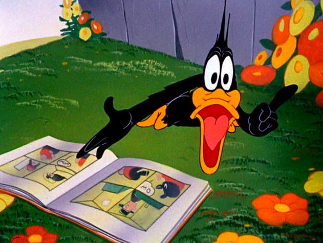
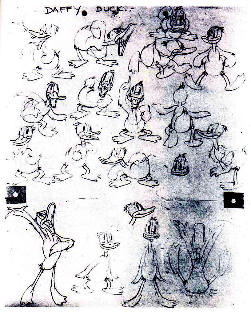 generic Daffy Duck proportions on model sheet VS
specific controlled expressions and proportions in a Clampett cartoon
 USE SKILL TO MAKE SOMETHING BLAND OR EXCITING ACCORDING TO YOUR PERSONALITY
Both approaches share the same fundamental knowledge and skills, but the result I like better is the one that takes nature into consideration. Nature has an ideal plan for everything, but no part in nature fits the plan perfectly and that's what makes things interesting. The variety and deviations from the perfect plan.
Disney has no variety or humanity. It aims for a Platonic ideal of attainable perfection and the result is stagnation. It's all just a simple formula that can never make a funny face or stand out from the purely ordinary. It all has to obey their limited design and motion rules. Disney artists are entirely too afraid (and unimaginative) to do anything nearly as interesting as what surrounds them in real life. Great cartoonists draw from real life and then bend what they observe with unafraid bold imagination.
Disney cartoons are like Christian Rock. Give me the real thing, not watered down flowery mush..
DO YOU HAVE TO DRAW BAD TO DRAW INTERESTING? NO.
Real live humans are constructed, but they have much more variety, caricature, natural imbalance and pliability than any Disney character - so there I disagree with you. You don't have to draw flat to draw interesting as you seem to infer is my theory. Look at your favorite old time stars (and mine) and how interesting and unbalanced they are. What is remotely polite about Frank Sinatra? He is much more like Clampett than Disney.
DO YOU HAVE TO DRAW BAD TO DRAW INTERESTING? NO.
As a caricaturist yourself, I would think that you especially would be repulsed by anything generic and evenly proportioned or middle of the road.
Your pal,
John
---------------------------------
Pete afterthought:
By the way, have you noticed how the rap fans are just as rabid as the anime fans in their belief that those who don't like it just haven't taken the time to truly understand it?
By the way, have you noticed how the rap fans are just as rabid as the anime fans in their belief that those who don't like it just haven't taken the time to truly understand it?
Me: Yes
that's why I believe we live in a very conservative age, where no one can make personal art anymore; they can only blindly copy trends that degrade from generation to generation.
today's art reminds me of Byzantine religious mosaics or Egyptian Hieroglyphs (only less skilled) that remained almost stagnant for hundreds and thousands of years because personal invention was considered blasphemous.
 " The development of the style of Byzantine Art was developed during the Fifth and Sixth centuries. From that time to the time the of the invasion by the Turks, very little change occured in the style. "Byzantine art displayed the same constancy: in the fifth and sixth centuries, it developed a formal expression that was manifested in the thousands of works of art that came to be regarded as sacred and immutable" (Marceau, Jo 1997, pg 136)..."
http://www.historylink101.com/lessons/art_history_lessons/ma/byzantine_art.htm


 http://www.imagekind.com/art/egyptian_art/
Because Egyptian art followed such strict rules of representation, the style of it changed very little over the more than 3,000-year history of Egyptian art. Originality was not the motivating force in Egyptian artwork, rather following a strict rule of law and regulations was prized. The best artists were those who could copy the original most accurately....
Of course we'd have to find something more primitive than Byzantine Art for a visual equivalent to Rap - maybe something more along the lines of elephant paintings.
that's why I believe we live in a very conservative age, where no one can make personal art anymore; they can only blindly copy trends that degrade from generation to generation.
today's art reminds me of Byzantine religious mosaics or Egyptian Hieroglyphs (only less skilled) that remained almost stagnant for hundreds and thousands of years because personal invention was considered blasphemous.
The Dark Ages were extremely conservative times, and I lament that we are now beginning to repeat them as our recently departed hunger for skill, knowledge, curiosity and invention is being replaced by ignorance, amateurism, fear and imitation.

Anime from 1,000 years ago and more...
 " The development of the style of Byzantine Art was developed during the Fifth and Sixth centuries. From that time to the time the of the invasion by the Turks, very little change occured in the style. "Byzantine art displayed the same constancy: in the fifth and sixth centuries, it developed a formal expression that was manifested in the thousands of works of art that came to be regarded as sacred and immutable" (Marceau, Jo 1997, pg 136)..."
http://www.historylink101.com/lessons/art_history_lessons/ma/byzantine_art.htm


 http://www.imagekind.com/art/egyptian_art/
Because Egyptian art followed such strict rules of representation, the style of it changed very little over the more than 3,000-year history of Egyptian art. Originality was not the motivating force in Egyptian artwork, rather following a strict rule of law and regulations was prized. The best artists were those who could copy the original most accurately....
Of course we'd have to find something more primitive than Byzantine Art for a visual equivalent to Rap - maybe something more along the lines of elephant paintings.