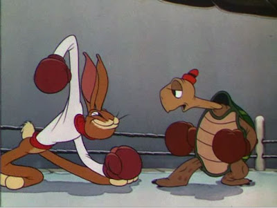
 Here's a cartoon with design and animation that turns cartooning into high art. At least for me.
 The design is super cartoony and appealing, not aiming at "realism" or "believability" at all.
 The graphic look of the cartoon is not typical of Disney, but reminds me of Otto Messmer's Felix the Cat comics.
 ![[FelixHippo.jpg]](https://blogger.googleusercontent.com/img/b/R29vZ2xl/AVvXsEgnGwByk8VFixL2-bEGK-lp120Ic2fZbBzRiOczCQmFCBaLWQoGnDsTQ5_UUUkBqyOBen7L45hq9cVmyfEdiQM3fxM8gKKBy8Zxlq9wlKk_RHprMkr178UpNHVoTMSK3LPBRK_76A/s1600/FelixHippo.jpg)
If you took Messmer's design sense and added some of the principles and techniques that were discovered by animators in the 3os you would get "Toby Tortoise Returns".


 The animation principles are not just there to be functional; they are turned into design elements. Each pose is beautiful. Not only that, but the way the characters move is beautiful in a really cartoony way.
 The principles are not overbearing or in the way of the action as in many late 30s cartoons.
 I love the tortoise's walk across the ring. Really rubbery, but clear and magical as all get out.


 The animators take a lot of liberties with volume and "logic" for the sake of entertainment and fun.
 I think Ward Kimball animated a lot of scenes, but am not sure which ones.
 "Toby Tortoise" must have had a big influence on Bob Clampett, because I see many scenes in his cartoons that remind me of this one.


 http://www.cartoonthrills.org/blog/Dis/36/TobyTortoise/1DogRefTortoiseIntro.mov
http://www.cartoonthrills.org/blog/Dis/36/TobyTortoise/2FightStarts.mov
I've got a bunch more clips from the cartoon and will post 'em soon. What's especially interesting to me, is that you can see the animators experimenting and getting more cartoony as the cartoon progresses. I love when you can see a cartoon that is so progressive that it actually evolves before your eyes. In 6 minutes! No sticking to the rules. It looks like they were having fun making it.


