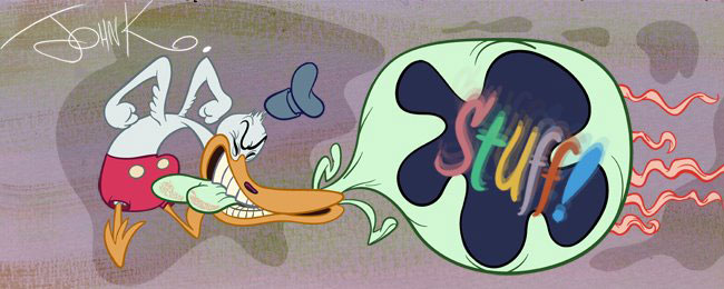
 Because he doesn't use a lot of detail in his scenes. It's all about the overall statement and clarity.
 He uses plenty of empty space in between more filled areas.
 He doesn't compose anything directly in the middle.
 Nothing is evenly spaced.
 He uses a combination of controlled framing devices and intersection. Nothing is placed in the scenes by accident.


 He uses lots of contrasts, tall and thin, short and wide, characters posed on angles to contrast against perpendicular furniture and buildings. Organic VS geometric shapes.
 His scenes have an overall clear statement. The whole frame reads as a design.
 You know how you can tell if you have a good composition? An overall pleasing design statement and a clear image? Not just a bunch of clutter?
 Look at the image small. If you can still easily read what is happening and the overall shapes add up to a clear design, then you are probably there.

 Frank Frazetta has beautiful intricate details in his work, but his images also are stunning simple compositions. The whole image is a design.


Tricky angles


 In my opinion, a good clean handsome layout beats a ton of evenly spaced cluttered detail any day. Especially in anmated cartoons where you keep cutting from scene to scene.


