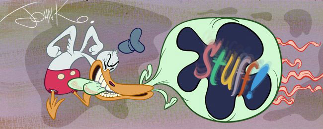
 Here are some layouts of Slab N Ernie for those of you who are practicing clean ups and inking and are sick of the same George drawings.
here's one by Mitch. He's hired. (I hope you separated the chairs from the characters, Mitch)
The hierarchy of his line weights is very logical. The overall forms of the characters are held together by thicker lines and the interior smaller details use thinner lines that wrap in the same directons as the larger forms. Especially on the heads. (The bodies could use a little more of that.)
He also did not even out any of the asymmetrical shapes, which is a huge plus to me. I have a hell of a time getting people to preserve the guts and flair of the pencil drawings, when they clean them up. Good job Mitch!

 Here's Amir Avni. Pretty damn good. I gave him a couple corrections.
And here they are:


setup 3 (above)


