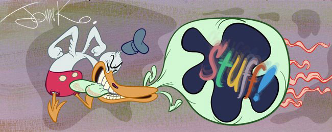
He has a lot of attributes underneath the lines that are equally impressive: Like cuteness and appeal.
 He draws very appealing eyes.
He is good at compositions. I love the contrasts in the buildings below. Very tall against very thin.
 Strong lines of action.
 Opposing poses. The characters look alive, organic and in the moment.
 Nice tongue-hatching.
 Natural looking asymmetry (the features-eyes,etc.-are not the exact same shape and size on either side of the characters)
http://comicrazys.com/2010/05/10/the-cow-jumped-over-the-mood-the-pogo-stepmother-goose-book-1954-walt-kelly/
You can find lessons on all these concepts at:
http://johnkcurriculum.blogspot.com/2009/12/disney-principles.html
http://johnkcurriculum.blogspot.com/2009/12/composition.html
Oh and thanks to the latest contributors:


