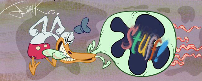
 A lot of cartoonists tend not to see space. We see fills or positive spaces.
  Areas of interest to us are eyes, mouths, ears, arms, fingers, but we sometimes neglect the big spaces between the fills. And those negative spaces are needed.
 I've noticed when students are copying drawings from Preston Blair or old cartoons, or even life drawing there is a tendency to shrink the open spaces.
 On a 3/4 angle, you see more space behind the eye that's close to you than the one that's farther away.
 Chuck Jones is a master of balancing fills with space. And of using contrasting shapes.
 He doesn't pile balls on balls, yet he uses all the classic 40s animation principles.
 In this earlier model sheet of the bird you can tell the WB artists are just trying to get the basic principles down and it looks more like balls on balls. Chuck's more interesting individual style developed after he got confident of his principles. Then he stopped piling up balls.
 Many cartoonists today (including me, when I'm not thinking about it) draw the whole face filling the head shape, with no space around it. This makes the image cramped and unfocused. It also leaves no room for the features to move if the character needs to raise his eyebrows or open his mouth wide.
And it's wrong. Characters have craniums and you see a lot of brain space behind the face. Or you should. Your face is well in front of your head.Below, I have exaggerated the space and perspective in Elroy's face.


 Even in an extreme close up where perspective is distorted you can see that the face doesn't take up a lot of space within the whole head. - and that there are spaces between the features. The aren't all crammed together.

Drawing these toys and trying to capture the construction, perspective and spaces oughta make it sink in.

