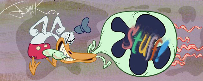
Attempt 1: face has been pushed in. And it's cramped.
Kaspar is falling over because his feet aren't solidly planted.
 I made the silhouettes of his face and the underpants clearer. Also added perspective to his huge body.
 Kali made another attempt and improved all those things. His face is now much more open and not cramped. It has a good silhouette too.
 Feet are better planted.
As a last step I traced her drawing and pushed the contrasts a bit. After pushing and pulling the first drawing around a bit, we ended up with a more solid, clearer and more stylish drawing.

