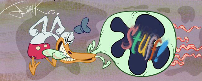
 I think it reeks of Disney to the core. This may look like a simple easy-to-do flat hip drawing like you see in modern cartoons, but it's nothing of the kind.
 This is the result of a decade and a half of honing Disney principles, inbetweening and animating on classic rounded Disney characters. It's a Tom Oreb layout and he uses all the tools he learned doing the uncool way of animation drawing.
  Thanks to Amid for this Oreb composition of an early version of the fairies from Sleeping Beauty-they should have looked this good in the movie!
This style is actually dependent upon MORE RIGID rules than the more organic 3 dimensional typical 40s cartoon characters. It is the extreme conservatism that controls the style and makes it so wooden and soulless. It's like an artistic math problem, existing solely for the challenge of its own problems.
When most people today draw flat, they are starting from no foundation of knowledge or experience at all. They see cartoons like Toot Whistle Clunk and Boom and say "I wanna be cool and rebellious too. Only I wanna skip the hard work and study and just go right to the top and be a designer." Then they draw from the details out with no master plan of organizing the designs. They start by drawing an eye, then a nose, then draw a head around it and eventually get to a finished chaotic picture of geometric shapes all in cluttered opposition and contradiction to each other.
Oreb is instead designing from the big shapes down to the small shapes and fitting all the smaller shapes within the plan of the larger shapes. Starting with the overall composition.
 The image is made of two major shapes - the group of cavemen and the girl. These 2 shapes are separated with negative space - a big hunk of it. The cavemen shape is then split into 2 groups of 2 cavemen each-separated again by a negative shape - this one smaller than the larger one between the girl and the men.
 Within each group of 2, the men are carefully, thoughtfully balanced against each other using lines of action, negative shapes, overlapping shapes, organic curves....
On the organicness. Here's the main key to the style. These aren't mathematical shapes. They aren't perfect circles, ovals, there are no straight or parallel lines as in today's flat cartoons. These are very organic but on a flattened 3dimensional plane - somewhere in between a 2 dimensional and 3 dimensional space.
The negative shapes exist both in spaces between the characters or in their arm poses, but they also exist within the characters. The negative areas are contrasted against the filled busy areas to provide readabilty and to make you focus on certain areas. If everything was filled up with detail equally, it would be a cluttered mess.
There are lots of contrasts of different types of shapes. Just compare each of their noses to start.
There are contrasts in texture - large flat colored areas against hairy busy areas.
 All the characters fit into the larger shapes of the composition, but within each one all the features follow the construction or hierarchy of the overall structure of the individual character.
 Next, I'll break down their head constructions and you'll see how they are well thought out and make sense. They aren't chaotic or random breakings of established rules. The eyes fit on the same plane of the head position;they relate to each other, they have direction.
When I first saw this cartoon (and the other handful of chapters of the Cal Arts Bible - Pigs is Pigs, Mars and Beyond and Paul Bunyan) I too wanted to be instantly cool. When I tried to draw in this style and make the characters look like they fit together and were doing something I quickly realized how hard it was to do. Now I know why.
I also realized the effort isn't worth it in terms of the ultimate entertainment value. I'll explain that later too.


This cartoon uses the same principles and more, but is far less restrictive creatively than the stylized Disney stuff.

Was this worth anything to you or did you already understand the style?

