I learned long ago that if you are gonna do TV animation, the budgets will be limited and you can't write stories that require full animation and lots of drawings or detail. That used to be the excuse for having cartoons be uncreative and boring.
But I reasoned that just because you can't afford a lot of drawings, doesn't mean the drawings you do have can't be at least expressive and interesting.
So I took part of the production system I learned at Filmation and Hanna Barbera and added elements of what I liked about classic cartoons to come up with an efficient practical way of making your cartoons look like they are a lot more elaborate than what the budget actually allows.
In order to use this system, you have to do layouts in house; you can't send them overseas. This is the only way you can have any control over having specific customized poses, and individual artistic style - because the overseas animators are trained to not have any style, or not even to know what the story is about that they are animating. They have no personal claim to anything they work on and don't care.
Nickelodeon - when it built its own studio on my foundation used this system (as best as they could understand it). Then other studios copied their (my) system for awhile. It was the "creator driven) system. Since then, I think many studios have abandoned layouts in favor of drawing storyboards with clean lines and sending them overseas to be blown up for the animators. That makes the storyboard artist more concerned with cleanup than with telling a story. It's also much harder to do really specific interesting drawings when drawing postage stamp size. The system has eroded even though there are still many pretend Spumco Cartoons on TV. Having a sensible production system is just about as important as having talented people on your staff. An illogical system undoes everyone's potential.
If you are gonna do layouts it's really important to have strong artists who are capable of customizing poses and not slipping into stock poses, otherwise it's a waste of money.
Friday, February 27, 2009
Shorts Program Goals Headings
TALENT
To Discover TalentTo Find A Director with Experience as Well as Raw Talent
To Surround the Director with like minded supporting talent
TO DEVELOP AN EFFICIENT PRODUCTION SYSTEM that allows the talent to flourish
TO LEARN FROM MISTAKES AND SUCCESSES
To Give Cartoonists Real Experience
To Bring Back Apprentice System and develop the talent
CHARACTERS
TO DISCOVER AND DEVELOP STAR CHARACTERS - ICONS that last and make money in other mediaPROGRESS
To Build a Studio Personality or Style (“branding”)TO DEVELOP NEW TECHNIQUES - TO PROGRESS and compete with slower more backwards studios
WHAT SHORTS PROGRAMS SHOULD NOT DO
NOT TO FIND A NEW "STYLE" EVERY TIME
Destroy the incentive to work your way up the chain
Expect a Revolution Every Week
These are just some of the topics I'll cover a bit at a time...
Labels:
shorts program
Thursday, February 26, 2009
Goals of A Shorts Program 2
Shorts, past and present - is there a difference?
The best most financially fruitful shorts programs all happened in the 30s and 40s.
Disney's shorts program allowed them to experiment with technique and develop their skills to the point where they could eventually create and make animated feature films and in the process push the whole medium forward.
Warner Bros.' shorts program developed the greatest Directors and created the most and best cartoon characters in history.
When I was a consultant for Fred Seibert at Hanna Barbera, I told him all this stuff and he decided it would be a good idea to start a shorts program of his own - to discover new talent and new characters for HB and the Cartoon Network.
It wasn't done as efficiently or logically as the old shorts programs of the 30s, and none of the modern shorts programs have been as successful as the classic ones that inspired them.
Today every TV studio has its own shorts program. Why? Because every other studio does, and studios copy trends without stopping to try to understand them. I've witnessed a lot of money wasted because of inefficient strategies and vague goals.
Maybe I can shed some light on why shorts programs yielded better results in days of yore by giving some details about not only the goals of a shorts program but how best to achieve them, following the models of classic Disney and Warner Bros.
1)To Discover Talent
Finding star talent is an immediately obvious goal of a shorts program, but it's not so obvious how to go about doing it - or hanging on to it.
There is more to discovering talent than just finding talented people. The people need experience and the ability to make some mistakes and more...I'll get into it in my next shorts post.
I can also relate some of my own experiences and lessons learned from study, practice and trial and error.
Labels:
shorts program,
true executive tales
Wednesday, February 25, 2009
Funny Walks in Limited Animation
Here's a normal Ranger Smith HB walk. Upper Body and head is 1 drawing that pans up and down while the arms and legs move.
a slight variation...torso is held while legs move. No up and down motion.
http://www.cartoonthrills.org/blog/01Principles/walks/ranger/walk1walk2.mov
another variation- upper body is a held drawing, but the butt and belt moves up and down as he walks
now it starts to get obvious and stupid
Limited animation can be really fun if you take advantage of it.
I love making arbitrary decisions about which parts of a drawing to be held, and which to move. That's what they did in the original HB cartoons to try to fool you into thinking it was actually animated. The difference is, I don't want to fool you. I want it to be obvious and entertaining that only parts are moving. The stupider, the better, I say.
http://www.cartoonthrills.org/blog/01Principles/walks/ranger/walk3walk4.mov
It gets even stupider...I'll prove it
Labels:
building the gag,
HB,
limited animation,
ranger smith,
walks
Tuesday, February 24, 2009
Chloe
Chloe is a supernatural artistic talent who should be rich by now. Her natural style is a kind of elaborate caricatured classical realism.
Or should I say surrealism? Anyhow, she has an amazing observational ability. she sees forms within forms to such an extreme level, that I can't imagine how complex the world must look to her eyes. She is also is very articulate and has written some of the most thought-provoking comments on this blog, although lately she has deprived us of her wisdom.
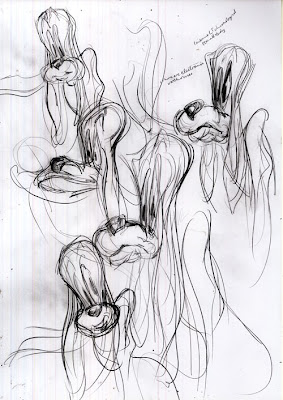
She decided a while ago to try her hand at something much simpler than what she normally draws - cartoons. She came up with these sketches of my characters and some others. I think it's very hard for her to boil things down to such simplistic rules and concepts. Her natural instinct is to make every drawing have hundreds of different planes.
Some of these interpretations of George Liquor are downright scary1
Here's Jimmy....
Here's her interpretation of Marc Deckter's style
So, I talked to her a bit and tried to convince to lower her I.Q. to the point where she could use just a handful of simple rules to draw cartoons.
There is a missing step here. She sent me a bunch of Bugs Bunnies from model sheets awhile back that were sort of halfway between the above and below drawings. She liked to use a thousand lines where just one would usually suffice.
Here she finally got it down to the simplicity that you need to draw good cartoons.
She still has a slight tendency to make things kind of wavy, as if the characters are made of flowing liquid, so I just suggested she try to make them a bit more solid.
If anyone ever figures out how to harness her talent, watch out.
I bet she feels guilty drawing this simply.
http://chloepaintings.blogspot.com/
Chloe should meet Adrian, a kindred spirit.
Subscribe to:
Posts (Atom)