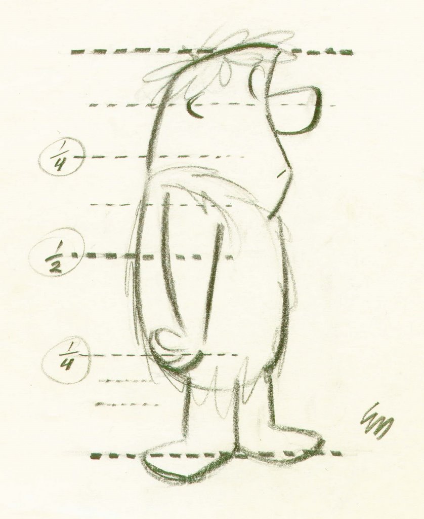
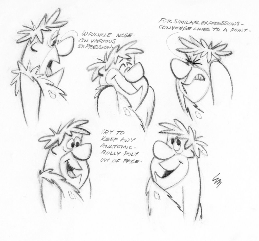
USE NEGATIVE SPACES WITHIN THE FORM!
Face is kept well to the front, with lots of negative space behind it. Top of face (eye area) is smaller than bottom of face (mouth area) for design contrast, Nose isn't in the middle. It's not symmetrical or evenly proportioned. If it was it would look mechanical.
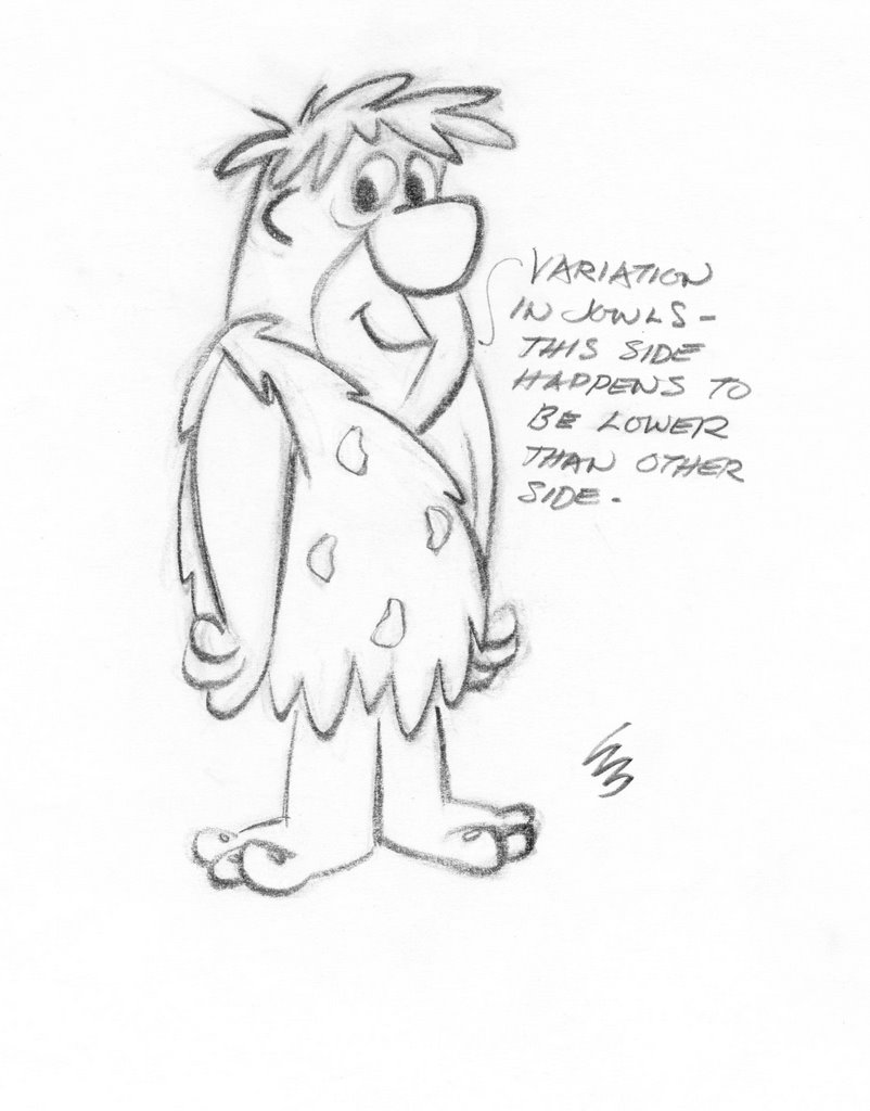
Here is a common mistake in modern design. CRAMPED AREAS - No Negative Space

Dino's whole face is squashed together at the top of his head. Same with the top of his body where his arms are cramped together with no negative space. These are easy corrections if you are thinking about it.

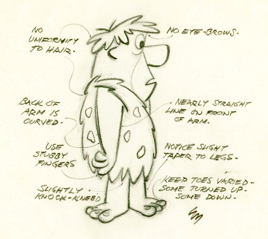
A vertical line running down the top of the face. Horizontal lines under and at top of eyes. These construction lines follow the form of that part of the head. This is where today a lot of people get it wrong.

They have the plane of the eyes contradict the plane of the face they are sitting on. (It came from a mistake in a
Ren and
Stimpy cartoon, and everyone thought it was on purpose.)

Disney eyes are very specific to them and their followers. You can always tell a Cal Arts animator by certain things they can't break out of - like Disney eyes. Sometimes the eyes have 4 corners. 2 subtle ones at top. But they always are thinner at the top, wider at bottom.

Disney eyes and same head construction on all these characters.


From Mark
Mayerson's site:

By the time of 101
Dalmations, the handful of stock Disney designs were all morphing into one. Every character in
Dalmations has the same construction and eyes. Maybe
Cruella has a very slight variation in head proportions, but the exact same eyes and eye expressions. This is the Don
Bluth bible, and later in degraded form, the Cal Arts bible. Same character designs, same eyes over and over again.


Slightly different jaw. Same eyes, only bigger. New nose! The Goth cartoonist's template.
Toot Whistle Plunk and Boom is on this set. Buy it.


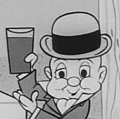
These humans all have the same basic head construction with slight variations in proportions and details. They don't have Disney eyes. They have regular cartoon eyes.
Actually Ed draws very unique eyes, but they are so tricky that the rest of us miss it when we try to draw his characters.


Animation is infamous for recycling designs. (And even more for recycling stories-but I'll save that for a rant)


Here's a much funnier variation on the head shape-and with original specific eye shapes. Try to catch all the subtleties. It's hard!
FLAT BUT FUNNY