


You can also use background elements as framing devices.

The master of this (and other posing techniques) is Harvey Kurtzman.


 Here are some characters in static poses.

 Fred and Barney's poses have strong lines of action and they have different degrees of action - they aren't in the same poses. Barnet's pose is stronger-he is leaning back on a diagonal line of action. Fred is on an arc that leans to the right at his head. the space between them is creating a V shape that leans to the right.
 Here is Wilma in a pose. She isn't standing straight up and down. Her pose tells us her attitude and what's happening in the story.
 Here is Ranger Smith in a static pose next to a cook in a subtly dynamic pose. Dynamic poses don't have to be extreme in every case. The pose should be appropriate to the scene, character and story.
 ACTION AND REACTION:
 I like how Eisenberg controls all his shapes and spaces to make clear readable and appealing poses. He is an extremely clever cartoonist and I am slowly learning some of his techniques.
 and here is an old Flintstone sketch I found.
 Harvey Eisenberg's natural style was fairly traditional - basically very rounded characters like 40s animation: Tom and Jerry.
  When he started having to draw comics using Ed Benedict's more stylized angular characters, he went through a transitional period where he tried to adapt.
 His clean compact and controlled compositions were evident right away, but he had some trouble figuring out how to tilt the characters' angular heads at first.
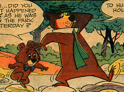
 Yogi's perspective doesn't make much sense in the panel above.
 His cheats became more subtle as he got used to working in this style.
 His staging is always very controlled and easy to read.
 Gene Hazelton - who had a similar background in animation had some differences in his style. He works more on a part by part design basis. Each individual piece of his picture has a pleasing design and style, but the overall staging and composition is less organized than Eisenbrg's. Drawing your pictures piece by piece, rather than from the big elements down to the smaller ones inevitably leads to a more cluttered look.
 I think Gene was more concerned about how the characters looked, and he filled in the trees and background elements in all the spaces left between the characters.
 Gene's specialty was stylish cuteness. He was known for his cute kids...
 http://www.cartoonbrew.com/old-brew/gene-hazeltons-angel-face.html
 Gene is also known for his cute women.
 Here's Gene with a less cluttered composition. With cute fishies.
 Here's Harvey showing off perspective and his easy organization (hierarchy) of a lot of detail.
 I loved these strips when I was a kid and thought that the artists must be animators, because the comics seemed to have elements of modernity, appeal and style that was more evident in animated cartoons than in the general comic strip style - which was traditionally more stiff.
 http://johnkstuff.blogspot.com/2009/05/eisenberg-subtleties-studies.html
 Each part of that phone receiver draws attention to itself, but the parts contradict each other and break up the overall shape of the phone.
 These are drawings made up entirely of 40s animation principles. Starting with very strong construction. All the characters are made of simple sphere, pear and tube shapes. I say simple, but that doesn't mean it's easy to put them together so well.
 Note that every character is the same design as Tom and Jerry and only superficial details that define the characters' species are differentiated. The chicken has feather and a comb. The dog has jowls. The pig has a snout and pig ears, etc...but everything else about them is exactly the same, just like Tom and Jerry. It made sense as animators were learning all the difficulties and principles of movement that they kept the characters fairly simple to draw - and solid, so they could easily turn them around in all dimensions. Many early characters hadn't evolved individual character designs yet. But they had everything else important to animating and clarity.
 Clear Staging/composition
 Line Of Action
 Silhouettes
 Opposing Poses
 The one stylistic statement that is consistent in this comic is that all the perspective in the backgrounds is rounded. Round streets, round fences and houses etc. This was a standard early 30s cartoon style and you don't see it in many 40s cartoons.
 By the 1940s, most of the advanced studios had gone past this pure, rounded spheres and pears approach and were starting to vary their character designs, background designs and some directors' styles were becoming very individual.
 Bill and Joe hung on to this basic early 40s style longer than anybody.
  Joe himself was reluctant to change as long as his cartoons were popular and winning Academy Awards. He didn't start creating individual characters with their own unique designs until forced into television. Then he hired Ed Benedict who gave the Hanna Barbera studio a style and a cast of individual characters on the cheap.
 and he mixed it with Ed's later.
 That was goodbye to pure pears and spheres (Preston Blair) and hello to more complex shapes, curves and angles,
  but it was not goodbye to good solid drawing principles. Not yet.http://johnkstuff.blogspot.com/2009/05/eisenberg-subtleties-studies.html


