Sunday, September 30, 2007
Mitch Is A Good Boy Who Will Go Places
I have been following a few of you folks who have been doing my lessons. The ones that do the most of them are definitely progressing fast.
I am quite impressed with Mitch, who seems to be taking very logical and practical steps towards learning all the basic tools of our trade.
http://mitchoo.blogspot.com/
1 Preston Blair
He started by drawing from the Preston Blair construction lessons. This teaches the logic (the brainy part) of drawing 3 dimensionally.
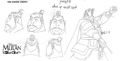
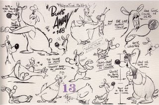
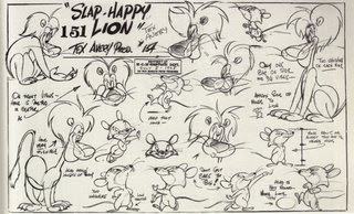
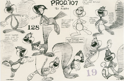
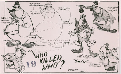
2 Copy Classic Model Sheets
3 Copy Classic Cartoons (Using knowledge from lessons)
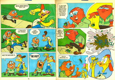
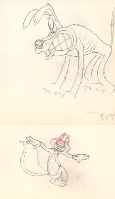
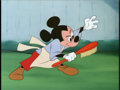
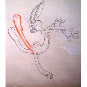
Then he moved to draw poses from classic cartoons while trying to APPLY the construction lessons to the poses. Copying classic cartoons teaches you a lot about posing, acting, angles and more. But do it after you start to understand construction.
You can see his first sketches (Chicken Hawk) are a bit hesitant or shaky, but then later he gets more confident (Porky Pig). That means it's starting to sink in. Practice makes the concepts from the lessons sink in! It's not enough to understand a theory. You have to apply it over and over again, until you understand it instinctively!
4 Draw lots and lots of studies-not just one time
He drew lots and lots of studies from the cartoons. the more he does, the more it all sinks in and the better he gets.
5 Draw Toys to Learn Even More about Construction
6 Draw the Same Drawings Again to try to fix Problems
This is a very important and useful step. Be your own critic. Analyze your studies. Write down what you think is wrong, THEN DRAW IT AGAIN AND TRY TO FIX THE MISTAKES!
You will improve very fast this way.
8 Do Cleanups Of Good Cartoon Drawings
Doing tight cleanups of good drawings also helps all the concepts sink in. I wouldn't make this step 1, though. It's not enough just to have a crisp clean line. You need to know where to put the lines so that the lines make the shapes look solid and convincing. That's where learning construction comes in. Doing all these lessons together makes everything make more sense and makes your drawings get better and more convincing.
7 Get A Job Cleaning Up Someone With Experience
If Mitch keeps going this way, I'll send him some cleanup or inking work and he will learn even more, but he is taking all the smart steps towards getting skills and knowledge of functional cartooning.
Hey Mitch, I have a couple suggestions or critiques for you. If you are man enough to have me do it in a post, let me know.
And thanks for the donation!
Saturday, September 29, 2007
Thanks to more great pals!
I really do appreciate your love gifts! Thanks loads.
Robert Davis
Sarah Johnston
Nico Colaleo
Stephen Rogers
Jason Heath
Adam Koford
Joel Mackey
Marlo Meekins
Leo Brodie
thistler productions/Josh Salmon
Mitch Leeuwe
Ian Maxwell
Did I leave anybody out?
Friday, September 28, 2007
Bakshi Presents: The Ice Goose Cometh
MOUSE FAMILIES! AVOID DOMESTIC STRIFE - DRIVE A RAMBLER!
Credits:
Script by Tom Minton
Character Designs: Jeff Pigeon, Carole Holiday, me
BG Paintings: Vicky Jensen
Direction: Me
Sheet Timing: Bob Jaques
Layouts: Jim Gomez, Mike Kazaleh, Lynne Naylor, Ishtvan Majoros, Bruce Timm, Ken Boyer
I forget who did the storyboard. If you remember, let me know! Byron Vaughns? Jim Smith?
______________________________
Bonus Feature: A classic wartime short!
http://www.animationarchive.org/2007/09/filmography-gandy-and-sourpuss-in.html
Wednesday, September 26, 2007
Cartoon College Year 2
1 Cartoon Drawing Tools Upgrade
Appeal and Balance Of Design
Appeal isn't just a matter of drawing cute eyes. It's a matter of good looking shapes that balance well together.
http://johnkstuff.blogspot.com/2006/05/design-appeal-mickey-mouse-club-cute.html
http://johnkstuff.blogspot.com/2007/02/appeal-1-starting-with-cuteness-as-1st.html
This means you need to know how to use negative areas in your drawings.
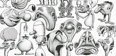
Basil Wolverton has a way of drawing ugly that is actually very cute. He uses strong contrasts, negative spaces and obvious distinct forms. The details in the cross-hatching do not try to hide the beauty and imagination of the statement. If you erased the cross-hatching , the shapes would still be distinct and funny.
A lot of young (or amateurish) artists have a problem with clutter. I was talking to a student the other day who asked me to look at his drawings on his blog and they had a typical problem. Too cluttered.
Some clutternuts will draw a head shape and completely fill it with the face. No empty spaces. All fill. That makes the face hard to see, and also makes it hard to animate expressions. You need space above your eyebrows if you want your eyebrows to move and make expressions, for example.
You need empty spaces to draw your attention to filled spaces.
Clarity Of Design VS Ambiguity
A lot of young cartoonists are influenced by modern comic strip "art".
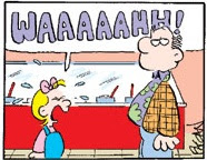
Many strips have characters that you have to stare at for a few minutes before you can even see which part is the face. Where the mouth or nose is, etc...What expression the character is trying to make.
Shameful.
Every design and drawing should commit to itself. It should be absolutely clear and distinct, so you have total control over what you are trying to say.
Organic Drawing
Organic Drawing
Semester 2 Cartoon Tools:
Using simple organic characters made of pears and spheres.Semester 1:
Appeal and Balance Of Design
Appeal isn't just a matter of drawing cute eyes. It's a matter of good looking shapes that balance well together.
http://johnkstuff.blogspot.com/2006/05/design-appeal-mickey-mouse-club-cute.html
http://johnkstuff.blogspot.com/2007/02/appeal-1-starting-with-cuteness-as-1st.html
This means you need to know how to use negative areas in your drawings.
Basil Wolverton has a way of drawing ugly that is actually very cute. He uses strong contrasts, negative spaces and obvious distinct forms. The details in the cross-hatching do not try to hide the beauty and imagination of the statement. If you erased the cross-hatching , the shapes would still be distinct and funny.
A lot of young (or amateurish) artists have a problem with clutter. I was talking to a student the other day who asked me to look at his drawings on his blog and they had a typical problem. Too cluttered.
Some clutternuts will draw a head shape and completely fill it with the face. No empty spaces. All fill. That makes the face hard to see, and also makes it hard to animate expressions. You need space above your eyebrows if you want your eyebrows to move and make expressions, for example.
You need empty spaces to draw your attention to filled spaces.
Clarity Of Design VS Ambiguity
A lot of young cartoonists are influenced by modern comic strip "art".
Many strips have characters that you have to stare at for a few minutes before you can even see which part is the face. Where the mouth or nose is, etc...What expression the character is trying to make.
Shameful.
Every design and drawing should commit to itself. It should be absolutely clear and distinct, so you have total control over what you are trying to say.
Organic Drawing
Organic Drawing
Semester 2 Cartoon Tools:
Learning and applying the cartoonists' code, our fundamental promise to the audience and our debt to our forefathers.
Bob Clampett, Tex Avery, Jim Tyer, Milt Gross and the rest are up in cartoon Heaven staring down at us wondering what the heck happened to the art they created and took to such high levels.
We should be able to take the head start they gave us and do work that makes them not only proud, but jealous!
This course explores 2 essential concepts of cartooning that just seem to have been completely abandoned
Exaggeration is not some uncontrolled anarchy like many stuffy animation critics would have you believe. Tex Avery was a highly structured master of what cartoons are and he was very careful in planning his seemingly crazy ideas.
Cartoon characters need to look alive, and motivated from within if they are to engage the audience.
Drawing characters that look alive seems to be a rare skill today:
Instead of life, we get a lot of pointy graphic clutter. I want students to learn to draw CHARACTERS, as opposed to graphic symbols. You should think of them as real creatures and draw them as if they are controlling the action, not being pushed around by you and a commitee of executives.
2 40s principles of animation Bob Clampett, Tex Avery, Jim Tyer, Milt Gross and the rest are up in cartoon Heaven staring down at us wondering what the heck happened to the art they created and took to such high levels.
We should be able to take the head start they gave us and do work that makes them not only proud, but jealous!
This course explores 2 essential concepts of cartooning that just seem to have been completely abandoned
Exaggeration is not some uncontrolled anarchy like many stuffy animation critics would have you believe. Tex Avery was a highly structured master of what cartoons are and he was very careful in planning his seemingly crazy ideas.
Cartoon characters need to look alive, and motivated from within if they are to engage the audience.
Drawing characters that look alive seems to be a rare skill today:
Instead of life, we get a lot of pointy graphic clutter. I want students to learn to draw CHARACTERS, as opposed to graphic symbols. You should think of them as real creatures and draw them as if they are controlling the action, not being pushed around by you and a commitee of executives.
____________________________________________________________________
30s rubber hose character principles are continued and added to by more principles that make the animation and drawings more natural or "organic".
Learning From Quality Generic
http://johnkstuff.blogspot.com/2007/02/rise-and-fall-of-construction-in_04.html
Overlapping Action/Follow Through
Weight Through Timing
Specific Walks and Runs
Lip synch For Assorted Muzzles and Beaks
4 legged characters
Timing Variations - Avoiding tricks
____________________________________________________________________
3 Basic acting
The visual language of acting
Acting in cartoons consists of appealing to 2 senses, the eye and the ear.
The voice actors tell your ears some emotions and the animator tells your eyes how the characters feel.
You should be able to do a story in complete pantomime using the visual tools that are at our command.
In this course, we would learn just the very basics of cartoon acting tools. In the next year's more advanced course we would explore more subtlety and specific acting.
Expressions
Starting with simple basic expressions and the basic emotions, to get used to drawing them with clarity and form.
PosesLearn to make bold, distinct clear poses that tell how the character feels using all the good cartoon principles.
Mouth Shapes -
Generic mouth shapes are better than Specifically Disney mouth shapes, but not as good as mouth shapes specific to the character and the scene.
Training your eye and brain to see that.
Studying Classic Cartoon Acting:
Generic-early Disney, Tom and Jerry
Slightly Specific - Tex Avery
More Specific – Chuck Jones
How Timing Affects Your Visuals
____________________________________________________________________
4 History of Cartoons and Entertainment
With emphasis on:
Stage presence
Acting
Clarity of Message
Entertainment value
Superhuman ability
Showmanship
Professional performance
____________________________________________________________________
5 Life Drawing With Emphasis On Caricature
____________________________________________________________________
____________________________________________________________________
6 Application Of Other Studies
There will be exercises where the students have to combine principles and studies from different classes into drawing and animation assignments.
The students will consult with the instructor to design their own assignments.
They will have to write what problems they want to solve and how they will combine different ideas.
The assignments will be judged on:
Cleverness
Clarity of Concept
Success in Combining elements
Entertainment value
____________________________________________________________________
7 TRAINING YOUR EYE AND YOUR BRAIN
Your eye and your brain are mortal enemies.Your eye is a liar, but a sometimes intuitive interpreter.
Your brain is an analyst that has been dulled by too many kicks in the head from modern culture.
I want to train both these important faculties and this will enable you to learn faster and make you a much more aware and inventive functional cartoonist.
HIERARCHY OF FORM AND DETAILS
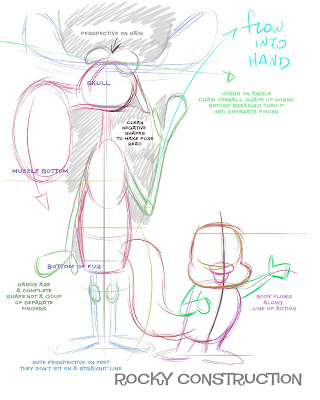
http://johnkstuff.blogspot.com/2008/03/rocky-and-bullwinkle-step-by-step.html
http://johnkstuff.blogspot.com/2008/05/more-bg-layout-note-hierarchy-of-form.html
____________________________________________________________________
The art of cartoons is the art of distilled fun.
It should be fun to learn how to cartoon.
It should be fun to make cartoons.
Your goal should be to give the audience more fun than they ever imagined possible.
That's what this school would be all about.
It should be fun to learn how to cartoon.
It should be fun to make cartoons.
Your goal should be to give the audience more fun than they ever imagined possible.
That's what this school would be all about.
Labels:
Cartoon College,
construction,
hierarchy,
Life
Oswald Ex Sheets, I'll help you out
Here, I partially filled out the ex sheets for you.
I marked off all the beats and bars to the left.
Each key pose happens on the beat that is numbered next to the drawings.
I wrote which beats had what lyrics and how many inbetweens to get to each post.
Note that beats 6 to 10 re-use a few drawings that cycle left and right.
So you don't need to redraw the same drawings over and over again. Draw them once, then repeat them where the ex sheets tell you to.
Labels:
animation lesson,
Oswald,
rubber hose,
timing to beats,
Walter Lantz
Tuesday, September 25, 2007
Gandy Goose and Sourpuss
When I was a kid, I loved Terrytoons. I still do! There was a Saturday Morning Mighty Mouse Show that was really cool.It had bumpers with Mighty Mouse riding a rocket and talking to us in a different voice than he had in the cartoons.
Then they would show classic Terrytoons from the 40s and 50s.
These were fully animated but I knew there was something unique and strange about them. They were good but sort of slapdash at the same time.
I also had super 8 silent movies that I ran over and over for my friends. Woody Woodpecker, Zippy The Chimp, Ub Iwerk's Puss In Boots and a Gandy Goose and Sourpuss cartoon.
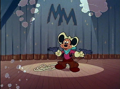
The cartoon was a take off on Mickey's Trailer. I must have watched that cartoon a million times.
Terrytoons made a practice of taking cartoons that were hits 10 years earlier and copying them using their own characters, now that the gags were completely out of date. It's a very ignorant yet funny practice. Joe Barbera would do something similar all through the 60s. He was always behind the times, but in a really funny way - like the episodes where Fred would sing Rock 'N' Roll.Gandy is a loveable homosexual. Sourpuss was a mean curmudgeon.
Gandy and Sourpuss had a funny relationship. They slept together and would invade each other's dreams. Sourpuss was the asshole character and Gandy loved him nonetheless. Their relationship inspired Ren and Stimpy.
Later when I teamed up with Ralph, he let me explore bizarre domestic situations in the Bakshi Adventures Of Mighty Mouse.
It was all practice for the Ren and Stimpy Show and my other cartoons. There is something inherently fascinating to me about domestic squabbles. They are a never ending supply of funny material.
Here, why don't you bone-up on Gandy and Sourpuss and I will reward your research on Friday.
Labels:
Gandy Goose,
terrytoons
Monday, September 24, 2007
Animation Lesson 2. Oswald Dance, animating to a 12x beat
ANIMATING TO A BEAT: The 12x Beat
12x is a very standard unit of time in cartoons. It's roughly the time it takes for a human to take a step in a normal walk. A fast walk would be 8x per step. Pepe Le Pew's hop cycle is 12x per hop.
Here is a perfect scene to learn the essential concept of animating to tempos. The scene is very simple and basically just moves from one pose to the next to the beat. No fancy overlapping action or secondary motions to distract you from the core concept of beats.
It's good to study just because it is so simple. A beginning animator needs to get used to how long a beat is in frames. This song is a 12x beat. Sing along and tap your foot to it, until you memorize the rhythm. Then do it later when you don't have the animation in front of you. After a while you will know what a 12x beat feels like.
In the beginning of the song Oswald holds each pose for 2 beats.
Add 24x to to frame 25 and you get frame 49. Got it?
Then it goes to a new pose on every beat. Watch the film frame by frame. Number the inbetweens by counting backwards from the key. If there are 4 inbetweens on the way to frame 49 and they are on "1's", then they will be numbered 48, 47, 46, 45
The mouths are animated on separate levels, so that the body and head animation can be cycled or reused. When you animate this scene, animate the actions first. After you shoot it and see it working, then go back and animate the mouths on a separate level.
Some of the poses are held for a few frames once they stop. The face keeps singing while the body is stopped.
Watch the clip. The song starts on the second scene. If you copy this animation, you will benefit greatly. If you shoot it, send me a link and I will post some of them.
CLICK HERE TO SEE THIS LUCKY RABBIT DANCE!
Just to confuse things, the clip is running at 30x per second ... like video. Film is 24x per second so you have to calculate a bit. Some of the frames are repeated to make it run at 30x per second.
That's why you see some double images in the clip. If you follow my instructions above as to how to number the drawings, it will end up at 24x per second.
CLICK HERE FOR 11" x 17" PRINTABLE VERSION OF AN EX SHEET
12x is a very standard unit of time in cartoons. It's roughly the time it takes for a human to take a step in a normal walk. A fast walk would be 8x per step. Pepe Le Pew's hop cycle is 12x per hop.
Here is a perfect scene to learn the essential concept of animating to tempos. The scene is very simple and basically just moves from one pose to the next to the beat. No fancy overlapping action or secondary motions to distract you from the core concept of beats.
It's good to study just because it is so simple. A beginning animator needs to get used to how long a beat is in frames. This song is a 12x beat. Sing along and tap your foot to it, until you memorize the rhythm. Then do it later when you don't have the animation in front of you. After a while you will know what a 12x beat feels like.
THE FIRST FEW "KEYS"
The music in this scene is 2 beats per second, or 12 frames per beat.
Each of these frames below is a key drawing. They are the drawings that you see and feel for each beat - the important drawings. The rest of the drawings are on the way to these keys. Those are the inbetweens.
Each key is either 12x or 24x away from the other keys next to them.
You should number the keys according to which frame they would appear in your animation test. Number your ex sheets that way too.This would be frame 25 (1 frame past the first 2 beats of pose 1.)
THIS IS THE SECOND POSE IN THE SONGEach of these frames below is a key drawing. They are the drawings that you see and feel for each beat - the important drawings. The rest of the drawings are on the way to these keys. Those are the inbetweens.
Each key is either 12x or 24x away from the other keys next to them.
You should number the keys according to which frame they would appear in your animation test. Number your ex sheets that way too.This would be frame 25 (1 frame past the first 2 beats of pose 1.)
Add 24x to to frame 25 and you get frame 49. Got it?
Then it goes to a new pose on every beat. Watch the film frame by frame. Number the inbetweens by counting backwards from the key. If there are 4 inbetweens on the way to frame 49 and they are on "1's", then they will be numbered 48, 47, 46, 45
The mouths are animated on separate levels, so that the body and head animation can be cycled or reused. When you animate this scene, animate the actions first. After you shoot it and see it working, then go back and animate the mouths on a separate level.
Some of the poses are held for a few frames once they stop. The face keeps singing while the body is stopped.
Watch the clip. The song starts on the second scene. If you copy this animation, you will benefit greatly. If you shoot it, send me a link and I will post some of them.
CLICK HERE TO SEE THIS LUCKY RABBIT DANCE!
Just to confuse things, the clip is running at 30x per second ... like video. Film is 24x per second so you have to calculate a bit. Some of the frames are repeated to make it run at 30x per second.
That's why you see some double images in the clip. If you follow my instructions above as to how to number the drawings, it will end up at 24x per second.
Labels:
animation lesson,
Oswald,
rubber hose,
timing to beats,
Walter Lantz
Subscribe to:
Posts (Atom)