1 Cartoon Drawing Tools Upgrade
Appeal and Balance Of Design
Appeal isn't just a matter of drawing cute eyes. It's a matter of good looking shapes that balance well together.
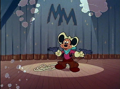
http://johnkstuff.blogspot.com/2006/05/design-appeal-mickey-mouse-club-cute.html
http://johnkstuff.blogspot.com/2007/02/appeal-1-starting-with-cuteness-as-1st.html
This means you need to know how to use negative areas in your drawings.
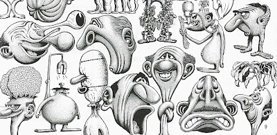 Basil Wolverton has a way of drawing ugly that is actually very cute. He uses strong contrasts, negative spaces and obvious distinct forms. The details in the cross-hatching do not try to hide the beauty and imagination of the statement. If you erased the cross-hatching , the shapes would still be distinct and funny.
A lot of young (or amateurish) artists have a problem with clutter. I was talking to a student the other day who asked me to look at his drawings on his blog and they had a typical problem. Too cluttered.
Some clutternuts will draw a head shape and completely fill it with the face. No empty spaces. All fill. That makes the face hard to see, and also makes it hard to animate expressions. You need space above your eyebrows if you want your eyebrows to move and make expressions, for example.
You need empty spaces to draw your attention to filled spaces.
Clarity Of Design VS Ambiguity
A lot of young cartoonists are influenced by modern comic strip "art".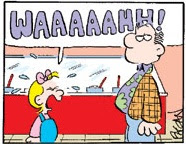
Many strips have characters that you have to stare at for a few minutes before you can even see which part is the face. Where the mouth or nose is, etc...What expression the character is trying to make.
Shameful.
Every design and drawing should commit to itself. It should be absolutely clear and distinct, so you have total control over what you are trying to say.
Organic Drawing
Organic Drawing
Semester 2 Cartoon Tools:
Using simple organic characters made of pears and spheres.Semester 1:
Appeal and Balance Of Design
Appeal isn't just a matter of drawing cute eyes. It's a matter of good looking shapes that balance well together.

http://johnkstuff.blogspot.com/2006/05/design-appeal-mickey-mouse-club-cute.html
http://johnkstuff.blogspot.com/2007/02/appeal-1-starting-with-cuteness-as-1st.html
This means you need to know how to use negative areas in your drawings.
 Basil Wolverton has a way of drawing ugly that is actually very cute. He uses strong contrasts, negative spaces and obvious distinct forms. The details in the cross-hatching do not try to hide the beauty and imagination of the statement. If you erased the cross-hatching , the shapes would still be distinct and funny.
A lot of young (or amateurish) artists have a problem with clutter. I was talking to a student the other day who asked me to look at his drawings on his blog and they had a typical problem. Too cluttered.
Some clutternuts will draw a head shape and completely fill it with the face. No empty spaces. All fill. That makes the face hard to see, and also makes it hard to animate expressions. You need space above your eyebrows if you want your eyebrows to move and make expressions, for example.
You need empty spaces to draw your attention to filled spaces.
Clarity Of Design VS Ambiguity
A lot of young cartoonists are influenced by modern comic strip "art".

Many strips have characters that you have to stare at for a few minutes before you can even see which part is the face. Where the mouth or nose is, etc...What expression the character is trying to make.
Shameful.
Every design and drawing should commit to itself. It should be absolutely clear and distinct, so you have total control over what you are trying to say.
Organic Drawing
Organic Drawing
Semester 2 Cartoon Tools:
Learning and applying the cartoonists' code, our fundamental promise to the audience and our debt to our forefathers.
Bob Clampett, Tex Avery, Jim Tyer, Milt Gross and the rest are up in cartoon Heaven staring down at us wondering what the heck happened to the art they created and took to such high levels.
We should be able to take the head start they gave us and do work that makes them not only proud, but jealous!
This course explores 2 essential concepts of cartooning that just seem to have been completely abandoned
Exaggeration is not some uncontrolled anarchy like many stuffy animation critics would have you believe. Tex Avery was a highly structured master of what cartoons are and he was very careful in planning his seemingly crazy ideas.
Cartoon characters need to look alive, and motivated from within if they are to engage the audience.
Drawing characters that look alive seems to be a rare skill today:
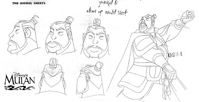 Instead of life, we get a lot of pointy graphic clutter. I want students to learn to draw CHARACTERS, as opposed to graphic symbols. You should think of them as real creatures and draw them as if they are controlling the action, not being pushed around by you and a commitee of executives.
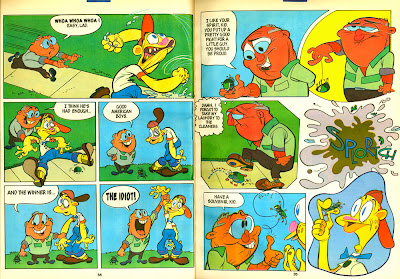
2 40s principles of animation Bob Clampett, Tex Avery, Jim Tyer, Milt Gross and the rest are up in cartoon Heaven staring down at us wondering what the heck happened to the art they created and took to such high levels.
We should be able to take the head start they gave us and do work that makes them not only proud, but jealous!
This course explores 2 essential concepts of cartooning that just seem to have been completely abandoned
Exaggeration is not some uncontrolled anarchy like many stuffy animation critics would have you believe. Tex Avery was a highly structured master of what cartoons are and he was very careful in planning his seemingly crazy ideas.
Cartoon characters need to look alive, and motivated from within if they are to engage the audience.

Drawing characters that look alive seems to be a rare skill today:
 Instead of life, we get a lot of pointy graphic clutter. I want students to learn to draw CHARACTERS, as opposed to graphic symbols. You should think of them as real creatures and draw them as if they are controlling the action, not being pushed around by you and a commitee of executives.
____________________________________________________________________
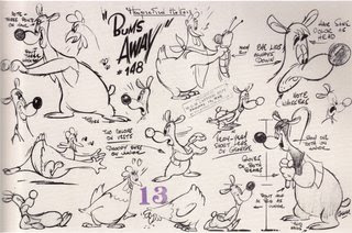
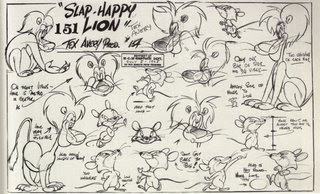
30s rubber hose character principles are continued and added to by more principles that make the animation and drawings more natural or "organic".
Learning From Quality Generic
http://johnkstuff.blogspot.com/2007/02/rise-and-fall-of-construction-in_04.html
http://johnkstuff.blogspot.com/2007/02/rise-and-fall-of-construction-in_04.html
Overlapping Action/Follow Through
Weight Through Timing
Specific Walks and Runs
Lip synch For Assorted Muzzles and Beaks
4 legged characters
Timing Variations - Avoiding tricks
____________________________________________________________________
3 Basic acting
The visual language of acting
Acting in cartoons consists of appealing to 2 senses, the eye and the ear.
The voice actors tell your ears some emotions and the animator tells your eyes how the characters feel.
You should be able to do a story in complete pantomime using the visual tools that are at our command.
In this course, we would learn just the very basics of cartoon acting tools. In the next year's more advanced course we would explore more subtlety and specific acting.
Expressions
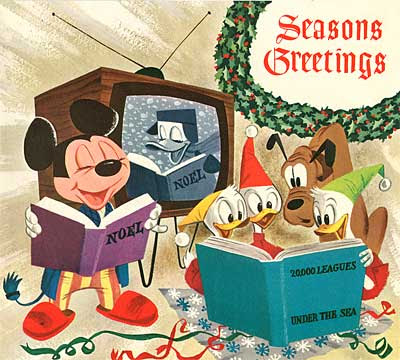
Starting with simple basic expressions and the basic emotions, to get used to drawing them with clarity and form.
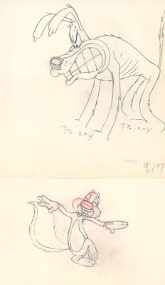
Poses
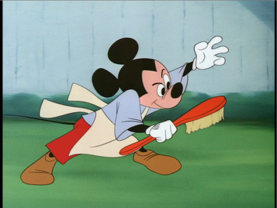 Learn to make bold, distinct clear poses that tell how the character feels using all the good cartoon principles.
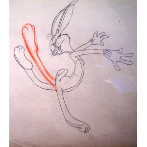
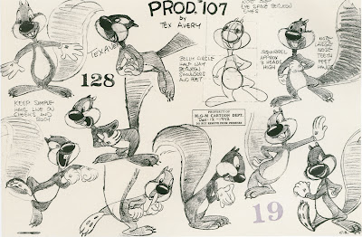
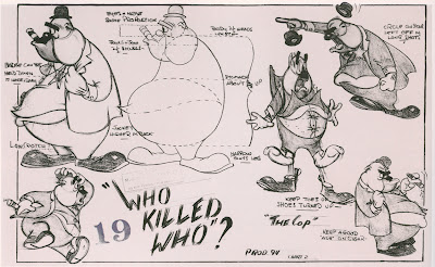
Mouth Shapes -
Generic mouth shapes are better than Specifically Disney mouth shapes, but not as good as mouth shapes specific to the character and the scene.
Training your eye and brain to see that.
Studying Classic Cartoon Acting:
Generic-early Disney, Tom and Jerry
Slightly Specific - Tex Avery
More Specific – Chuck Jones
How Timing Affects Your Visuals
____________________________________________________________________
4 History of Cartoons and Entertainment
With emphasis on:
Stage presence
Acting
Clarity of Message
Entertainment value
Superhuman ability
Showmanship
Professional performance
____________________________________________________________________
5 Life Drawing With Emphasis On Caricature
____________________________________________________________________
____________________________________________________________________
6 Application Of Other Studies
There will be exercises where the students have to combine principles and studies from different classes into drawing and animation assignments.
The students will consult with the instructor to design their own assignments.
They will have to write what problems they want to solve and how they will combine different ideas.
The assignments will be judged on:
Cleverness
Clarity of Concept
Success in Combining elements
Entertainment value
____________________________________________________________________
7 TRAINING YOUR EYE AND YOUR BRAIN
Your eye and your brain are mortal enemies.Your eye is a liar, but a sometimes intuitive interpreter.
Your brain is an analyst that has been dulled by too many kicks in the head from modern culture.
I want to train both these important faculties and this will enable you to learn faster and make you a much more aware and inventive functional cartoonist.
HIERARCHY OF FORM AND DETAILS
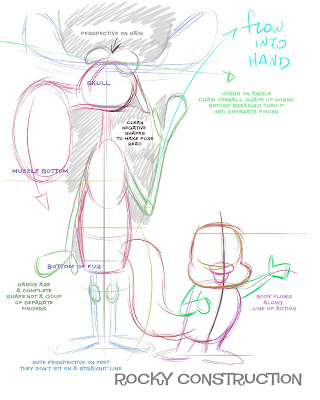
http://johnkstuff.blogspot.com/2008/03/rocky-and-bullwinkle-step-by-step.html
http://johnkstuff.blogspot.com/2008/05/more-bg-layout-note-hierarchy-of-form.html
____________________________________________________________________
The art of cartoons is the art of distilled fun.
It should be fun to learn how to cartoon.
It should be fun to make cartoons.
Your goal should be to give the audience more fun than they ever imagined possible.
That's what this school would be all about.
It should be fun to learn how to cartoon.
It should be fun to make cartoons.
Your goal should be to give the audience more fun than they ever imagined possible.
That's what this school would be all about.

