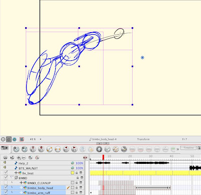
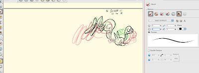
I roughed this character's body on 2 layers
1) Body
2) arms (because I wanted to overlap the timing of his arm with his body
Then I made another layer above the 2 rough layers, just for my cleanups
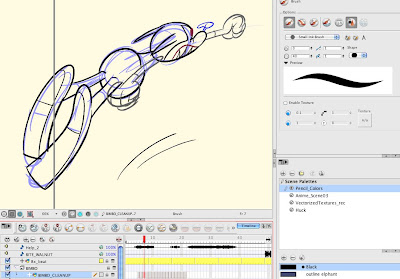
You can turn off individual layers and just see the clean up. I go back and forth to check everything. One problem is that the layers underneath are just as dark as the layers above so it makes it hard to see what you are doing.
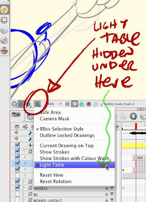
But you can turn on "light table" to make the other layers less opaque. (if you can find it). I would rather be able to just set a & for other layers but that doesn't seem to be an option. If you know how to do this, let me know!
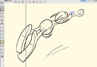
You can turn on onion skin to see the progress of your cleanups and make sure they are connecting smoothly
THICK AND THIN LINES:
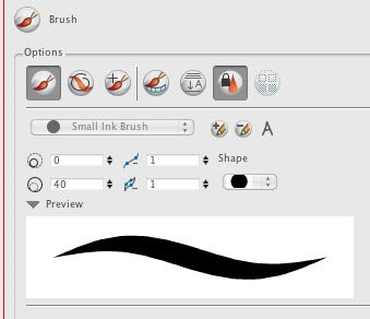
You can control the thickness of the lines by setting the numbers. My character starts in the scene big and then flies away and gets small.
For the bigger drawings, I set the width at 40, then as he gets smaller, I reset the width as I go until it becomes about 3.
This way the relative thickness of the lines stays as consistent as I want.
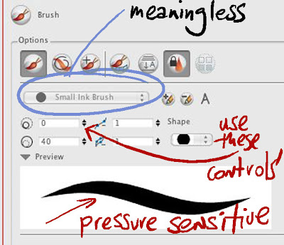
It takes practice to control the thick and thin lines, but the brush is pressure sensitive and after awhile I got the hang of it.
It is much easier to get good lines in Harmony than in Flash. I assume it's the same for Animate Pro. Now that I am used to it, I would never go back to Flash or even paper to animate.
You can also change the thickness of the lines by pressing the "O" button on the keyboard. It doesn't always work, but when it does, it's faster than setting the numbers in the menu.
The less menu items you have to drag around or find, the less you break the flow of your animating.
Unfortunately, too many essential commands are buried in multiple mystery menus and I am constantly having to stop being creative to find and reset things that should be more obvious, but I will make a list of some of those and suggest that Toonboom make them easier to use.
I will get Alex to upload this clip both in rough and clean form so you can see how they look moving.


 I roughed this character's body on 2 layers
 You can turn off individual layers and just see the clean up. I go back and forth to check everything. One problem is that the layers underneath are just as dark as the layers above so it makes it hard to see what you are doing.
  But you can turn on "light table" to make the other layers less opaque. (if you can find it). I would rather be able to just set a & for other layers but that doesn't seem to be an option. If you know how to do this, let me know!
 You can turn on onion skin to see the progress of your cleanups and make sure they are connecting smoothly
 THICK AND THIN LINES:
 You can control the thickness of the lines by setting the numbers. My character starts in the scene big and then flies away and gets small.
 It takes practice to control the thick and thin lines, but the brush is pressure sensitive and after awhile I got the hang of it.

 I think I may have an animatic of this scene that Eric Bauza made. I can't remember if Mike Pataki did the voice. He must have...
 The reason to do layouts here (in America or your homeland) is so you can create custom acting.
 By "custom" I mean creating original poses and expressions that only fit the particular scene and story you are working on.
 If you are just gonna use stock prefab model sheet poses and expressions, then there really is no reason to do layouts in the country. You might as well just send the script directly overseas. It's a lot cheaper and all that matters is what the characters say anyway, right? Not how they say it or how they think?
 This is not exactly what layout was created for. It's really the animator's job to create the acting, but since animation is all done overseas (or in flash) this is the best solution I could come up with to at least have some directorial control over the performances in the stories.
 It's a bandaid created for TV production. However, TV practices and philosophy have largely been adopted by many full animators too. Meaning that most animators these days are expected to not really vary much from the model sheets or even the limited house styles that exist today. I see characters in every major studio making the same expressions and moving the same way they have moved for 25 years. Maybe some move smoother or have more overlap, but the acting seems to be out of the can.
 I've found that even really good animators have trouble adapting to different styles and especially breaking out of stock expressions, actions and poses. Too many artists do things the way "it's supposed to be done".
 So layout is also a way for me aid the animators in getting the customized acting I like.
 Chuck Jones used to do a lot of his own poses even back when he had great full animators at WB. I think he said not all them could draw well and needed detailed poses from the director.
 The ideal to me would be to have animators who not only can move things smoothly, but who also have their own individual styles - and an ability to break from formula - to be able to think on their feet. To be able to feel the emotions of scene and have the chops to translate those feelings into distinct and confident drawings and animation.
 Here are a handful of storyboard panels from "Wilderness Adventure", one of the firs Ren and Stimpy stories written. The cartoon was rejected 3 times in a row by hippie ladies who hate Republican men.

 people ask me sometimes what the difference is between storyboards and layouts. These few storyboard panels turned into 34 layout poses.
 Here are the first few.
 Layouts are where I tighten up the poses and break down all the acting.
 You can't do this with the current system of drawing tight tiny storyboards and sending them overseas to animate without layouts.


