Sunday, March 30, 2008

Big Thank You to March Contributors- And How To Write Dialogue


Read this out loud and see if you can make it sound natural.

Thanks to everyone who contributed to the blog as of Mar 30 08...

Benjamin Hernandez

John Faso

Blorch! Studios

Tim Maloney

Matthew Glenn Nunnery

Anthony Rizzo


I took all your cash and bought my sick chihuahua a warm sweater, so Killer thanks you too!


I found an old page of notes (from 1994) with tips to my storyboard artists on how to write natural sounding dialogue. It's your reward for contributing. I hope it's helpful:


DIALOGUE

The first thing a dialogue writer needs to know is that people do not speak the way a writer writes. Especially a cartoon writer.

Dialogue should sound natural, off the cuff, spontaneous.

It should be structured but it shouldn't sound structured, or deliberate.

It should be poetic, not in a rhyming sense, but in a lyrical, flowing sense.

Know your characters.

This doesn't mean that certain characters always say certain things; don't substitute catch phrases for personality.

Be aware of context - how the characters feel at this moment.

Suggested approaches:

(There is no right way to write dialogue.)

1. Structured Approach:

Figure out what a character needs to say in the story context, structure it for the story's purpose, then rewrite it in the character's words.

2. Empathic Approach

Be the characters: put yourself in the scene. Turn the lights out except for a desk lamp.

Know who the characters are and how they express themselves. Know the situation that the characters are in. Know their specific motivations and feelings at this moment in the story.

Now act. Live the scene. Spontaneously, free-form; just act the scene out loud.
Walk around the room, loosen up.

Improvise the dialogue. Just say your character's feelings as they gush out of you.
Have an assistant take notes.

Don't worry if all your lines don't connect perfectly or smoothly.

You are looking for inspirations.

*This is a good method for artists too.

If you are a S.B. or L.O. artist, Director or comic artist, act it out a few times to get used to it.

After you finish, have an assistant type up notes, categorize your ideas and directions, give them headings.

You edit, arrange, and smooth out, fill in gaps, connect ideas, and write your scene.
This is the better method for writing dialogue. You will find more surprises. Your dialogue will sound more natural and spontaneous.

*There is no perfect, calculated way to write good dialogue. Of all the elements of writing for the screen, writing, dialogue is the one that most closely resembles art.

This requires feeling as well as skill.

Good dialogue does more than just tell the story, it sounds good, it is aesthetically pleasing just for what it is.

CONSIDER THE ACTORS!

Good dialogue must be easy to read. A director always knows if a line or passage of dialogue is not working when the voice actor repeatedly stumbles through the line. This has happened to me many times. A writer (including me) will write a line that is just too long and the actor can't get enough breath to get it out. Or the words just don't flow easily together;they aren't musical, so the actor keeps getting tongue-tied.

To write good dialogue, you should have some experience reading dialogue, so you have empathy for the actors.

This is what's wrong with today's cartoon writers; they have no experience doing any of the things they are demanding of the actual creative people, so what they write simply doesn't work and everyone wants to kill them.

So...test your dialogue before you hand it in. Read it out loud. Is it smooth?

Ask someone else to read it out loud.

Dialogue is perhaps the hardest part of the cartoon writing process. Writers with a natural feel for dialogue are rare. I've worked with lots of funny people, or people who are good with structure and story ideas, but usually end up rewriting much of the dialogue myself.

With that said, it is also the most creatively rewarding part of the process of putting words together. The characters' dialogue are the only words that the audience or reader will ever hear or read of the writer's work. These words can directly affect the audience, can make it believe that the story is really happening.

Again: The audience will never hear your descriptions of plot or action, so use as few words as possible there and be strictly matter of fact and instructional:

Ren does this.

Then Stimpy does that.

Then this happens.

Then Stimpy says (looking deep into his own soul with extreme sincerity, religious resolve):

"I know now what I must do! I must use my gift of invention....to save Ren"


Put your creativity into the dialogue. That will actually be heard.

And make it sound natural - even though it has dramatic purpose hidden under the faked spontaneity.

Saturday, March 29, 2008

Famous Cartoonists line of Pencil Toppers

Who wants an Eddie to stab your pencil into?


Legend has it that if you have a famous cartoonist impaled on your pencil, you will suck out some of his creative spirit and you will draw much better.

Thursday, March 27, 2008

Japan Toys are smart


Kali let me in on A secret the cartoonist girls seem to know. Japan makes the most interesting and fun toys. Here's a kind she just showed me.
They make little tiny characters with stumpy armS and legs (when they have legs)

and the key is they make tons of them, so they are collectible. Part of the fun is that they look like little funny crips.
Disney has hopped on the bandwagon too. I think it's a good idea. They are even allowing the toys to be off model.
They give them a nice Jap feel.
Kali suggested :"I think it would be keen if you made Spumco toys in the stubby small style" and I agreed.

So I'm on it.
Would you buy these if you saw them in a gum ball machine?


How about a line of stubby cartoonists?
These were also featured in a monumental post on Kali's blog.

Go check out her million latest crazy and creative doodles and studies!


Hyrma took a shot at it. Pretty nice!

What Is It

Ever try to do a caricature of someone for the first time, just from memory? It's a real test of your observational skills. I tried to do Anderson Cooper, then I watched 360 last night to see what I missed. I kinda missed his expression,. He seems like a smart guy when you hear his questions, but he has this sort of stunned look, like he's not sure who put the suit on him and that is hard to capture. I'll work on it.

Wednesday, March 26, 2008

Don Martin - department store 2, The Genius of "Ignorant Humor"

Every so often I read someone’s decree that cartoons have to be “believable” and I think to myself, “Wow, this person really just doesn’t get what cartoons are”. You get a lot of theories like that from executives who would never be caught dead even watching cartoons on their own if their jobs didn’t force them to.

My own idea of what cartoons do is to make the unbelievable believable, which requires great talent and skill. Not all cartoonists are equally gifted in this area.
My pal Eddie has a term he uses when he likes something funny. He calls it “Ignorant Humor”. I think that’s a funny term too, but hope he never uses it in front of a layman or cartoon executive, because it might give the impression that cartoons are stupid and easy to do.
I hope I am not misinterpreting your term, Eddie. Feel free to add your complete definition in the comments! I’d love to make an elaborate post of it.
I think by “ignorant” he means “low-brow” - the category that includes Tex Avery, Mad Magazine, The 3 Stooges but for some reason often excludes Charlie Chaplin, The Marx Bros. and Laurel and Hardy and Frank Miller.
Many critics thumb their snooty noses at pure comedy or “ignorant humor”. Why is that? Because the pure comics don’t contaminate the ice cream with pathos, heavy seriousness or important issues?
The top ignorant comics like the 3 Stooges, Jerry Lewis and Don Martin are actually extremely intelligent.

It takes a lot of not only talent and skill, but intelligent sophisticated planning to pull the audience along a trail of completely preposterous events and logic.

These top humorists are among humanity’s greatest heroes, because they take us away from all the ugly things in life for a few minutes and let us cleanse away worldly poisons with laughter.
The sophistication in what Eddie calls “Ignorant comedy” and could also be called “generous comedy” lies not merely in the content itself but in the execution of it. The staging, he structure, the momentum, the acting, the sincerity, the performances, the creative invention, the pure joy of craziness.

If “Ignorant Humor” were truly ignorant, then everybody could make Tex Avery cartoons, Don Martin comics and 3 Stooges shorts. On the other hand just about anybody can criticize them. That doesn't take much intelligence. Luckily, most people just enjoy the fruits of their genius.


more of Don Martin's Department Store to come.

Tuesday, March 25, 2008

Mike Fontanelli's Latest Amusements

The artist who sculpted this Kangaroo was a genius! He must have been a disney artist or something.


Proof of evolution.
They don't make Indians this fun anymore.


There's something about a toy in a bag that makes the toy that much more appealing.
It's even more appealing when it's upside down in a bag. "Upside Down Cartoon Friend In a Bag". It should say that on the cardboard strip.

Monday, March 24, 2008

Yancy's Surprise

Someone named Yancy sent me these pics to impress me and it really does!
George Liquor is a hard enough to draw, let alone sculpt.
She even caught the backwards slope of the top of his head.
She captured the asymmetrical organic stuff I like too.

Friday, March 21, 2008

Hierarchy 2: Character Design Balance: Rocky and Bullwinkle Step By Step

The difference between a thoughtful cartoonist and a random cartoonist is that the thoughtful one organizes all the elements that make up his drawings into a whole. He is thinking clarity of design, functionality and then an appealing arrangement of the shapes. Style happens only as an afterthought. After the important drawing and design principles have been covered.


An inexperienced and unskilled cartoonist thinks of the individual pieces and his personal style and ends up with a cluttered, disconnected uncontrolled random image.

The drawings from the first episode of Rocky and Bullwinkle are skilled organized images that display most of the classic cartoon principles. On the surface, you may look at them and think, "Oh! That's that 'UPA style' where everything is simple, designy and flat!"

Based upon that superficial observation you might then decide whether you like it or not. People who don't like things to look too simple will think "Oh that's easy to do. There are hardly any details."

http://images.amazon.com/images/P/0785121013.01.LZZZZZZZ.jpg

this has a lot of details and some reasonable drawing skill, but no design or organization of the total image. Too many details can make an image hard to read and not have a point of view.

People who love UPA because it is superficially simple will think. "What genius! There are hardly any details!"


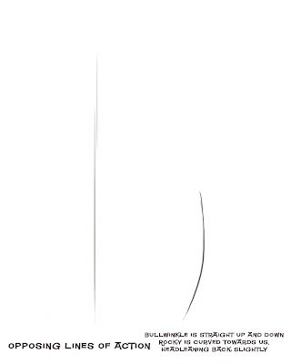
1) LINE OF ACTION
AND OPPOSING LINES OF ACTION.
Cartoonists use lines of action to express characters' attitude through the body. A line of action is even more primordial than a skeleton. Once you have decided on your line of action, then you form your character along that path.

When you have 2 characters together you need to balance each of their body attitudes together so that:

1) They read clearly
2) that we know the difference between them, either as characters in general or their individual attitudes at the moment
3) They create an appealing or aesthetic balance.

http://johnkstuff.blogspot.com/2006/11/composition-7-compose-your-poses.html


I picked this image because it has a very simple pair of lines of actions, just to make this point clear.

Here is an image with no thought to lines of action, let alone opposing ones.
Here is an image with a nonsensical attempt at line of action:

I see young artists do this all the time. They put a curve in the body, thinking they are drawing a line of action.
Line of action is a tool that points your character in a direction. It has to have balance and go somewhere-forward backward, etc.

This drawing has no direction or attitude. It is merely bent. Bullwinkle's huge head in this position would cause him to fall backwards. It's a very awkward uncontrolled drawing.
2 Proportions
Proportions do a lot to help or hurt your drawings. Even proportions tend to look generic and bland. Odd proportions are more interesting.

http://johnkstuff.blogspot.com/2006/06/animation-school-8-proportions-affect.html

Bullwinkle has very unique proportions. He has an extra long torso and tiny skinny legs.
His skull is much smaller than his muzzle.

Even the structure of his torso has uneven proportions. The chest area is shorter than his belly.

Bullwinkle's proportions contrast strongly against Rocky's more even "cute" proportions.

Here is a drawing that doesn't use Bullwinkle's contrasted uneven proportions:

Hi muzzle is more nearly the size of his skull. The body is the same size as his head. His body is not as skinny as the god drawing we are discussing. All contrasts have been dulled down.

3 Construction and Negative Shapes- Bullwinkle


I combined these 2 concepts because I couldn't figure out how to separate them.

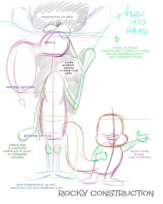
Bullwinkle has sensible construction in the basic shapes that form him. As I was putting together these shapes, I had to look at the relationship between each shape and the next.

Negative shapes:
I do this by looking at the shapes of the spaces between them. These empty spaces are every bit as important as the filled spaces.

The empty spaces help us see the forms. Unskilled artists tend to have cluttered drawings. What makes them cluttered? There are no spaces- or no planned spaces.

The spaces should have appealing shapes too.

Note the thought in this drawing-not every part of the filled structures have the same amount odd spaces between them.

The arm on the left is close to Bullwinkle's side, while the arm on the right is much more in the clear where you can see it. The artist wants you to see that arm. It is waving. If the other arm also had the same amount of large space between it and the body, then it would compete for attention with the right arm.

Here is a picture made by someone not conscious of the usefulness and appeal of negative shapes:


Construction: Parts of Bullwinkle that in the finished drawing are made up of smaller parts are well organized. They fit within the larger forms.

His Antlers have a very definite overall shape. They aren't just wiggly lines. The negative shape in between them helps define their overall shape.


Unlike these:


Fingers are part of the hand shape. The hand flows out of the arm.
Rocky's proportions are more even than Bullwinkle's but not totally even. He is a bit more than 2 heads high. His design lies more in his details than in his form, but that's for the next post...


Note that Rocky's construction flows along his line of action. I have seen many artists start out with a line of action, but then lose it when they plop the construction on top of it. It happens all the time.

How did this artist avoid that problem? Compare the left side of Rocky's body to the right side. The right side puffs out more. It is a convex curve. The line on the other side is straighter. It doesn't puff out. This makes Rocky appear to have his chest coming towards us.

I am always harping on my artists not to add big lumpy details that break up the silhouettes and lines of action in their drawings. Your final drawings should have clarity of direction and attitude, and too many lumps and details that stick out of the silhouette eat those concepts up.


Raff here missed that subtlety - as many artists do. But now that I've explained it, I'm sure he will get it on his next try, and be a much richer man for it!


SO WHERE DOES STYLE COME IN?

I'll explain that in the next post. I'll also add the details of the characters and show how the they follow same principles that I discussed here.

Style is the last element of a good drawing. If your drawing doesn't have all these other principles in it, then it won't have style. It will just be a jumble of mistakes.