Neutral colors are colors that are not primary or secondary colors. They are colors not easy to name because they are much more subtle blends. "Brown" is the simplest form of a neutral color but even "brown" is usually too harsh to use as a main area of color.
Gray is neutral too, but there are many tints of gray. Add a touch of blue for a cool gray, a touch of red for warm gray, etc...
 Grays, tans, earthy colors, creams and a myriad of shades can be found in nature and not in enough cartoons (not since the 40s anyway). In the cartoon world trees are thought to be "brown" with "green" leaves. Which is why so many cartoons have unsubtle pure brown and green trees - and blue skies. If you actually look at any trees, very few are actually "brown". Again - the psychological danger of thinking of art in terms of the simple words we use to describe things. Words are crappy artists. Eyes and brains make better pictures.
Here's a wonderful painting of trees made with subtle neutral colors:

 What color is a fart cloud? "brown" comes to mind, but I would rather use more subtle grayed brown-ish colors. And some olive green tints and fumes suggest a particularly rancid odor.
 All these neutral colors are tinted in various color directions, some towards the yellow, some towards magenta, etc. Using a variety of tints enriches every fart.
 I do Stimpy's nostrils in brownish colors - but over top of the blue shades. Blending the two color groups harmonizes them by lessening the contrasting hues.
 I'm using cooler colors for his eyelids - grayed blueish, purplish colors to give a subtle contrast to the warmer gaseous part of the waft.
 "Delta Brown" is more gray than brown. I'm using it for the darkest deepest part of the nose-hole.
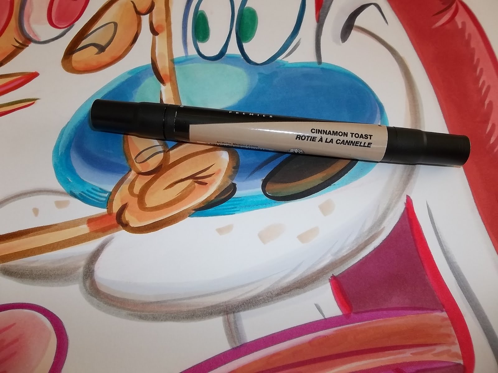 I'm using "Cinnamon Toast" around the rim of his nostril, just to make the orifice that much more delicious.
 I can never remember what color Stimpy's eye mask is. You've probably noticed it changes all the time. Perhaps it changes with his emotions.
OK, it's almost finished.
 Next step is to touch up the lines and add some more shades and to make it look worked.
 Let's give a special thanks to my all time favorite dream pet with the gorgeous neutral colors and Clampett -like appeal and proportions.