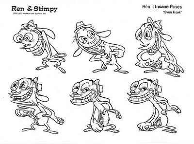
Wednesday, January 31, 2007
Milt Gross comics, drawing with every principle EXCEPT construction
I think Milt Gross is the most naturally gifted cartoonist in history.
On the surface, if you are just looking at his work for the first time, you might be shocked. It's so loose and cartoony and doesn't use strict construction. Not all the details wrap perfectly strictly around the forms. (They DO wrap around the shapes and compositions.)
BUT Milt had absolutely great natural control over a ton of principles and skills, he had a natural observant eye for the way things really looked, a gift for caricaturing them and a beautiful ornate style that had humor as its first element.
His graphic style is hard to peghole. It doesn't fit into any school of cartooning. It's neither 2 dimensional nor 3 dimensional. It has elements of both at the same time, but perfectly controlled. I guess it's 4 dimensional. He bends space to allow you to see what he thinks is important in the scenes.
He also had a very rare gift that few cartoonists have-the gift of life. His every panel and character seem alive and bustling and full of inner motivation. I don't even know if that can be taught. Some artists never get it, no matter how many principles they learn.
This panel below has:
Great page layout design - every panel is a different and organic shape, yet all the panels are composed to look good together.
Every Pose is different and fun.
Every Pose has a clear silhouette and line of action.
A funny observant take on dog anatomy- Milt takes the stiffness of a dog's limbs and bends them into human actions and situations. This is not like Bugs Bunny or Tom and Jerry, who are merely built of pears and tubes. Their poses are comfortable in human attitudes. Pooch here is struggling with his own canine anatomy, but is not at all deterred despite the awkwardness- genius!
Original Cartoony designs inspired by but not hampered by reality
Look at these hilarious designs of ferocious animal heads! They aren't stock Disney animals or stock anybody's animals. Milt needed to make a story point and did it as extreme and precise as his wild creativity let him.
Great backgrounds
These BGs are not only shown from very difficult angles-they are also very specific.
The characters are in a Craftsman house.
Gross must have done tons of drawings of real things. He must have looked at all different kinds of houses, trees, landscapes, cities, furniture etc.
He was interested in how everything looked and he thought everything looked funny so that's how he drew it.
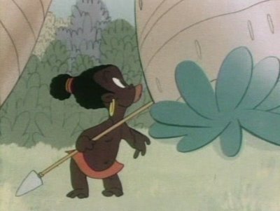
He didn't draw the "stock cartoon house" or the stock Nelvana tree with the Sheridan college bark that looks the same as the texture on every object in the Sheridan college universe.
I think Milt does the best cartoon backgrounds ever.
Crazy Ideas and Funny execution of them
Compare these pages to the great Harvey Eisenberg pages in the post below. While Harvey's are technically great, they aren't particularly funny and the story is just stock comic book cartoon story fare.
The idea of a mutt wanting to be glamorous, so he cuts up a fox fur and glues it to himself in patches is funny by itself, but the drawings show the hilarious incongruity of how matted up and nasty the dog looks, yet he is prouder than a peacock.
Genius Page Layout
Great Compositions
Varied and contrasted character designs
Look how each character is made up of different shapes. The lady has a diamond shaped head with a pointy nose.
The man has a large forehead and a skinny protruding jaw. The little character has an upside down triangle head and an upturned bulbous nose.
The man is organic and the woman is more angular.
Many animated cartoons recycle the same basic shapes for their designs and just change the ears to denote what animal you're looking at.
In a Jack Kirby comic, almost every man has the same square head design.
It's very rare for a cartoonist to have a lot of different custom designed characters.
Milt Gross seemed to never run out of them.
Wild Action
Milt's comics seem more animated than most animation-especially today's.
Control of details-look how in the middle panel, the lady with the out of control vacuum cleaner and the horse all fly in an overall arc...the seemingly chaotic situation is carefully controlled to make it funny and easy to read and beautiful.
Funny Poses- no stock poses for Milt. Look at the pose in the second panel of the man with bent knee supporting the stretched right side of his body.
Scale.
Amazing design, composition and control of where to put details to make this mansion look huge and magnificent.
Note the trees in the foreground are different kinds of trees than the ones in the background.
Dynamic Angles!
Comic Story Pacing
The angles get progressively more extreme which helps build the pace of the action.
Opposing Poses
The poses of the characters contrast and react to each other. They don't just stand there straight up and down. They are alive and thinking.
The best animal Designs
This bulldog kills me. He isn't your stock Preston Blair bulldog that you see many variations of in old cartoons. This one is totally original. Actually, maybe it's a boxer, but look at what an asshole he is!
Extreme Cartooniness
These pages are just pure brilliant cartooniness. Milt is obviously totally into his story and having a lot of fun drawing it and that fun translates to us.
Cartoons are supposed to be fun, aren't they?
UPA really missed the boat on this point. Graphically, the UPA (and Disney's "UPA Style cartoons) cartoons are similar to Gross'. They are both "designy", yet the UPA and Disney cartoons are missing the element of fun and exuberance for life that leaps off of Milt Gross' pages.
I always wonder what Clampett would have done had he stayed in cartoons through the graphic 50s. He loved Milt Gross and his cartoons were always very alive. I imagine they would have looked something like this only with that great animation you only see in Clampett cartoons.
Designy cartoons don't have to be flat or boring.
These pages are works of fine art and should be hanging in a museum somewhere.
A 15-page Pete the Pooch comic is reprinted in ART OUT OF TIME!
Discover more Milt Gross and lots of other great cartoon art at Shane's wonderful site!
http://cartoonretro.com/
NEXT! .....The Rise and Fall of Construction in Cartoons, an inspiring and sad story.
Labels:
Cartoony,
Gross,
opposing poses,
principles,
School
Harvey Eisenberg - Tom and Jerry comics - construction, difficult angles and other skills
Harvey Eisenberg was a giant among cartoonists.
He was a layout artist on the early Tom and Jerrys and then he migrated to doing comics in the 1940s.
He could draw almost everything well, because he understood all the principles of good drawing in general, and then good cartooning/animation principles on top of that.
He could draw a character and a background from any angle, no matter how difficult. This gave him a much wider canvas to create from than today's flat cartoonists who are limited by only being able to draw a small amount of poses and only in 2 dimensions. You might be able to imagine a certain expression pose and angle in your head but then find that your pencil won't give it to you, because you have been relying on drawing "by design" rather than learning your skills properly.
Construction and asymmetry
Varied and interesting compositions
These are the kinds of skills I think they should teach at cartoon and animation schools.
The more knowledge and skill you have at principled 3 dimensional drawing, the more creative choices you have to draw from.
Harvey could draw in many different styles. He later did Hanna Barbera comics more in the TV style, but they are great looking because of how well he could draw technically.
If you are young and are drawing in a flat stylized style, you are severely handicapping your creative choices and your future. Learn the principles well and you will be much more creative in the long run.
AND....YOU WON'T HAVE TO STRUGGLE SO HARD TO GET YOUR PENCIL TO DO WHAT YOUR IMAGINATION WANTS IT TO.
Here's more great info from animator Kent Butterworth:
Harvey Eisenberg started doing comics around 1943 at Timely (later Marvel) comics, then he and Joe Barbera started their own comic book company, Dearfield in 1946 with "Foxy Fagan" & Red Rabbit". Joe supposedly wrote the stories & Harvey did most of the art. (Jerry Eisenberg told me that Joe & his dad worked out of a small shed in their back yard)
After this, he drew Tom & Jerry comics (and other stuff for Dell) from the late '40s though the early sixties.
His style became streamlined in the '60s, but there was always a great sense of action and perspective in his shots. It was never "flat". He really knew how to show depth in a layout with a minimum of simple shapes. A carefully placed fence or picnic table would give a perfect sense of "camera angle" and describe a 3-d space, and then a real nice dynamic shape for the characters in motion in the scene (foreshortened so they are "in the scene" not flat like a model-sheet lineup). Lots of nice "low angle" shots so we could see both Tom & Jerry in the same shot (Jerry in the FG) and see the facial expressions on both of them clearly.
He makes it all look really easy and simple, but there's a lot of skill in laying out these panels.
Labels:
construction,
Eisenberg,
principles,
tom and jerry
Sunday, January 28, 2007
Saturday, January 27, 2007
Folks Seem to Like Drawing Sody
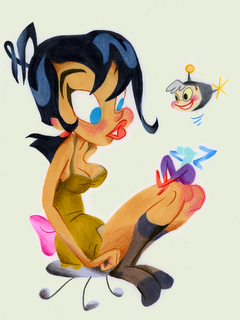
Here's more inks from Brian Romero.
Looks like real Spumco material to me.
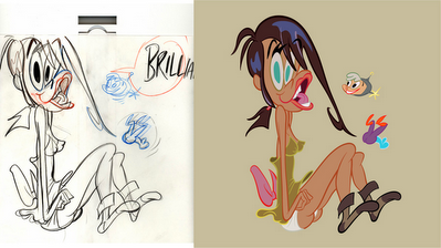
People keep sending me their renderings of Sody Pop.Here's Kali's...
And Art's.
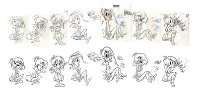
I'm gonna be doing some cartoons about Sody and her pals soon, so if you are good at drawing cute girls, I'm gonna need some help. It ain't easy, lemme tell ya!
Thursday, January 25, 2007
Look What Brian Did
Hey Brian Romero took it upon himself to ink and color one of the pencil roughs I did of Sody Pop and Raketeena the Imp From The Future. http://brian-romero.blogspot.com/
He did a pretty good job too, I think. He captured all the flowing lines.
Would you give it to them?
http://johnkstuff.blogspot.com/2007/01/sody-meets-raketeena-for-raketu.html
He did a pretty good job too, I think. He captured all the flowing lines.
Would you give it to them?
http://johnkstuff.blogspot.com/2007/01/sody-meets-raketeena-for-raketu.html
Wednesday, January 24, 2007
Crackpot Executive Beliefs 1
Executives in Hollywood are like cultists. They believe fervently in things that completely go against common sense and reason. They are like Scientologists, except that executive beliefs change faster than established religions. The religion of executives follows trends.
Every time someone comes along and breaks all the previous religious beliefs and is successful, a new crop of nutty executives displaces the last and tries to find the magic reasons that the latest new entertainment phenomena succeeded. Then for years and years they try to repeat a formula that wasn't there, until a new rule breaker like me or Mike Judge or Matt Groening comes along to dash the previous religion to bits.
The executives never come to the obvious conclusion that a normal sane person would, that when a new show comes along that destroys the previous religious beliefs, that the reason for the success is the person who made the show.
Here are just a few preposterous beliefs of current executives in animation:
Someone With Talent Who is A Natural Entertainer Needs Someone Who Has Never Entertained Anyone To Tell Him How to Do His Job
That's the justification for why you need executives in the first place. That's it. They freely admit and with great pride, that they were previously dentists, lawyers or secretaries and now they tell cartoonists how to make cartoons. They never think they need to explain why they should know better than someone who actually can do it, has done it and does it naturally and has spent a few years learning the craft.
This is a fairly modern belief. It happened after Ren and Stimpy. All the shorts programs have as their goal to find a young kid who has the latest greatest idea in the world.
They actually believe that you don't need to have ever worked on cartoons to create a cartoon.
It's as if they were hunting for the latest choreographer and they put up a sign saying, "Dancers need not apply".
This is a hugely dangerous and evil belief.
One exec actually told me, "we can't buy cartoon ideas and characters from someone who has been working in the business, because his ideas won't be fresh."
They then get some kid from nowhere who has never worked for anyone in cartoons or has very little experience, doesn't know how cartoons are made and they put him in charge of a short or series.
Of course SOMEONE has to have experience who works on the cartoon or the cartoon won't get made.
So they put an inexperieneced kid in charge of artists who have paid their dues (and would like a chance to make their own cartoons) on other people's cartoon series and all the experienced people are jealous of the guy who came from nowhere and won the cartoon lottery.
So if you plan to make a career of cartoons, you better sell a show the first couple years you're in the business, because as soon as you have learned something the execs think you can no longer be creative. But be prepared for your crew to hate your guts.
Execs think that characters by themselves have inherent value. "This character is worth millions". They never get that the artist who is able to create great characters is the thing of value.
Bugs is a great character, right? Then why hasn't anyone been able to do a good cartoon with him in 50 years?
Because they don't have Clampett, Avery or Jones to direct him. These guys created scores of great characters.
This obvious fact of history that repeats itself over and over again is completely over the heads of executives.
Executives believe that anyone is qualified to write cartoons-that is anybody except cartoonists.
Secretaries, friends of execs, psychologists, film editors - this is where execs find their "writers". Not experienced real writers, let alone cartoonists with story ability who are funny-
the folks who built the animation business and created the greatest cartoons and characters in history do not qualify.
I guess they think you can only have one talent at a time.
They would also assume that The Beatles needed plumbers to write their songs for them and that Walt Disney, Chuck Jones, Bob Clampett, Tex Avery and a horde of other cartoonists couldn't decide for themselves what cartoons to make.
Every time someone comes along and breaks all the previous religious beliefs and is successful, a new crop of nutty executives displaces the last and tries to find the magic reasons that the latest new entertainment phenomena succeeded. Then for years and years they try to repeat a formula that wasn't there, until a new rule breaker like me or Mike Judge or Matt Groening comes along to dash the previous religion to bits.
The executives never come to the obvious conclusion that a normal sane person would, that when a new show comes along that destroys the previous religious beliefs, that the reason for the success is the person who made the show.
Here are just a few preposterous beliefs of current executives in animation:
Someone With Talent Who is A Natural Entertainer Needs Someone Who Has Never Entertained Anyone To Tell Him How to Do His Job
That's the justification for why you need executives in the first place. That's it. They freely admit and with great pride, that they were previously dentists, lawyers or secretaries and now they tell cartoonists how to make cartoons. They never think they need to explain why they should know better than someone who actually can do it, has done it and does it naturally and has spent a few years learning the craft.
You Can Direct And Create Cartoons With No Experience
This is a fairly modern belief. It happened after Ren and Stimpy. All the shorts programs have as their goal to find a young kid who has the latest greatest idea in the world.
They actually believe that you don't need to have ever worked on cartoons to create a cartoon.
It's as if they were hunting for the latest choreographer and they put up a sign saying, "Dancers need not apply".
This is a hugely dangerous and evil belief.
One exec actually told me, "we can't buy cartoon ideas and characters from someone who has been working in the business, because his ideas won't be fresh."
They then get some kid from nowhere who has never worked for anyone in cartoons or has very little experience, doesn't know how cartoons are made and they put him in charge of a short or series.
Of course SOMEONE has to have experience who works on the cartoon or the cartoon won't get made.
So they put an inexperieneced kid in charge of artists who have paid their dues (and would like a chance to make their own cartoons) on other people's cartoon series and all the experienced people are jealous of the guy who came from nowhere and won the cartoon lottery.
So if you plan to make a career of cartoons, you better sell a show the first couple years you're in the business, because as soon as you have learned something the execs think you can no longer be creative. But be prepared for your crew to hate your guts.
A Cartoon Character Has Inherent Value
Execs think that characters by themselves have inherent value. "This character is worth millions". They never get that the artist who is able to create great characters is the thing of value.
Bugs is a great character, right? Then why hasn't anyone been able to do a good cartoon with him in 50 years?
Because they don't have Clampett, Avery or Jones to direct him. These guys created scores of great characters.
This obvious fact of history that repeats itself over and over again is completely over the heads of executives.
You Need To Find The Next "Look"
Another modern executive belief. Because Ren and Stimpy came along in 1991 and looked "different", they expect this to happen every year at every studio.
Things tend to evolve (or devolve). Very rarley throughout history do "new" things spring into existence out of nowhere. When they actually do, all the execs and establishment do everything they can to crush them out of existence.
Instead of just wanting the cartoons to be good, and strong and funny and amusing, there is this insane search for something relatively insignificant.
An exec told me a month or so ago, again, that experienced cartoonists were doomed because they couldn't create one of these new looks, but some 16 year old kid from the Ozarks who can barely scrawl, can.
The exec admitted one drawback to this doctrine and rolling her eyes said, of course "these kids are a pain, because they have never made cartoons before so we have to hold their hands throughout the process."
D-uh!!!
"Adult" Cartoons Have To Look Like They Were Drawn By Kids
Because the Simpsons and Beavis and Butthead were so successful, the execs tried to figure out the "secret" of their success. The magic ingredient taht could be injected into every cartoon ever after.
Execs being simple of wit and illogical, looked at the most superficial aspects of the shows-that the drawings were primitive and looked like kids drew them, rather than professional artists.
From then on, every "adult" cartoon show has looked like it was drawn by 8 year olds.
They seriously believe that if you had a show that was aimed at adults but was drawn well, people wouldn't watch.
Adults Don't Like SlapstickExecs being simple of wit and illogical, looked at the most superficial aspects of the shows-that the drawings were primitive and looked like kids drew them, rather than professional artists.
From then on, every "adult" cartoon show has looked like it was drawn by 8 year olds.
They seriously believe that if you had a show that was aimed at adults but was drawn well, people wouldn't watch.
When I was developing the George Liquor Program for MTV, the executive in charge of my creativity kept telling me to take out the crazy stuff. Formerly from MTV, and never having worked on The Simpsons, she told me what she thought the formula was for the Simpsons: "Your cartoons are too lively and animated. Adults don't want that. That's for kids. The Simpsons works for adults because nothing ever happens. They sit on the couch and say witty things. Adults don't like slapstick."
This was at the time Jim Carrey was making hit after hit of wacky slapstick films for adults.
Anybody can write cartoons (except cartoonists)
Executives believe that anyone is qualified to write cartoons-that is anybody except cartoonists.
Secretaries, friends of execs, psychologists, film editors - this is where execs find their "writers". Not experienced real writers, let alone cartoonists with story ability who are funny-
the folks who built the animation business and created the greatest cartoons and characters in history do not qualify.
I guess they think you can only have one talent at a time.
They would also assume that The Beatles needed plumbers to write their songs for them and that Walt Disney, Chuck Jones, Bob Clampett, Tex Avery and a horde of other cartoonists couldn't decide for themselves what cartoons to make.
Anybody can direct voices, as long as they didn't have anything to do with creating the cartoon story
The voice director of course used to be an actor.
Nope.
A writer?
Nope?
A cartoonist?
God no!
Execs believe that you need a special person to tell the actors how to act out the cartoon voices.
They don't believe that the creator of the show, or the writer of the episode or the storyboard artists, all people who have spent considerable time on the actual episodes know how the characters feel about the events in the story.
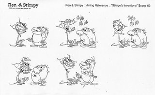
They believe that someone who has just this moment been handed a script, knows exactly how to direct the voices. Someone seeing the show for the first time, who has no creative stake in the show, because she also "directs" 15 other shows every day.
Now, maybe you think the reason this person is better qualified than the people who made the stories and characters is because she has some special training.
The voice director of course used to be an actor.
Nope.
A writer?
Nope?
A cartoonist?
God no!
Voice directors are usually the studio head's secretary, someone who spends most of her time under the most important desk in the studio.
After awhile, the boss wants a fresh new secretary and promotes the dusty one to "voice director".
There are many more crazy executive beliefs. In fact if you have experienced any, feel free to share your experiences in the comments-better post anonymously!
By the way, don't take my word for any of this.
Read the crazy religious beliefs of some of the most renowned crackpots in the cartoon business:
http://mag.awn.com/index.php?ltype=search&sval=RD01&article_no=2738
Labels:
true executive tales
Tuesday, January 23, 2007
BGs and Style 7 - Inki and the Minah Bird (1943) - backgrounds
That Chuck Jones sure was an experimental rascal.All through the early to mid forties, Jones tried all kinds of different background styles, from cartoon to cartoon, sometimes radically different.
I find it interesting that his character design style slowly evolved but his BG style changed in creative spurts.
His characters were very stylish and you see a constant progression from cartoon to cartoon with slight variations and experiments, but the style is still firmly based on the pears and spheres-Preston Blair-standard 40s cartoon style.
The one big experiment he did in character styling was The Dover Boys-1942. But I heard Leon Schlesinger hated the cartoon and told him never to do anything like that again. John Hubley at Columbia cartoons saw it and was hugely influenced by it and copied the characters and styling for his own cartoons, Professer Tall and Mr. Small. He later carried the idea of experimental design even further and helped found UPA.
Maybe Chuck's way of staying experimental was by trying different, more graphic BG styles.
He might have thought thatLeon didn't pay attention to the BGs and so wouldn't notice how radical the changes and experiments were. I don't really know, but it is odd to see graphic BGs behind rounded flowing characters.
I was always fascinated by these early Jones cartoons and hugely impressed at how many ideas were created so fast, whereas today it takes a whole decade at least to notice any discernible changes in cartoon styling and it's usually accidental and for the worse.
People ask me about the Ren and Stimpy or the Spumco "style" and I always say there isn't one. Jones and others instilled in me the idea to constantly try new things and experiment and always be restless and never satisfied with anything. I might be the last person on earth who remembers the concept of "progress" as a positive thing, a concept that just a few decades ago was the American philosophy that made the country the greatest, most influential and fastest moving nation in history.
What is known as the "Spumco style" is really the style of my imitators who carry on all the mistakes in my cartoons and turn them into cliches.
The real John K/ Spumco style is the combination of whichever artists worked on which cartoon and what we were thinking about at the time. Almost every Ren and Stimpy is a different style -until Nickelodeon took it over and even then it took awhile to become a formula. The barreling momentum of constant change started on Bakshi's Mighty Mouse and carried on in Ren and Stimpy took awhile to brake.
It finally did and now has gone quite a bit in reverse in the cable cartoon network studios.
I find it interesting that his character design style slowly evolved but his BG style changed in creative spurts.
His characters were very stylish and you see a constant progression from cartoon to cartoon with slight variations and experiments, but the style is still firmly based on the pears and spheres-Preston Blair-standard 40s cartoon style.
The one big experiment he did in character styling was The Dover Boys-1942. But I heard Leon Schlesinger hated the cartoon and told him never to do anything like that again. John Hubley at Columbia cartoons saw it and was hugely influenced by it and copied the characters and styling for his own cartoons, Professer Tall and Mr. Small. He later carried the idea of experimental design even further and helped found UPA.
Maybe Chuck's way of staying experimental was by trying different, more graphic BG styles.
He might have thought thatLeon didn't pay attention to the BGs and so wouldn't notice how radical the changes and experiments were. I don't really know, but it is odd to see graphic BGs behind rounded flowing characters.
I was always fascinated by these early Jones cartoons and hugely impressed at how many ideas were created so fast, whereas today it takes a whole decade at least to notice any discernible changes in cartoon styling and it's usually accidental and for the worse.
People ask me about the Ren and Stimpy or the Spumco "style" and I always say there isn't one. Jones and others instilled in me the idea to constantly try new things and experiment and always be restless and never satisfied with anything. I might be the last person on earth who remembers the concept of "progress" as a positive thing, a concept that just a few decades ago was the American philosophy that made the country the greatest, most influential and fastest moving nation in history.
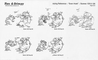
What is known as the "Spumco style" is really the style of my imitators who carry on all the mistakes in my cartoons and turn them into cliches.
The real John K/ Spumco style is the combination of whichever artists worked on which cartoon and what we were thinking about at the time. Almost every Ren and Stimpy is a different style -until Nickelodeon took it over and even then it took awhile to become a formula. The barreling momentum of constant change started on Bakshi's Mighty Mouse and carried on in Ren and Stimpy took awhile to brake.
It finally did and now has gone quite a bit in reverse in the cable cartoon network studios.
Labels:
BGs Layout Style
Functional drawings1 - draw with a purpose - layout/posing
Learn Fundamentals
There is a reason for learning all these basic drawing tools I've been talking about. Once you understand your basic tools, you'll want to do something with them.
By themselves they have no meaning unless you apply them to some purpose.
If you just fill up sketchbooks with floating characters that look neat, that's not really functional. That's good for showing your friends, and it's good if you are studying how certain things look, but it won't help you do an actual job.
That's the next step- using your skills to perform a function.
Applying fundamentals to a purpose- functional art
I have learned (and I learned this slowly) from experience that talent and skill is not enough to be able to do a job.
I have hired many young artists just on the basis of some sketches in their portfolios that indicated to me that they had talent.
Sometimes it paid off fast. A small % of them learned quickly and then after a couple months started doing work that was usable.
Most didn't. Talent and even basic skills isn't enough. I used to assume if you had talent, you could just sit down and bang out a scene.
Everyone learns to function at different rates. Some never do.
It's a sad state of the system today that people can't learn the best way to do functional animation drawings.
The best learning system existed in the 1930s, when all the animation was done in the studio in the country, and under the direction of an experienced animation director.
You started as an inbetweener working for an animator and by tracing his drawings and filling in the inbetweens you learned how to animate.
You learned to leave enough space between your characters for when they had to stretch their arms or jump up or walk out of the scene or sit on a chair. This is stuff you can only learn by doing it, and all that is done outside the country now, so really hardly anyone who makes cartoons today really knows how they are made, because they never learned by doing it themselves.
So it's not the fault of the young artists today, but the system makes it almost impossible to do anything truly animated in a creative way because you just can't afford to train people on the budgets that the studios give you. And the most important jobs are done overseas.
That's what this blog is for, to give young cartoonists as much knowledge and common sense tips to help them teach themselves what will give them the the most skills and more skill and knowledge means you have more tools to create from.
Functions in Animation
Animation is a collaborative medium. There are so many creative steps that go into making a cartoon and every one is important.
Here are some rough functions of some departments:
Storyboards:
These are the drawings that write and tell the story.
The function of a storyboard artist is to make the story make sense, be entertaining, have structure and give some indication of the acting and personalities of the characters.
It's not enough to be able to draw funny characters that float in a sketch book.
You have to be able to draw logical steps in continuity.
The characters to be staged in a way that tells each story point the most effectively.
The characters have to make expressions that not only tell the viewer what they are thinking each step of the way, but tell you in a way that only that particular character would do it.
The expressions have to be
1) funny
2) in character
3) in context of the moment of the story
The same goes for the body poses and gestures.
Now these are just a few functions you have to be able to perform to draw a storyboard.
You also have to have good and logical cutting.
You have to understand how animation works so that you don't storyboard something that is impossible to animate.
You can only really know this by having done some animation and having shot some storyboards on film and then seeing the final animation working and having people who you don't know laugh at the final product.
I'll talk about storyboards more in another post.
Here are some rough functions of some departments:
Storyboards:
These are the drawings that write and tell the story.
The function of a storyboard artist is to make the story make sense, be entertaining, have structure and give some indication of the acting and personalities of the characters.
It's not enough to be able to draw funny characters that float in a sketch book.
You have to be able to draw logical steps in continuity.
The characters to be staged in a way that tells each story point the most effectively.
The characters have to make expressions that not only tell the viewer what they are thinking each step of the way, but tell you in a way that only that particular character would do it.
The expressions have to be
1) funny
2) in character
3) in context of the moment of the story
The same goes for the body poses and gestures.
Now these are just a few functions you have to be able to perform to draw a storyboard.
You also have to have good and logical cutting.
You have to understand how animation works so that you don't storyboard something that is impossible to animate.
You can only really know this by having done some animation and having shot some storyboards on film and then seeing the final animation working and having people who you don't know laugh at the final product.
I'll talk about storyboards more in another post.
Posing for Animation Layouts
Because animation was done overseas by the time I got into the business, there was no way to control the entertainment though the character drawings in the 1980s, so I came up with a band-aid approach: Doing tons of poses in the layouts.
Doing character layouts is similar to storyboard posing but more detailed and finished.
The functions (besides using all the fundamental drawing tools I've been talking about) are
breaking down the scene into every pose that tells the story and that tells the changes in emotion.
Drawing the characters "on-model". Not on-model in the sense of tracing model sheets like most studios do, but to draw them recognizably as who they are.
Here's a relatively simple scene below as an example of a functional and creative scene.
Before you draw a scene, you have to analyze the story meaning of the scene and the physical restrictions of the scene. You can't just sit down and be creative and draw in the style of your sketchbook or phone doodles.
You need to analyze...
the Story purpose: In this scene above, you have to tell the audience in a funny way that:
1 The Happy Helmet has just kicked in and Ren is feeling his first moment of pure happiness.
2 Stimpy is an idiot and has no clear expression unless something moves.
3 Ren laughs joyously, innocently, not crazy yet
4 Stimpy sees Ren laugh and has a "pre-reaction" -slight surprise before:
5 Ren stops laughing/moving and Stimpy goes retarded again
6 Ren starts to talk, all happy now
7 Stimpy reacts- he joins in with Ren's new found emotion
Physical requirements:
This means there has to be enough space in the scene for the characters to do all the story things they have to do.
Ren basically moves up and down, so he has to have space above his head to move up.
This sounds simple, but you wouldn't believe how many layout artists (me too) who don't leave enough room for the action to happen in and have to go to the xerox machine to shrink down and reposition everything.
The expressions have to be clear, specific and in context and have to wrap around the construction of the characters.
So... having to balance all the story requirements and physical requirements of the scene drags your brain down and makes it hard to be creative. You have to work out a lot of creative and mechanical problems at the same time.
You might wonder: Where is there room for creativity here if the story is already written?
In the quality and entertainment value and humor of the drawings. In fact, to me this is the most creative and important step in the animation process-drawing the drawings that the people see. These drawings are the entertainment. They are the performers of the show and every other job on a show is subservient to the performance.
It's a lot easier to do a free and creative fun looking drawing in a sketchbook when you don't have anything to think about except how cool the individual floating drawing is, but as soon as you sit down to do functional drawings that have a consecutive order and have to build emotionally and be in the right place, then you find out what drawing really means.
This process of functioning makes you stiff. All of a sudden your drawings are lifeless and boring and awkward. This is natural to most artists and the only cure for it is to keep doing it until you are able to loosen up and function at the same time. This is a very frustrating balance and it breaks a lot of cartoonists. It separates the boys from the men. I've seen people give up just because they hate that stiff period while they are learning something new that they haven't done before. Every real artist goes through this constantly (unless they settle into a comfortable cliched simple style). You have to eat the pain and get used to hating your drawings every time you try to improve yourself. It's natural.
This takes time and practice. Start now! If you want to have cartoons that are filled with funny drawings and acting you better get your fundamental skills down as soon as possible and start doing whole scenes! Once you get confident and loose you will have a lot of fun.
Every expression and pose in here is completely specific to the progression of the story. There are expressions that were created for the scene because no stock expression would do. Of course after the cartoon, you've probably seen some of these expressions again out of context in other cartoons.
The drawings look free and crazy and fun, but they are not at all arbitrary. They are suited to the needs of the scene. I wouldn't be able to think of expressions like this arbitrarily if I didn't have a funny story to inspire me. I could think of arbitrary crazy non-functional drawings and I do on my napkins at Lido's, but those drawings are only seen by 2 or 3 people and they sure wouldn't affect the world the way tailored wacky drawings to a story can.
Here's a scene that a talented Spumco cartoonist was struggling with. The more things that happen in a scene, the harder it is to coordinate them together. The scene becomes way harder to plan. There were a ton of complex problems to work out in this scene.
There are a lot of long long scenes in Spumco cartoons. A general theory I have heard at the Saturday morning (and prime time) studios is that you should keep your scenes short, keep cutting at random from a long shot to a close up to a medium shot etc. Why? "To keep the film interesting". That's because nothing interesting happens in many modern cartoons, so you have to have quick cuts to fool the audience into thinking the film is moving along.
I've had scenes without a cut that lasted more than a minute and people laughing all through them. That's because I make sure there is always something happening, not just flapping lips.
Like this one.
This scene was extremely hard to work out functionally and it took 3 of us: Mike F., Bob Camp and me all helping each other.
Stimpy is cute, stupid and sincere and has to press a button with clear silhouettes.
Learn your fundamentals and then start to function!
Labels:
functional drawing,
Ren and Stimpy,
specific acting
Subscribe to:
Posts (Atom)