I put them in roughly chronological order so you can see the evolution and devolution of the style. All these drawings have most of the basic principles I always harp about so they are great to draw from.
 The earliest cartoons had less construction.
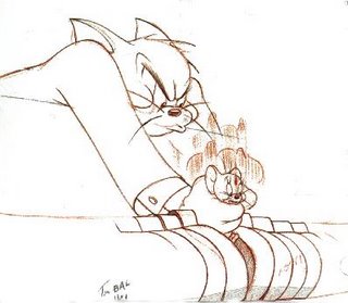
 Here Tom is getting solidified, not perfectly constructed yet, but that's good, because it gives the character more flexibility to move and act in the animators' specific styles.

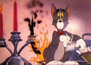
 This is almost the final recognizable model of Tom. I like it better than the final, more generic one.
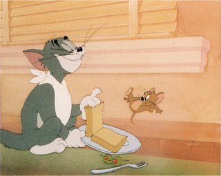
 Here is the solidified design from the mid to late 40s, when the cartoons become excellent craftsmanship, but visually generic. The design is too perfectly mathematical (the Golden Mean) to give the animators freedom to experiment visually. It's become a formula, although a great one to study pure animation drawing principles from.
 Bill and Joe, like Walt Disney had a tendency to search for the perfect formula in everything, and their styles always headed towards strict mathematical conservative formulas, even when their characters didn't start out that way.
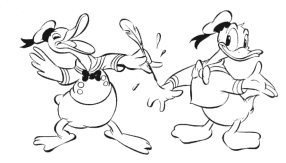
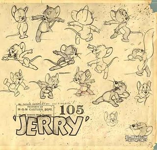
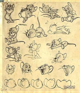
These Jerrys are beautiful and as perfect as generic designs can be. These are all the animation principles done perfectly, with no specific original ideas or design quirks to distract you from the principles.

Note how all the characters in Tom and Jerry are the same design. The only differences are what kind of ears and what specific species characteristics are tacked on to let you know what animals they are. Tom and Jerry themselves are the same design, with different proportions and different ears.
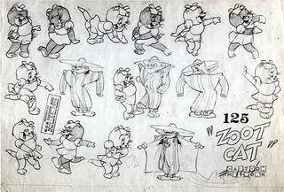
Put a dress on Tom and make the ears smaller. Voila! You have a girl design.
 Here's Tom with a bigger jaw and a Beatle haircut.
In the fifties, the characters got more generic and a bit stiffer.


 This seal is what both Tom and Jerry would look like without ears.
These models are all great for you to copy. You will learn all the important basic principles of animation drawing from them.
Then you will begin to understand how other styles are variations of these basic drawing tools.
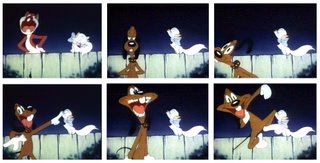
Here are the same principles used by Rod Scribner. He adds a lot more contrast and variations to the shapes and makes it much more fun and visually interesting than mere perfect circles and pears.
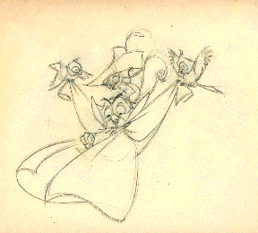 Here are the same principles with one addition: Angles. The designs are still even and generic but add up to a different look and feel than the same principles done with rounded forms.
Today we draw the angles without the principles underneath and get flat bland and crooked Mulan, Samurai Jack and Fairly Odd Parents.
 Chuck Jones is known for his style, but he has solid principles underneath.
 Tex Avery was much more creative and free with ideas than Bill and Joe. His Lion and mouse are different designs, while Tom and Jerry are the same designs.
 Here's a later Tex Avery cartoon with Mike Lah's influence added to Tex' style. Another unique look that still uses basic animation drawing principles.
If you learn your principles correctly then you can contribute to your boss' style. You will be able to differentiate style from substance and be a functional useful artist.
Maybe you can find your own style one day, but remember:
Substance is more important than style.
Here's how you might draw Tom and Jerry if you didn't understand their principles:
