

 I love this cartoon. It 's very clever.
 It's one of Jones' last WB cartoons.
 I wonder how Maurice Noble co-directed this? Did he do rough BG designs and turn them over to Givens to do finals?
 This is a cartoon that really uses what cartoons can do that other mediums can't compete with.
GREAT LAYOUTS BY BOB GIVENS
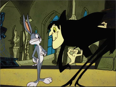
 I love the BGs in this. Not merely because they are stylized, but because they are also really well drawn, composed and moody.


 Bob Givens used to say "You would think Chuck was a Goddamned *#% from the way that he draws, but I've seen him with girls, so I guess he's not."
This cartoon is very stylish, but it's not so much so that it becomes too cloying as some other Jones' cartoons do. Instead, it's very handsomely designed and drawn.
DRACULA IS THE STAR, NOT BUGS
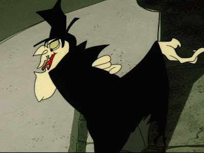
 This design of Dracula is really good. It's a combination of animated cartoon forms, human anatomy, Ronald Searle and Chuck Jones all in perfect balance.
 This would be really hard to animate, because of all the complex organic forms and stylized angles and curves. But since it is made up of real cartoon principles and the animators have been animating for 20 years or so and learned the classic techniques, they are able to pull it off.
 Today, when many cartoonists try to be stylish, they don't have the solid drawing and animation background that Jones did, so it just comes off looking like bad drawings or collections of drawing mistakes.
 To do this takes extreme control. And lots of careful decisions.
EXPERIMENTING WITH DESIGN AS YOU GO - Designing by organizing a group of concepts
 Here's something that you don't see much of anymore: Chuck designed the character but didn't stick exactly to his first conception of him. Instead of being a model sheet design with every exact incremental shape and size carved in stone, it's a collection of design concepts and ideas, left open to constant tinkering throughout the cartoon.
 His proportions and details keep changing, not only from scene to scene, but from pose to pose. Does the audience notice this? Of course not, but today's executives and show runners would seem to think that they do and will get mad if you play with the character designs as you go.
 This method of creation opens up the creators' pallete and allows for a much wider assortment of entertainment possibilities.
 It isn't uncontrolled ignorance like much of today's stylized stuff. It's highly controlled sophisticated visual concepts. Each character is designed as a combination of general concepts, rather than specific mathematical proportions and shapes.
DRACULA'S HANDS
 Aren't these hands great? Inspired by real hands, but just stylized enough to give him a gothic evil flavor.


 Aren't these hands great? Inspired by real hands, but just stylized enough to give him a gothic evil flavor.


THE SKIN TOOTH
 I know some cartoonists who hate the Chuck Jones patented skin tooth, but I think it works perfectly here.


The animation in 1963 has lost a lot of the 40s punch and dynamics, but what Jones' animators did here is still very skilled and clever and has subtle contrasts in the timing.
The Bill Lava music kind of slows the pace down, but it's so visually stunning that I almost don't notice.
The Bill Lava music kind of slows the pace down, but it's so visually stunning that I almost don't notice.
Dracula's Floating Cape
 Chuck Jones being clever again.
BUGS' DESIGN

Bugs changes all through the cartoon too. I loved the way Jones drew Bugs when he was using his "handsome style" rather than his fruity style.
 I used to always notice the bumpers he did in the original "Bug Bunny Show" from 1960. The Friz and McKimson bumpers looked bland and lifeless by comparison.
 Here's a strange design, almost looks like Friz.
 Some of the animators are drawing Bugs too tall.

 One weird thing about the later Bugs. He has tiny hands.
 Here, he has the gift of human arms.
Just to compare with classic 40s Bugs...


There are lots more good things about Transylvania 6-5000 - like the gags, and I'll get to 'em soon.
BTW, this is also one of the rare remastered cartoons that hasn't been significantly altered by engineering wizards. The colors are mostly still subtle and the lines haven't been thinned to where they are all pixellated like in so many other Looney Tunes DVDs.
