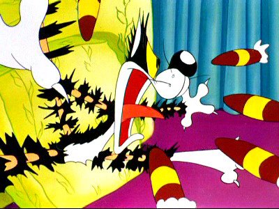
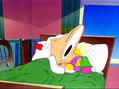
 Everyone knows what a "take" is, right? It's a startled or surprised reaction.
All animators use them. Most use them as simple punctuation, an accent that draws your attention to the a character's surprise or change of emotion. You're not supposed to really notice them.
It's just another punctuation tool, to help the audience follow what is happening in the story.
Tex Avery Turns The Tools Into The Art Itself
Tex Avery, on the other hand thinks the animator's tools are more than mere grammatical devices.  He thinks the tools are funny and can be entertaining in of themselves.


 He thought takes were so funny that he constructed a few whole cartoons around them.
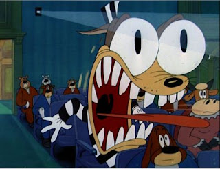
 Northwest Hounded Police is a cartoon with a story that is just an excuse to draw wilder and wilder takes.
 It makes you wonder what Heck Allen's role was.


 Here's a "double-take", 2 in a row.
 I love this one.


I first saw this take as a still black and white image in Joe Adamson's "Tex Avery, King Of Cartoons" book. I had never seen a Tex Avery MGM short before and just staring at pictures like these in the book made me completely rethink what was possible in cartoons. I had seen crazy images like this in Mad magazine - drawn by Basil Wolverton, and in Weirdo model kits and Nutty Mad toys, but never in cartoons. I didn't realize that this was being done at least 10 years before Mad and 20 before Weirdo's.
Shortly after reading the book, I started to see the actual Avery cartoons and they blew my mind. I instantly started drawing crazy drawings of my own. Not as great as this below!
Shortly after reading the book, I started to see the actual Avery cartoons and they blew my mind. I instantly started drawing crazy drawings of my own. Not as great as this below!

It's not the event itself that is funny. It's how funny and well designed the drawing is. You could write, "His eyes bug out and his tongue jiggles", but would that make anyone laugh just to read it?
A lot of other cartoons tried to imitate Tex' innovation, but didn't always get it.
 Famous studios was basically made up of Fleischer animators who'd abandoned their own style in favor of imitating Warner Bros. and Avery cartoons, but they never seemed to feel it. It's like someone did actually write, "Olive's eyes stretch out" and the animators just literally did it, without thinking about it having to look funny or pleasant. They drew what was required according to the story, and collected their paychecks.
 I wish I had a Casper cartoon on DVD to show you some of the takes they animated. What they missed was the good design. A funny cartoonist needs to have a sense of design and balance. Held takes work best when they have beautiful shapes and composition. They can't just be ugly.
Other animators also did funny Avery style takes, including Clampett and Walter Lantz animators.


Here's an Avery style take from "Man's Best Friend".
Next...
Clampett

Clampett did do a few Avery style takes, but also had a really unique way to do takes that I've never seen anyone else do.
Instead of just relying on a held funny design, he also did "motion takes". I'll explain tomorrow.
BONUS: "Ugly art" that is actually beautiful design
 I'm sure this is all inspired by Tex Avery's takes.


 Personally, I think all this stuff has a ton more design-sense and skill than any of the so-called "designy" cartoons. Plus, they are fun.
