A Scene Setup drawing to prepare for layout
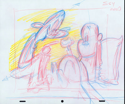 I made this layout setup by looking at the various storyboard panels that all use the same setup.
-----------------------------------------------
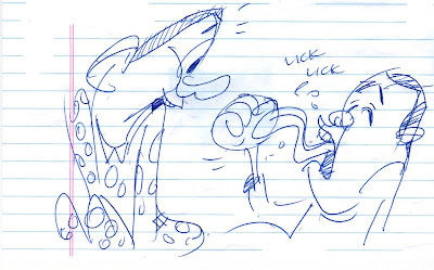
Here are some storyboard panels from the first chapter of Slab's First Fist. These are all shots that use the same "setup". - In other words, the camera is at the same angle and distance from the same background and characters.SC 1
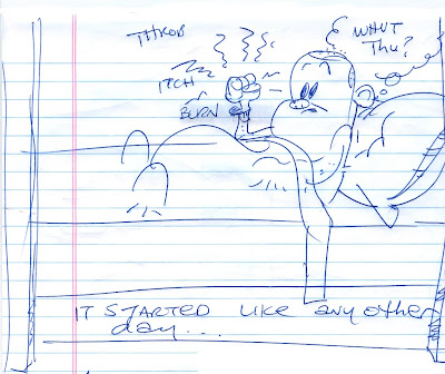 When I draw these storyboard panels, I am drawing fast and straight ahead, not worrying about the drawings being perfect, or the drawings flipping from pose to pose for animation. I am just telling the story. If I had to make perfect clean drawings that flip exactly and with detailed backgrounds, I would not have the time or mental energy to think about telling the story.
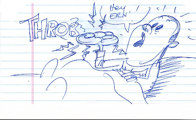 But I am thinking about the layout artist's job as I do it. He's next in line, and so I plan the scenes so that they won't be impossible to lay out. I try to re-use some shots to keep the background count down and save work for other artists down the line. It also helps the continuity to return to certain established shots. I don't create an entire new setup for every scene cut.
 http://jkcartoonstories.blogspot.com/2009/12/slabs-first-fist.html
LAYOUT is a BALANCING ACT!
Planning your scenes and staging them - or "layout" is a complicated and frustrating process.
It's not merely a matter of doing a bunch of pretty drawings in a row (although that's the last step)
FIND THE FURTHEST POINTS OF ACTION IN THE SCENE: top, bottom, left, right.
SC 4 is the first scene I roughed out
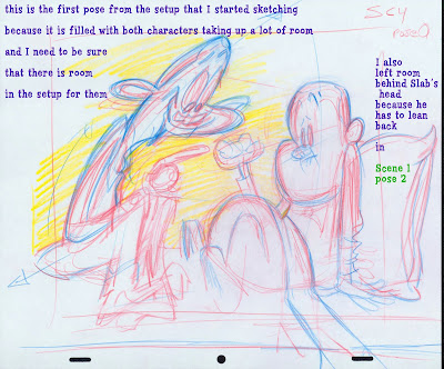 You need to plan for your widest actions. The poses above and below use up the most space in the frame. If you can fit these into the paper, you'll be able to fit the rest of the poses that don't take as much space up. (I have a tendency to draw everything too big, and have to go back and resize things)
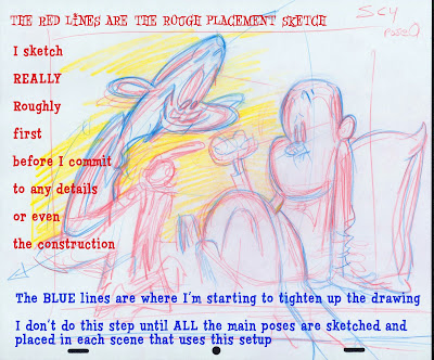 If you do one drawing and finish it and later find a mistake in staging (like drawing too big), you will have done a lot of finish clean-up work for nothing. Multiply that mistake by how many other drawings use the same setup, and all your work will have been wasted.
So plan all the scenes and poses very roughly at first.
Make sure the biggest shapes fit into the scene and flip nicely from pose to pose, and have room left over to move into if needed.
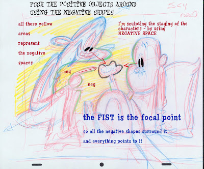
MAINTAIN THE GUTS OF THE LARGE SHAPES!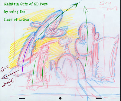 While you are functionally staging the characters and the BG, you also have to be aware of the guts of the storyboard poses, and try to maintain, or even better - push them. That means you have to analyze the lines of action, the expressions, the actions and story and make sure all those things are being maintained.
This is why layout is so demanding. You have to balance a pile of restrictive concepts at the same time-while making the drawings appear free and unrestricted.
 While you are functionally staging the characters and the BG, you also have to be aware of the guts of the storyboard poses, and try to maintain, or even better - push them. That means you have to analyze the lines of action, the expressions, the actions and story and make sure all those things are being maintained.
This is why layout is so demanding. You have to balance a pile of restrictive concepts at the same time-while making the drawings appear free and unrestricted.
Here is another main pose, this one from scene 6. I roughed it out to make sure everything fit in place and is clearly composed.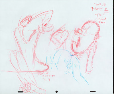 then I went back and added a couple poses to hook up with scene 5 ( a different setup). These heads will use the same body pose for the scene, because only Ernie's head is moving. His body remains still.
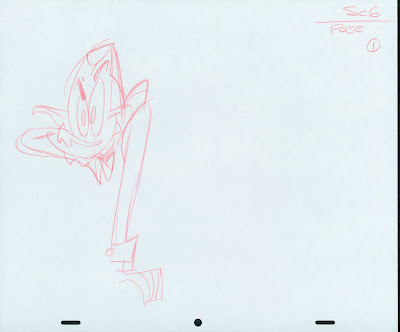
 then I went back and added a couple poses to hook up with scene 5 ( a different setup). These heads will use the same body pose for the scene, because only Ernie's head is moving. His body remains still.
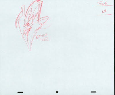 The last step in doing these layouts is to clean them up and tighten up the details and make sure they are stylish and funny. First and more important was to make them functional. I'll do cleanups in another post.
I have to tell you, that this use of layout is the most important ingredient of the so-called "creator-driven" revolution of cartoons that happened in the late 80s and early 90s. It's every bit as important as the creativity of the ideas behind the cartoons, probably even more so.
Without it, all the ideals of cartoons written by cartoonists, directors heading up units, individual artists' styles being recognizable and the input of each creative person's personality and ideas actually appearing on-screen could never have happened. Could never and would never have.
Animation itself, the kernel of what we are supposed to be doing was forever banished to far-away shores, away from the control of the few wanna-be cartoon creators. In television, using layouts to control what you see on screen was the only way possible to give cartoons back to the cartoonists.
It freed the story artists to once again concentrate on story, allowed the top artists, draftsmen and stylists an avenue for their creativity and brought back the job of "director" to cartoons. Not merely a "sheet-timer" as many people think of direction, but a true director who could follow the creativity of the film from beginning to the end of production and make the cartoon unique and filled with original specific ideas and drawings, not just another assembly line product.
The rest of the Spumco production system was built around this fundamental part of the creative process.
______________________________________________
BTW, I added an overview of my ideal cartoon college curriculum:
http://johnkcurriculum.blogspot.com/2009/12/cartoon-college.html


